This is a technique that I have used in reports that analyze a feature in a data set that is at the bottom of a hierarchy. For example, customers that belong to a larger customer segment or accounts that belong to a grouping. The report analyzes information for an individual customer or account; however, we want to bring in some comparisons for other customers or accounts that belong to the same segment, grouping or cluster.
To start, I’ll quickly recap where we left off in Part 1.
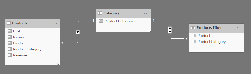
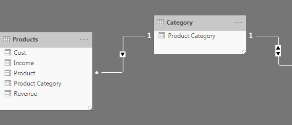
The Filter table is now connected to the Products table via the Category table with the Product Category field. This means that when we select an individual product from the Filter table, the product category associated with that product filters the Category table. This Product Category then filters the Products table by Product Category once again.
However, there can be multiple products that roll up to this category! That is how we can return multiple products from the same category by filtering down to an individual product in the Filter table!
We are very close, but not quite there yet! Once again, filtering by just the product category in the Filter table will returns all of the products that roll up to that product category. This will result in all the products being visualized in the scatter plot, but all of the revenue and cost information will also come into the column charts.
There are two ways to build the last step. The first is to duplicate, or create a subset of, the existing fact table. The second is to create an additional relationship in the data model and use the DAX function =USERELATIONSHIP().
Create a second fact table
I will demo the “data model” solution first. This does not require any complex DAX measures to provide a reporting solution. However, creating another fact table is not always (or usually) the optimal solution, depending on the size of the fact table.
In this example, the fact table and data model are small enough that we are fine to move forward with this method. As always, it is important to understand your data and business scenario.
I duplicated the fact table in the data model, so I now have two different tables: Product – Fact and Product Category – Fact. It was a true duplication because I needed all of the fields from within the original fact table for the report.
The scatter chart that I am building to show all of the products within a product category requires revenue, cost and income. If the visual only needed revenue, then it would not be necessary to copy all of these fields onto the new fact table.
My data model now has two fact tables connected to the product filter table:
- Product – Fact via Product to Product Filter
- Product Category – Fact via Product Category fields to the Category bridge table
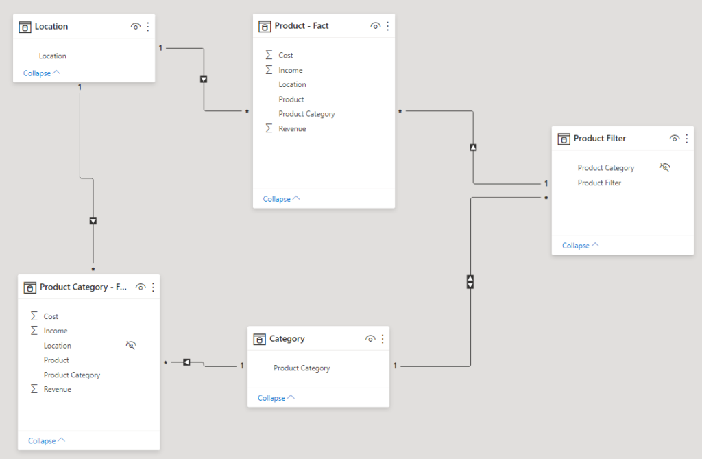
This means that when the Product Filter field is used to filter the report, the Product fact table will be filtered based on the product field and the Product Category fact table will be filtered based on the product category field.
This is what allows us to display both information for a specific product as well as information for all products within the same product category.
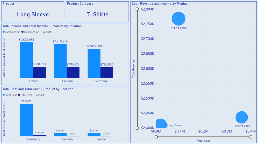
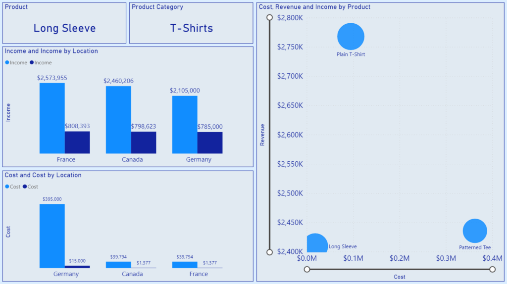
Our updated report now functions as expected: filtering down to a product (Long Sleeve T-Shirts) updates the two card visuals on the top of the report to display the product and product category from the Product – Fact table.
The two clustered column charts underneath display income and cost for both the product and product category. This is achieved by using the same field from both fact tables within the visual: Income from Product – Fact and Income from Product Category – Fact.
The report also displays the relationship between cost, revenue and income for all products within the product category on the scatter chart. This only uses fields from the Product Category – Fact table.
DAX measure – USERELATIONSHIP()
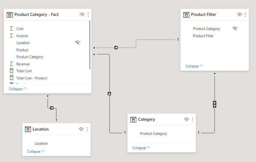
The second way requires a more complex DAX measure, but results in a more simple data model. The data model only has one fact table (still labeled Product Category – Fact in the diagram below) as well as the Product Filter and Category bridge tables that we built in Part 1.
The first step was to create an additional relationship in the data model between the Product Filter and Fact tables on the Product field. This is represented by the dotted line in the diagram below.
It looks a bit different than the other relationships created in the data model. This is because it is an inactive relationship! It is inactive because there is already a connection between the Product Filter and Fact tables, via the Category bridge table. There cannot be two active relationships between two tables simultaneously, so the new relationship defaults to an inactive status.
The relationship between the tables is inactive, but we can still leverage it by using a DAX function! We will have to explicitly define that the DAX measure use this inactive relationship when filtering via the Product Filter table.
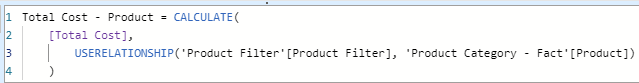
I created an initial measure on the Fact table named Total Cost. This measure was defined as the sum of the Cost field. When this measure is dropped into a visual on the report, it is filtered via the Category bridge table.
I then created another measure, Total Cost – Product, which adjusted how the measure was filtered from the Product Filter table. I wrapped the Total Cost measure in a =CALCULATE() function. Then I leveraged =USERELATIONSHIP() as the second clause, explicitly defining that I wanted to use the Product Filter to Product relationship to filter the new measure.
This results in the same report and functionality as above using a data model with two fact tables. In the column chart, I used both the Total Cost and Total Cost – Product measures. This patterns of building an additional measure was repeated for income as well.