Objective
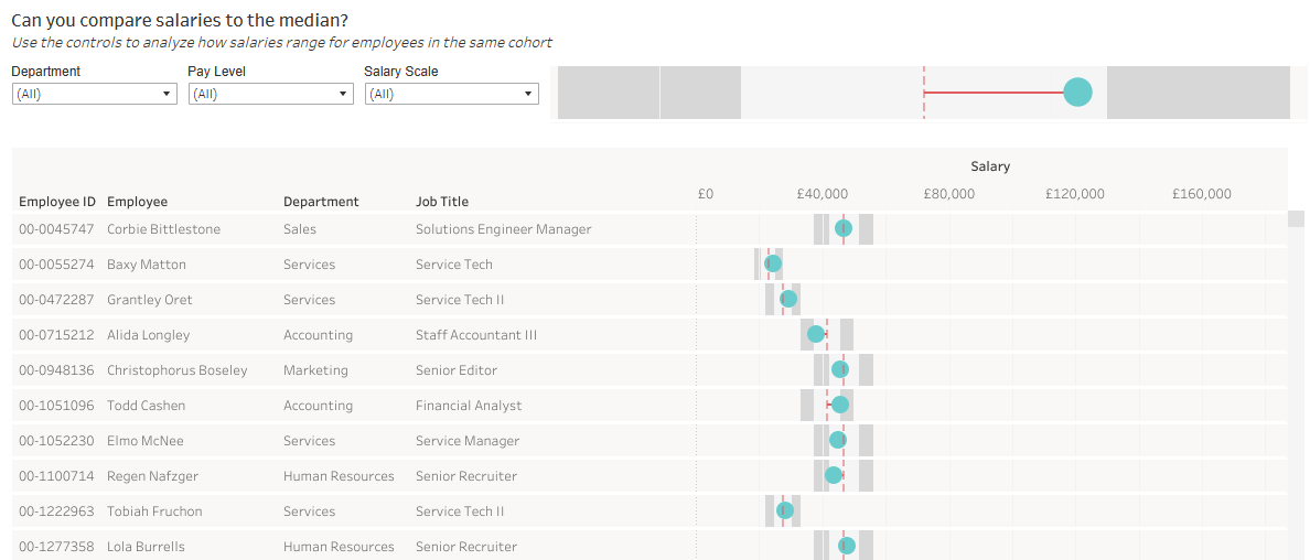
This goal of this visual is to compare an employee’s actual salary against the median salary of all employees with the same pay level (cohort). Along with this, a salary scale determines how close that employee is to the median, and then provides an effective way of being able to see how employees in the same cohort compare – are there some departments that typically pay more than others; are there employees who may need a pay increase as they’re quite adrift?
WoW Challenge Link
Highlights
The things that jumped out to me to build the visual are:
- reference lines
- the
FIXEDLOD expression - synchronized, dual axis
Reference Lines
Reference lines are what enables the bands around the median that visualize the difference from median. This involved a few different types of calculations:
- calculate the reference bands themselves (90% median, median, 110% median, etc.)
- calculate the median salary for each pay level (outlined below)
- calculate the difference of an employee’s salary from the median salary as a $ amount as well as a %
FIXED
I tend to think of Tableau functions through a Power BI/DAX lens, so FIXED is essentially a CALCULATE() statement with simplified syntax.
One of the requirements of the report is to compare an individual employee’s salary against the median for their pay level. So for each employee, I needed to determine what their categorical pay level, return all of the salaries for each employee at this pay level, and then calculate the median.
This can be done with a level of detail expression. I wanted to “fix” the calculation of the median salary to the Pay Level field. This will return the relevant pay level median salary for each employee, which I then used to compare their salary too.
{ FIXED [Pay Level]: MEDIAN([Salary])}
Dual Axis
In order to properly recreate the visual and show all of the reference lines, I needed to create a dual axis. This is part that I struggled with the most and ended up looking at the solution.
On one axis, I was able to visualize the employee salary, the median salary, and the various comparison bands. In order to visualize the difference of the salary from the median with a horizontal bar, I had to create a secondary axis and then synchronize with my original axis.
This was a nice trick! Off the top of my head, there isn’t a real comparison in this functionality to Power BI, which is perhaps why I struggled to think of the solution with this method!