My first post about using R! My first encounter with R was during my undergrad days, when I took a customer analytics class. It opened my eyes to how powerful the language is. Even with this knowledge, I have only really been learning R over the past six months or so. I have already come a long way and feel comfortable throughout the data analysis process. I typically stay within the tidyverse when I use R, utilizing the following core packages:
- readr and readxl for data importing
- tidyr for data cleaning
- dplyr for data manipulation
- ggplot2 for data visualization
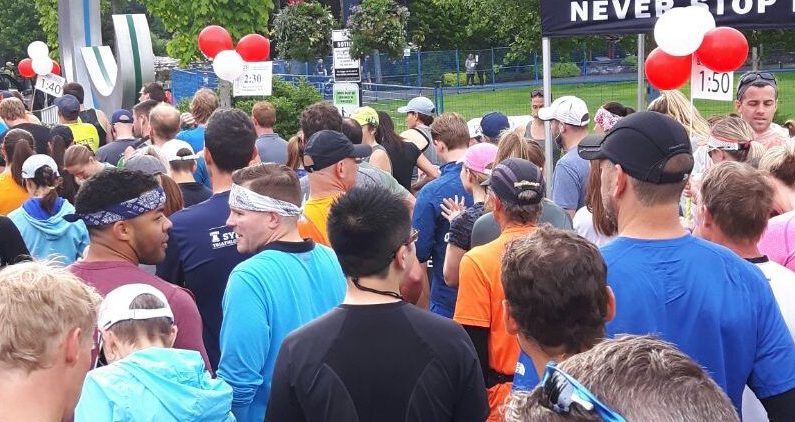
I will be using only two of these packages for my analysis in this post. As I mentioned on Twitter, this past weekend I ran my first half marathon in Whistler. It was a fantastic experience and it gave me the chance to play with some data captured from my Fitbit. I went to the Fitbit Dashboard in my browser and accessed my race details. I then exported the data as a TCX file.
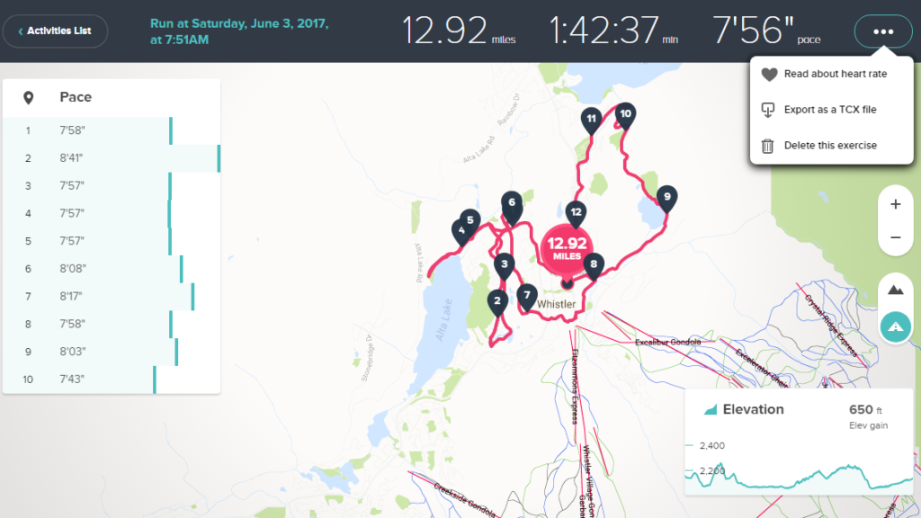
I had not used this extension before, so I tried opening the file in Excel. It was handled as an xml and loaded a clean table. I saved as an xlsx for import into R. I opened up RStudio and imported the table using the read_excel function and assigned it to dataset: WhistlerHMData.
WhistlerHMData <- read_excel(“H:/FitBit Data/2017-06-03 HM.xlsx”)
One of the main aspects of my data I was really excited to play with was the GPS data. My longitude and latitude throughout the run were captured every second. This resulted in 6,147 records. I have had limited experience with geospatial up to this point, but figured I could simply plot all of these points as a scatter plot. That is exactly what I did, initially using geom_point from the ggplot2 package that I was familiar with.
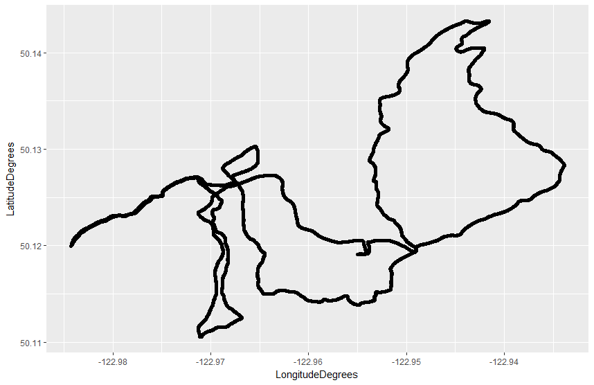
However, there was significant overlap in my data points, which led me to use geom_path instead. This resulted in a much nicer visual.
route <- geom_path(data = WhistlerHMData, aes(x = LongitudeDegrees, y = LatitudeDegrees)
ggplot() + route
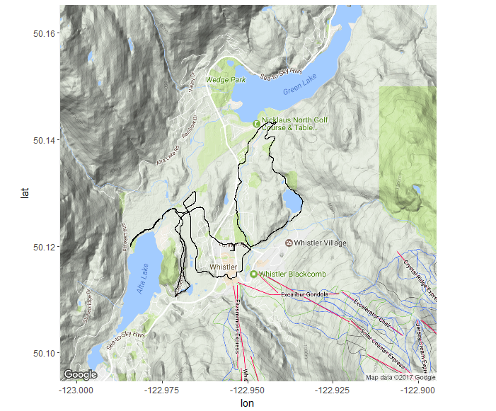
I was happy to see that my race route captured in my GPS data looked exactly like the course route. This was a great starting point, but I wanted to have some context to the route. The visual so far is very bare and it is not obvious what it is. I decided I needed a map to be the background for my route. I used the get_map function within the ggmap package which queries Google Maps to provide the layer I wanted.
whistler <- c(longitude = -122.95, latitude = 50.13)
whistler_map <- get_map(location = whistler, zoom = 13)
race_map <- ggmap(whistler_map)
race_map + route
Much better! My route with the context I needed. Almost done.. One part I had missed, which is often overlooked with visuals, were the labels and title. These are crucial, crucial aspects to any visualization, chart, or graph and are usually forgotten about. I will add these features with ggtitle and labs. I also centered the title over my visual using the plot.title argument in theme.
race_map + route + ggtitle(“Whistler Half Marathon Route”) + theme(plot.title = element_text(hjust = 0.5)) + labs (x = “Longitude”, y = “Latitude”)
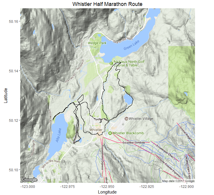
There it is, the plot of my GPS data using R. This visual is basic and I will likely build on it in the near future. This was a fun exercise for me, as I had not used the ggmap package before. Just a quick post this time, but I am looking forward to deeper dives into R with a future post.