Purpose
This Power BI report is all about showing off the latest features and functionality in Power BI. I present monthly at the Vancouver Power BI & Modern Excel User Group on “What’s New in Power BI”, highlighting my favorite features from the latest release of the desktop app. The idea is to not just tell you about these updates but to show you how they work in real-life situations.
I aim to do two things: keep you informed and spark some inspiration. By showing you what’s new and how to use it, I hope to open up new paths for you to explore in data visualization and analysis.
With this in mind, I have developed a report that has the flexibility to demonstrate new features in all areas of Power BI, whether it be data transformation, analysis, visualization, DAX, or anything in between.
Typically, Power BI features are used to best communicate the key message or insight from the requirements of an analysis. This purpose of this report is the total opposite, the analysis is used to highlight features of Power BI.
You can interact with the report to see some of these news features in action! All of my “What’s New in Power BI” sessions can be found in the YouTube playlist below. From these videos you can see which features I have picked out as my favorites and how I have incorporated them into my demo report above (I recommend opening the report in full-screen mode, using the expand icon in the bottom corner).
I’ve provided some additional commentary, outlining the data sources, transformation, data model, DAX measures, and visualizations.
Data Source & Transformation
The main dataset used in the report is based on a typical retail banking scenario. The dataset has undergone a rigorous anonymization process, stripping away identifiable information while also being curated and adjusted for enhanced relevance and accuracy, resulting in a dataset that is rooted in real-world data.
The dataset is relevant to any retail sales scenario, consisting of:
- Fact Table with counts of clients and total balance information
- Client Dimension with demographic information like client age and segment
- Product Dimension with product categorization hierarchy
- Date Dimension for time intelligence functions
Occasionally, I will add isolated tables to the report that can help me to better showcase a specific new feature. For example, I also have a Cities table that consists of Latitude and Longitude data across almost all of the States in the US. This can be used to showcase new mapping functionality in Power BI, which isn’t really possible using the core tables.
Data Model & DAX Measures
The main tables of the report are modeled as a basic star schema. I have a single fact table with some basic measures, connected to the dimension tables with one to many relationships. This provides a solid foundation to build a variety of visuals and DAX measures.
As mentioned above, there are sometimes isolated tables in the data model as well.
The core DAX measures of the data model are quite basic:
Count of Clients = SUM('Fact'[NumClients])Total Balance = SUM('Fact'[Balance])Mean Balance = AVERAGE('Fact'[Balance])
So nothing super complex with the data model or measures. The main reason for this is that the report is unique, in the sense that there aren’t any requirements. I’m not analyzing anything in particular. It is a simple, flexible model with basic measures that is suitable to highlight a wide variety of functionality in Power BI.
Visualizations
The report has five main visuals:
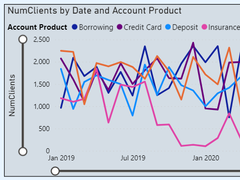
- Line Chart – Count of Clients over time by Product Type
- Area Chart – Total Balance over time
- Column Chart – Total Balance by Product Hierarchy
- Card Visual – Total Balance by Product Category
- Matrix Visual – Total Balance by Client Hierarchy
These visuals provide a foundational, if a bit vanilla, analysis of the fictional retail bank. They address common asks in this scenario: “how many clients do we have?”, “how are balances changing over time?”, “which products have the highest balances?”, and “how do different clients types contribute to our total balance?”.
These are arguably the five most common visuals in Power BI – and this is no coincidence! I needed a variety of popular visuals in order to showcase potential new features. Examples that stand out in my mind from over the years include Zoom sliders, conditionally formatted data labels, and visual calculations.