Happy 2018 everyone!
I hope you all had a festive holiday season and are looking forward to the new year! I have some exciting announcements to make over the next few weeks, so make sure to follow me on my social profiles found in the Follow Me pane on this page.
This post is the first in a new series of reviewing the monthly Power BI Desktop feature updates. I am starting with last month’s (December 2017) because there was so much cool content to cover.
There will be another post in a few weeks’ time covering the first month of 2018!
The full feature summary documentation can be found on the Microsoft Power BI blog.
Q&A for Report Creation (Preview)
This is HUGE! The Q&A preview feature provides natural language functionality within the Desktop environment. Looking for an insight from the data? Simply ask for an insight, such as:
Count of Positions by Organization
A visual displaying this information will then be created. This can help speed up the process of creating a report, as well as allow for fast ah-hoc analysis of the data.
The first time I opened Power BI Desktop after updating to the December release, I was prompted with an “Introducing Q&A” dialogue pane. I loved the “chat with your data” tagline.
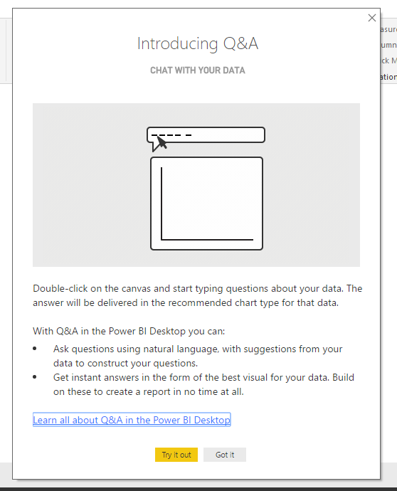
I selected “Got it” and proceeded to load the data necessary to create my report. As outlined in the dialogue pane above, the natural language Q&A functionality can be generated by either:
- double-click on the report canvas
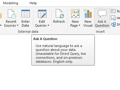
- navigate to the “Ask A Question” icon
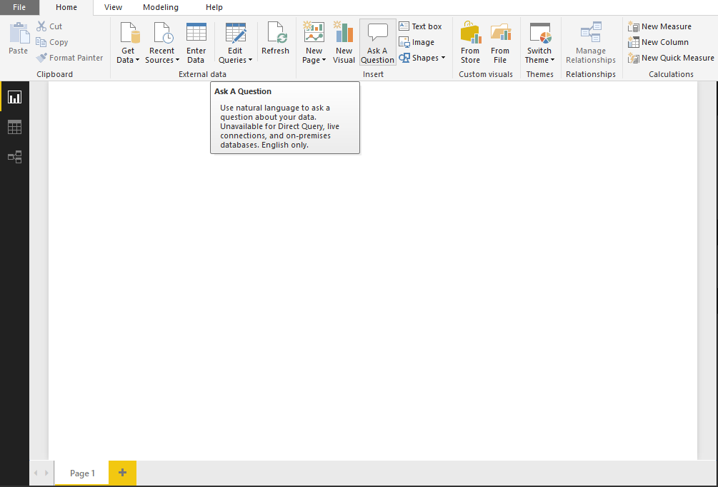
The “Ask A Question” icon is located in the Insert group of the Home tab on the ribbon.
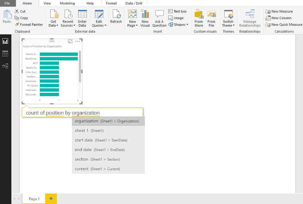
I selected this icon, which brought up a dialogue box where I could start typing in what insights I was looking for. I asked my first question of the data: “Count of Positions by Organization.”
As shown below, my question created a drop down list of suggestions from my data. This is useful to see in case the field names are unfamiliar.
I continued to create my report using Q&A. I made a few adjustments to the visuals and formatting, but I was able to build a report more quickly than using the interface.
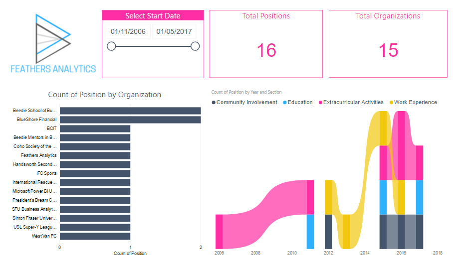
This report will be used to demonstrate two other features from the December update.
Bookmarks
Bookmarking in Power BI allows for a view of a report to be saved. This is fantastic for sharing insights easily with other users.
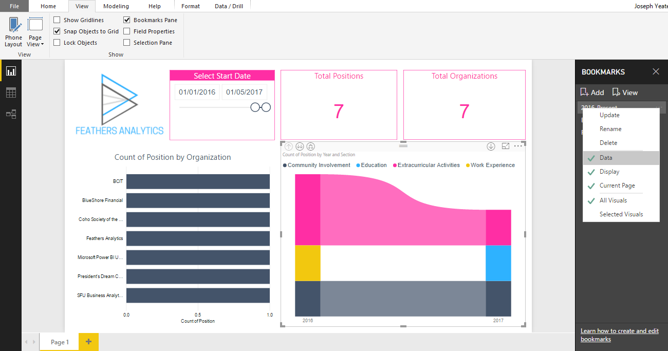
I continued on with the report I created using Q&A, navigating to the Show group in the View tab on the ribbon.
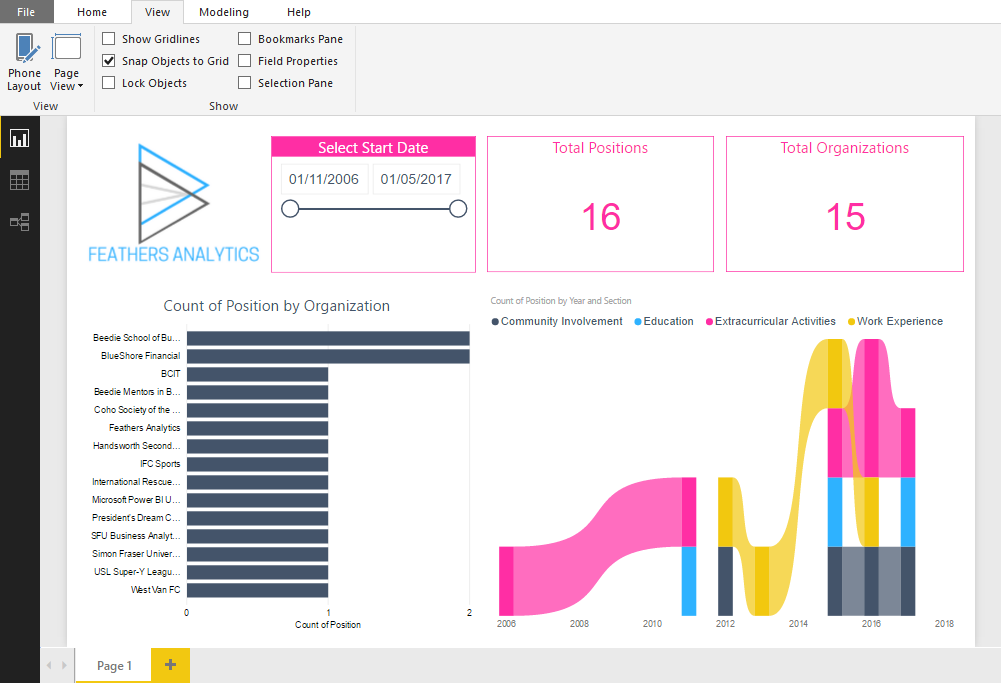
I checked the Bookmarks Pane checkbox which brought up the bookmarks pane to the right of the canvas. Bookmarks are easily created by clicking on the Add icon in the pane.
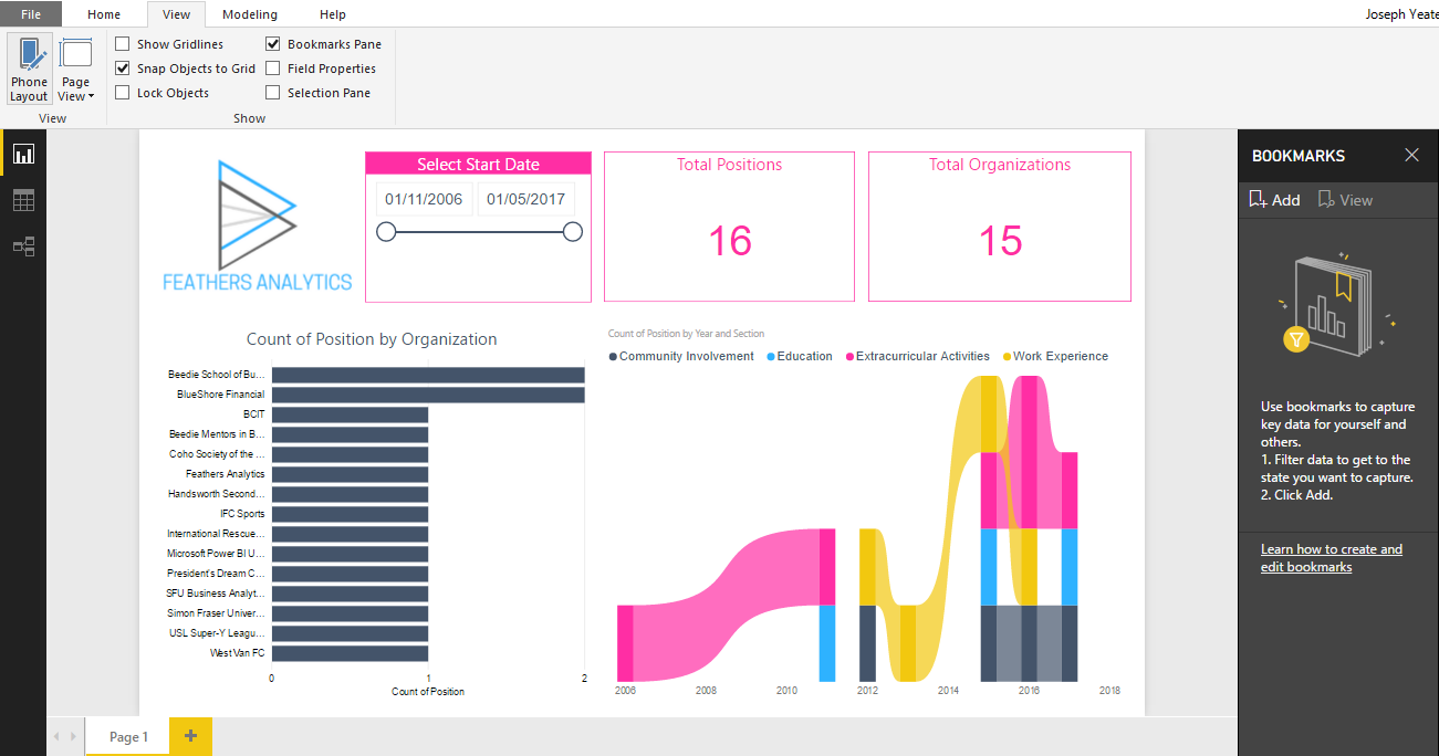
I created three bookmarks from my report. Bookmarks can be viewed as a slideshow to present analysis and insights by selecting the View icon in the Bookmarks pane.
The Bookmarks preview was available in previous releases of Power BI Desktop, but two enhancements from December 2017 are:
- Cross-Highlighting
- Added Flexibility
Cross-Highlighting
Bookmarks can now save a cross-highlighted state of a report. This was a point of frustration for me before, as some powerful insights can come from cross-highlighting.
I used this improved functionality to help create my Extracurricular bookmark. I have two filters set on my report to build this bookmark:
- Start Date filter set from 1/1/2016 to 1/5/2017
- Extracurricular activities Section selected on my Ribbon Chart
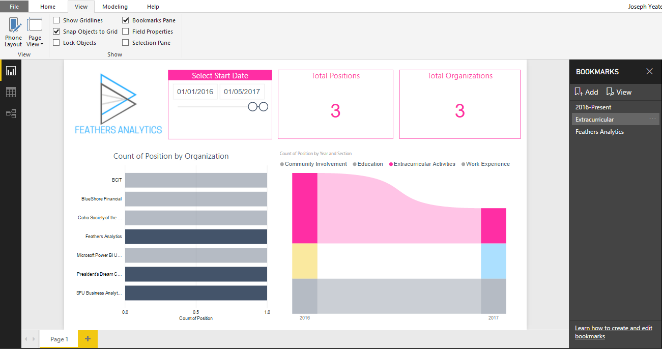
The selection from the Ribbon chart cross-highlights the bar chart and the two Cards on my report. This view makes it easy to see information regarding my extracurricular activities over this two year period.
Added Flexibility
This is another win for the bookmarking functionality. This added flexibility gives the user more control over how a bookmark should look and what will be included in the view. The increased control can be broken down into four sections:
Data: controls the view of the data in the bookmark. This is applied to the filters and slicers in the report.
Display: controls the visibility and spotlight property.
Page: controls the change of page that moves users to the page visible when the bookmark was added
Visuals: controls which visuals to be included in the bookmark. By default, all visuals on the page are included. Now, a user can pick and choose which visuals on the page to include.
Both cross-highlighting and the added control improve the bookmarking experience in Power BI. I can’t wait to start incorporating this powerful functionality into my reports!
Drill Filters Other Visuals
Drilling down in a visual will now filter other visuals in the report. This results in a more intuitive report functionality and user experience.
To demonstrate this new filtering, I selected the Ribbon chart. It’s axis was based on a timeline which was already filtered by my date slicer.
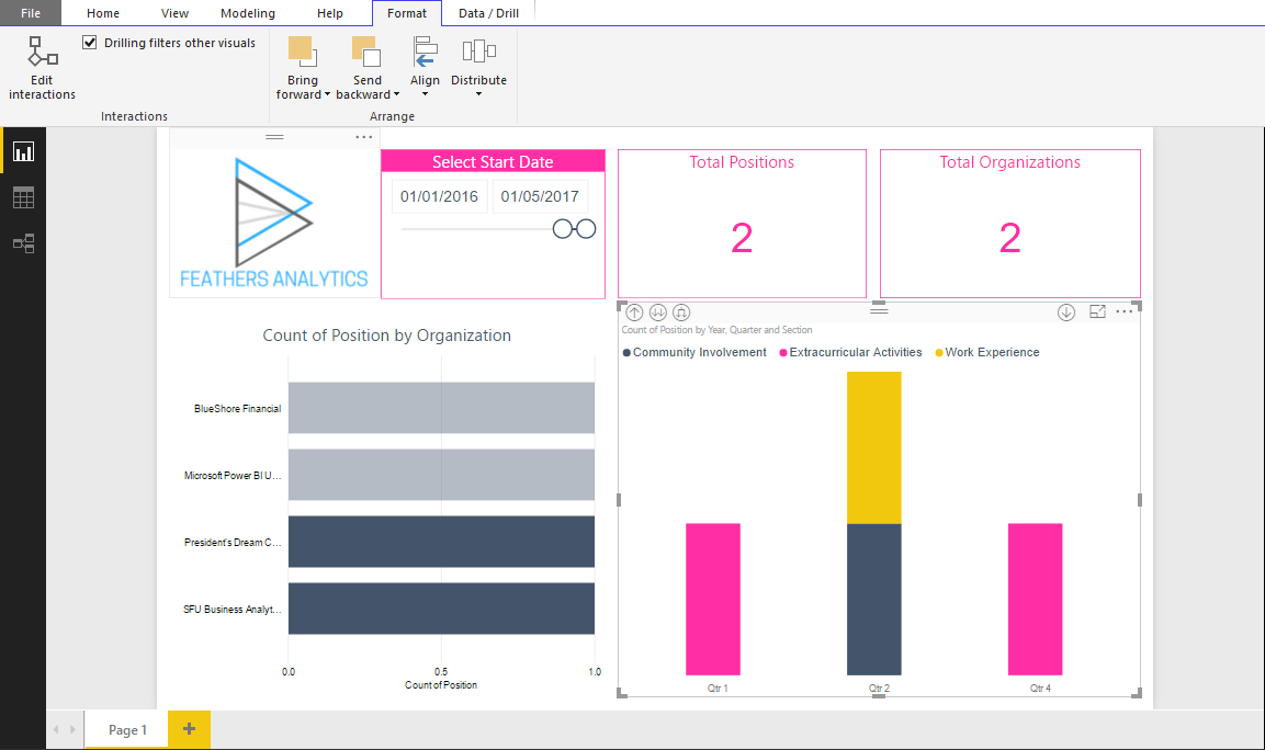
I selected the first quarter bar and right-clicked to generate the drop down menu. This gives the option to drill down.
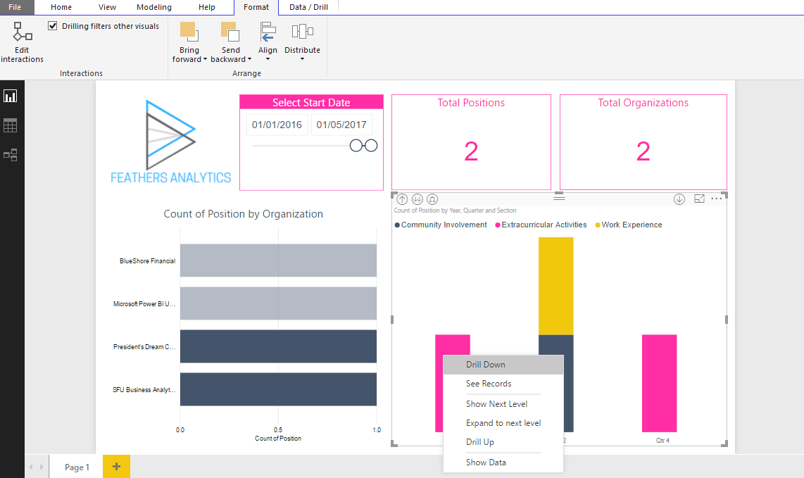
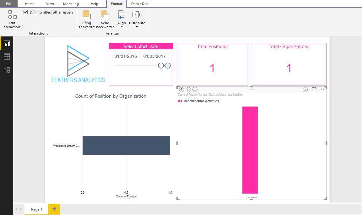
I selected drill down to get to the monthly view of the data. In this case, the month of January. Drilling down on the Ribbon chart resulted in the Bar chart and Cards also being filtered.
Those were my three favorite updates from the Power BI Desktop December feature summary! Remember to follow my social profiles to stay updated with some exciting announcements in the coming weeks.