A custom theme is a tool to personalize and brand a Power BI report. In this post, I will first review the elements of basic report theming and then explain how to create an extended theme. Extended theming was introduced in the September 2017 Desktop App release and is powerful way to control the aesthetics and formatting of report visuals.
The full documentation on report themes in Power BI can be found here.
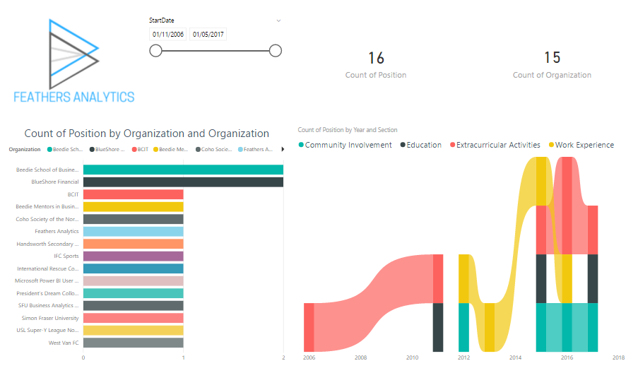
I will use a report with four visuals (slicer, cards, bar chart and ribbon chart) to demonstrate the effect of both basic and extended report themes. This is how the report appears with default formatting:
Basic Report Theme
I briefly covered the topic of basic report themes in a previous post, Power BI Tips & Tricks. A basic theme contains five lines:
- name – the name of the theme
- dataColors – list of colors for the elements of the report
- background – color of the background in table/matrix visuals
- foreground – color of the foreground in table/matrix visuals
- tableAccent – color of the accent in table/matrix visuals
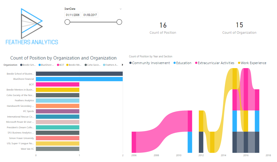
I created this basic example for branded reports. It includes a list of three hex color codes as well as colors for the three table/matrix visual arguments.
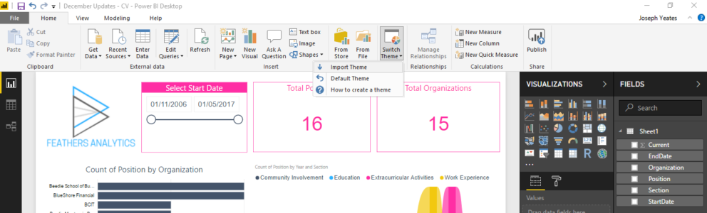
A custom theme is applied in Power BI by navigating to the Themes section of the Home tab on the ribbon and selecting Import Theme from the menu.
When applied to the report, this theme only changes the colors of the visuals.
Extended Report Theme
An extended report theme provides greater control over the granular details of report visuals. An extended theme includes the five lines outlined in a basic theme, as well as an additional section: visualStyles.
The visualStyles section consists of four layers:
- visualName – corresponds to the visuals used in a Power BI report (e.g. Bar chart)
- styleName – I am not sure what this corresponds to and I have seen others ask this question in various forums. Any answers would be appreciated!
- cardName – corresponds to an element of a report visual (e.g. Bar chart legend)
- propertyName – corresponds to a property of a report visual element (e.g. color of Bar chart legend)
The visual styles section allows for both globally applied formatting, as well as distinct formatting between report visuals. Formatting is applied globally to all visuals or cards by using an asterisk (*). Distinct formatting is applied by specifying the various layers in the visual styles section.
The full list of visual names, card names, and property names can be found here.
Below is a condensed example of an extended report theme. Some initial formatting is applied globally to all visuals, as well as a detailed example of the legend card in a bar chart visual.
This extended theme formats changes the colors of the visuals as well as the formatting of the legend in the Bar chart visuals.
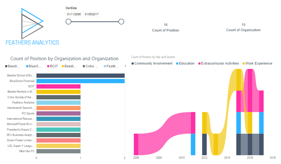
It looks a bit different than the basic theme, as additional arguments have been specified for the Bar chart visual. This theme can be developed out with more arguments to control more properties in a wider variety of cards and visuals.
That is my take on report theming in Power BI! Be sure to check out the new Media page of the Feathers Analytics website. I have lots of cool content planned for the coming months that you won’t want to miss!