
Another post on the monthly update in Power BI Desktop! Every month, I review a few of the new features from the release.
This month I went more in depth on two of my favorite features: report page tooltips and the Timeline custom visual.
I use the report I created in my post from last week to demonstrate both of these features. My previous post covered how I built a report using the data.world connector as my data source.
If you missed it, be sure to check it out!
Report Page Tooltip
To create a tooltip for the Tweet timeline line chart, I created a new page in the report. I navigated to the format section in visualizations pane.
Under Page Size, there is an option to set the type of page. I set the page size to Tooltip.
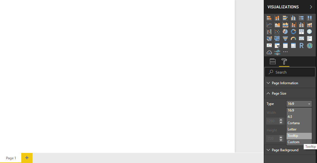
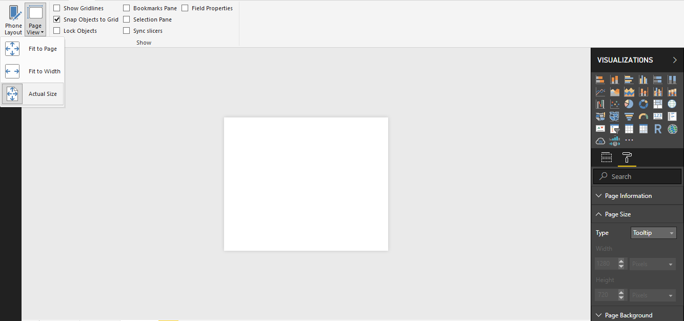
It didn’t look like anything had changed as the page remained the same size. However, I watched the video of the feature release and they provided a great tip on changing the page view to Actual Size.
This will ensure you can design a tooltip with a view of how it will actually look to a user of the report.
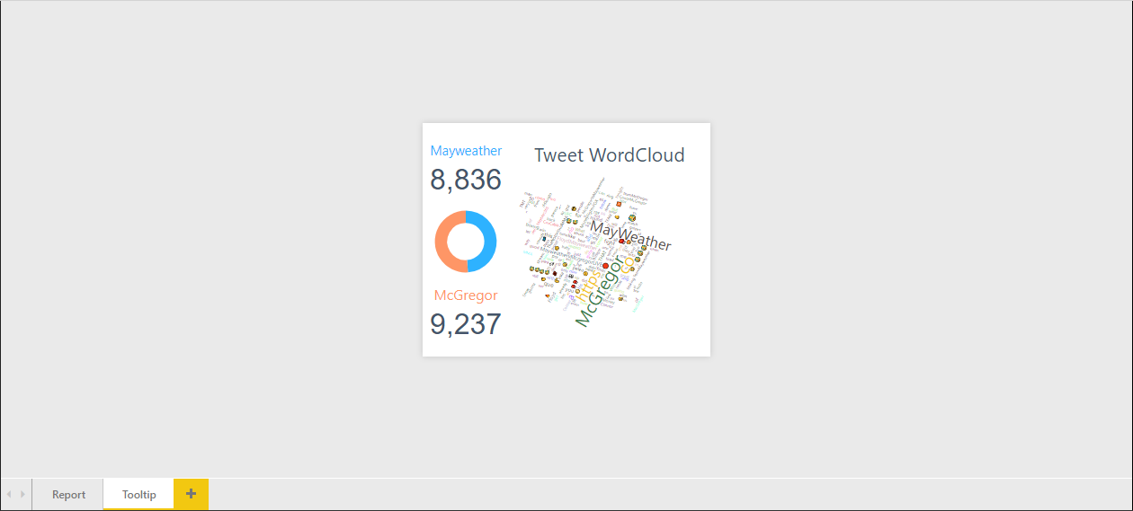
I kept my tooltip simple. I had cards visualizing the count of tweets containing the word Mayweather or McGregor.
A donut chart visualized the comparison of these counts between the two fighters.
Finally, a WordCloud visual displayed the contents of the tweets.
I linked the tooltip to a report visual by navigating to the format section of the visualizations pane on my report page. If the preview feature has been turned on, the last menu section should be tooltip.
There is now the option to customize what the tooltip for the visual is set as.
I toggled the report page option on and selected my Tooltip page as the report page that I wanted as my tooltip for the visual.
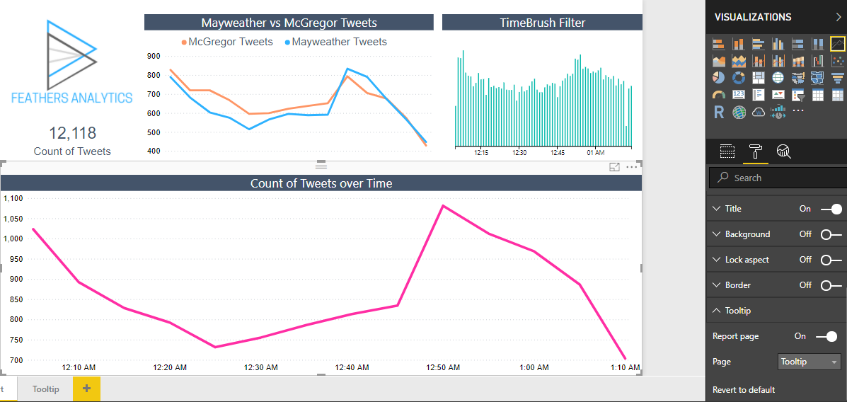
This linked the tooltip visual I had built to the Tweets over Time line chart.
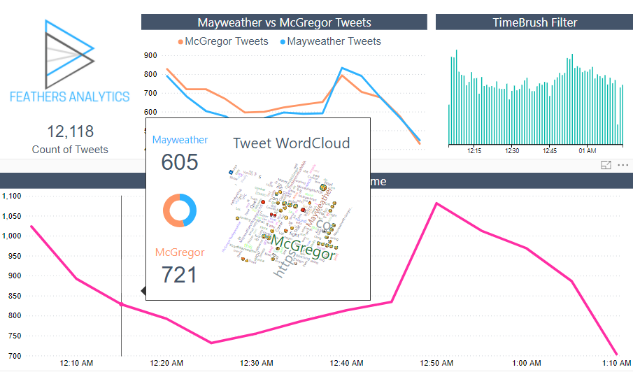
I think this is an awesome feature! The additional context provided by these tooltips eliminate the need to navigate away from a report page to get further information.
Timeline Custom Visual
The Timeline custom visuals formats data in a way similar to the Twitter timeline. This was a natural addition to my report as the data set was pulled from Twitter!
To get started, I downloaded the custom visual from the Marketplace.
I added three columns to the visual:
- Date
- Screen Name of the Twitter account
- Tweet contents
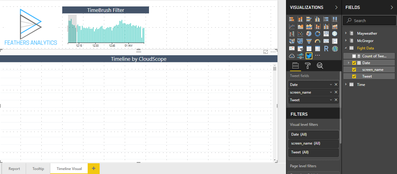
And then nothing happened. I played around and discovered that after selecting the fields, they need to be mapped onto the visual.
The Date field was mapped to Tweet date, screen_name to Author screen name and Tweet to Tweet text.
This resulted in the visual being populated. It started to look more like a Twitter timeline embedded in the Power BI report.
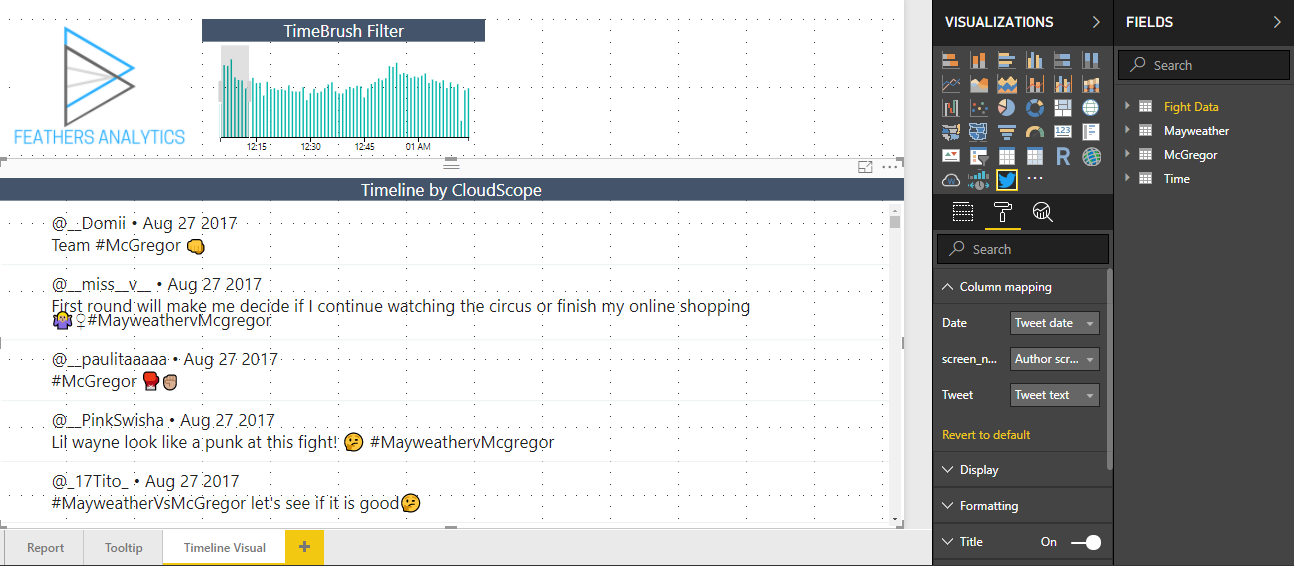
I paired the timeline visual with the TimeBrush filter and WordCloud visuals from the original report page.
I filtered the page to display the tweets from the first 15 minutes of the data set. This time frame corresponded to the events leading up to the fight.
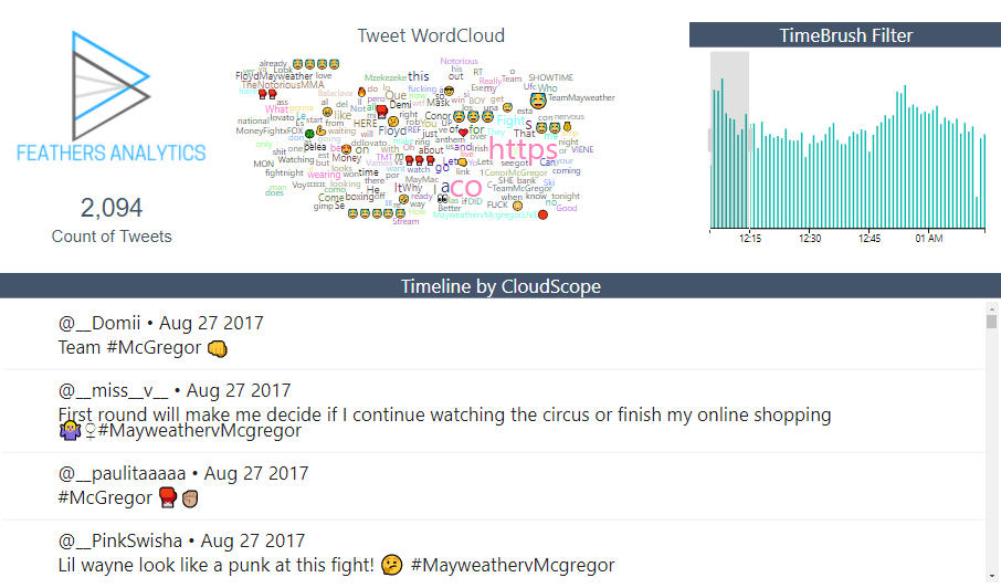
I further filtered the data by selecting the laughing crying emoji from the word cloud.
This filtered the data down to 183 tweets. These tweets all contained some interesting thoughts on Mayweather as he was walking out for the fight.
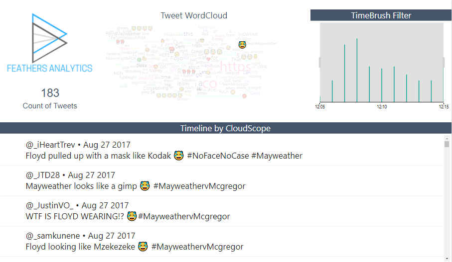
These were probably all fair reactions as Floyd Mayweather walked out wearing a ski mask along with his usual Money Team gear.
And here comes #FloydMayweather!! #MayweatherMcGregor pic.twitter.com/OgbkhBvs9h
— UFC (@ufc) August 27, 2017
Report page tooltips and the Twitter timeline custom visual were my two favorite features from the March 2018 update.
Both of these features enhanced the report on the Mayweather vs McGregor fight and allowed for clear insights.