
So.. I (kind of) lied. I said last week that this post was going to be about report tooltip pages.
I was planning the content for this post and wanted to use the data.world connector to get a new data set to play around with.
I realized I did not have a blog post about how to use this type of connector to get data. So, I decided to write a quick post to outline data.world and how I built a basic report to demonstrate report tooltip pages.
Next week I will follow up with tooltips and some of the other March update features.
data.world
data.world is a website that allows a user to host and share data sets. It is a great platform for collaboration and sharing analysis.
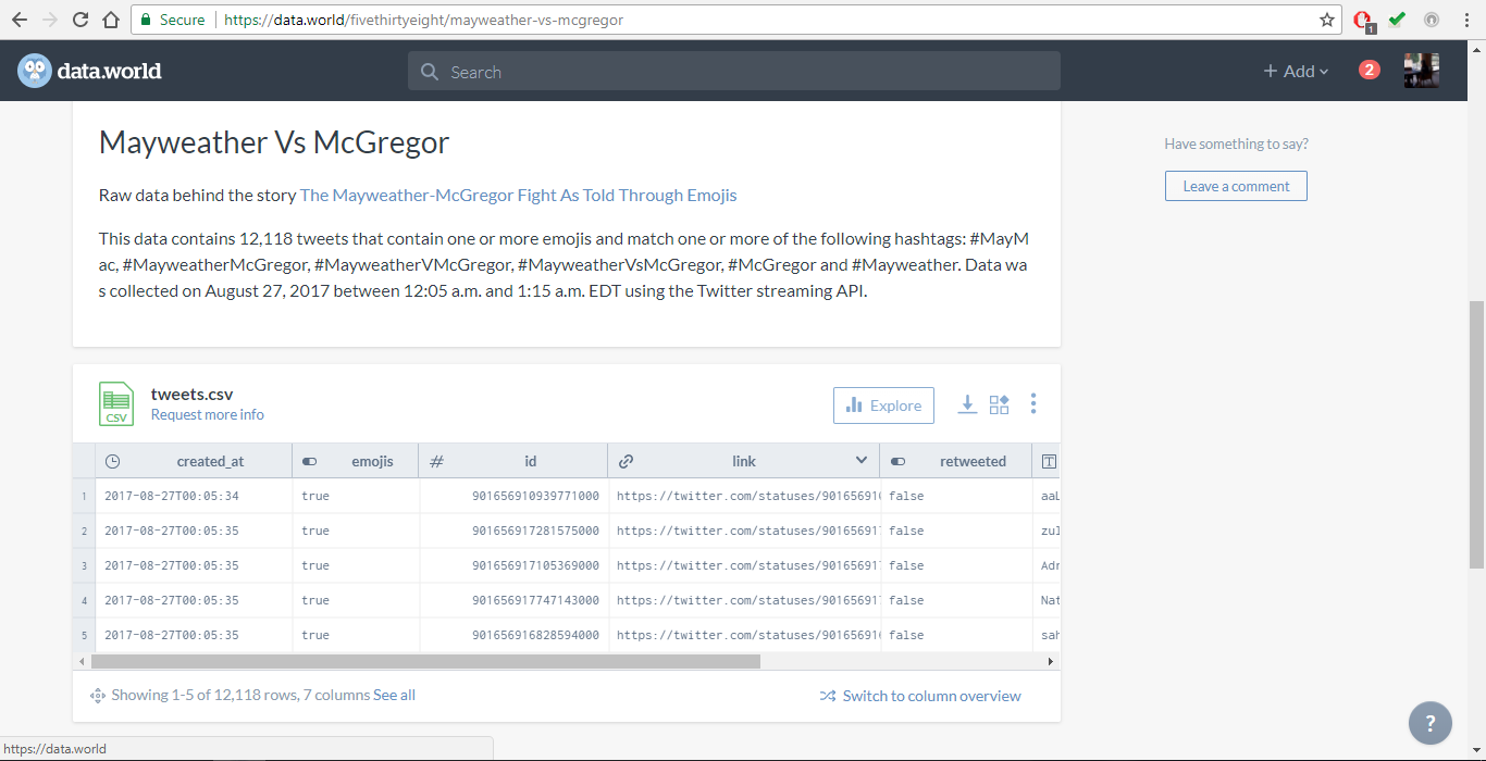
The data set I used for my report was from fivethirtyeight, Nate Silver’s data journalism website. It contained the data behind their story on the Twitter following of the Mayweather vs McGregor fight from last summer.
A full explanation of the context for this data set can be found here on their data.world page.
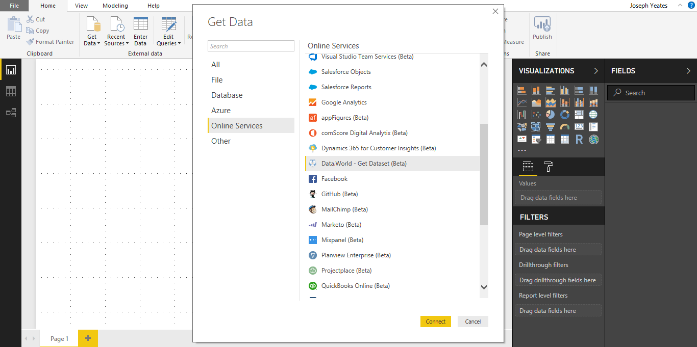
To connect to this source in Power BI, I navigated to Get Data from Online Services and selected Data.World. This option is about half way down the list.
You need to have a valid data.world account in order to connect to their data sets. I tried signing up using my GitHub account, which did not work (for whatever reason). I ended up signing up with my Twitter account.
After creating an account and logging in, it prompted me to enter the:
- Owner of the data set (fivethirtyeight)
- Dataset ID (mayweather-vs-mcgregor)
- Query to further specify the data returned (Optional argument)
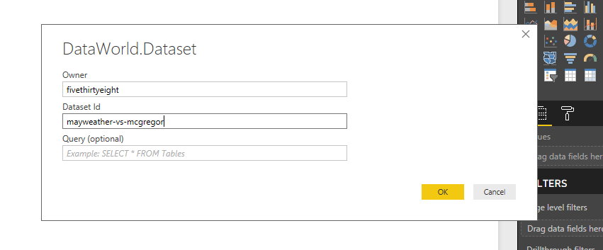
It looks like the Owner and Dataset Id correspond to the data.world url for the web page with the data set.
I clicked OK which loaded the Power Query editor.
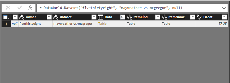
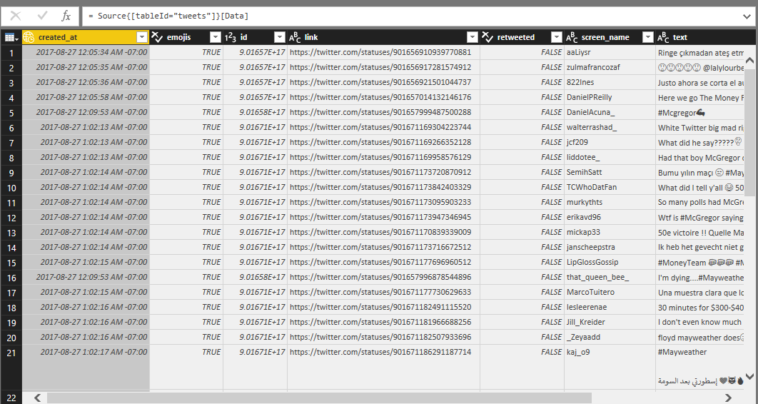
I drilled down on the Table in the Data column. This brought up the raw data.
This included the date and time the tweet went out, the link to the original tweet, the screen name of the twitter account the tweet came from and the body of the tweet itself.
The data was already fairly clean and well structured, so I only had to use a few applied steps to further shape it to how I wanted for the report.
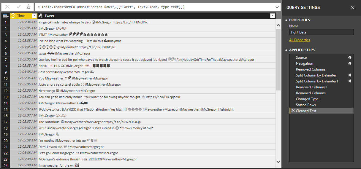
One of the applied steps I want to highlight is the last one: Cleaned Text. I cleaned the Tweet column to remove non-printing characters.
This was important as a number of the tweets included line breaks between the text and tags. The Text.Clean function eliminated these and resulted in a clean data set.
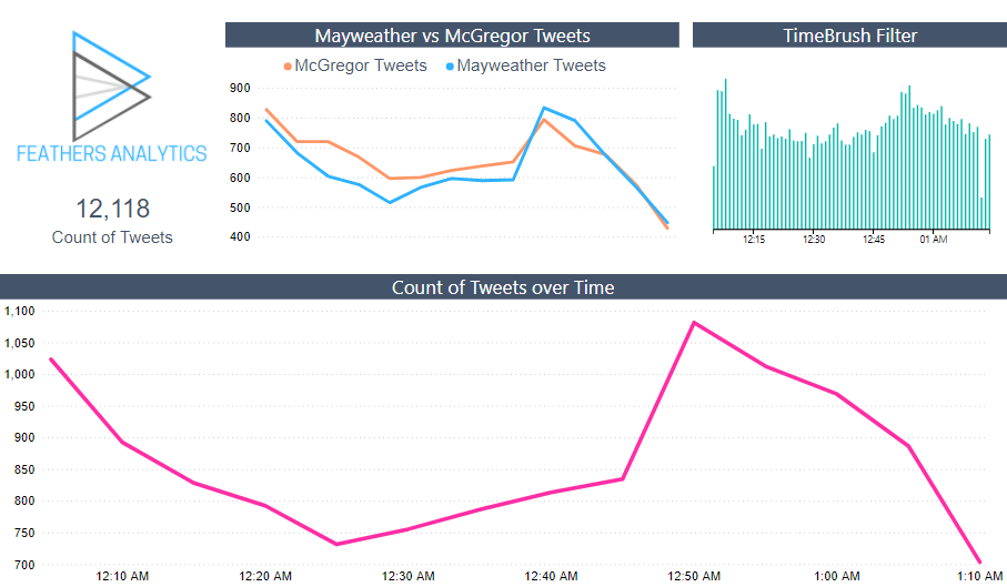
Now that the data was shaped properly for the report, I closed the Power Query editor and started building visuals.
I kept it straightforward with a Card visual, some Line charts and the TimeBrush custom visual.
That is how I created the report that I will use to demonstrate the new tooltip functionality next week! This is a powerful new feature that definitely has the “wow factor”, so be sure to check out my post next Thursday.
1 thought on “Power BI – Data World Connector”
Comments are closed.