Another entry in my series on Power BI Desktop monthly updates! I’m covering May this week and the new June features next week.
As always, I cover my favorite features from all of the updates. This month I selected two: New “From Web” connector in preview and the ability to set line width to zero in line charts.
New “From Web” connector – By example data extraction (preview)
The most important part and the part I always forget, without fail, is to turn the preview feature on!
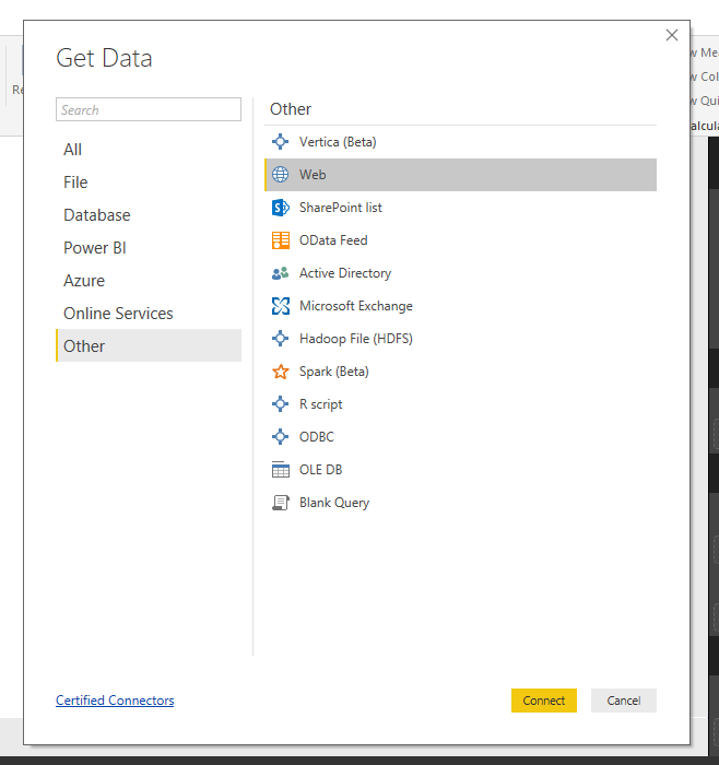
After I turned the feature on, I went to Get Data and selected from Web.
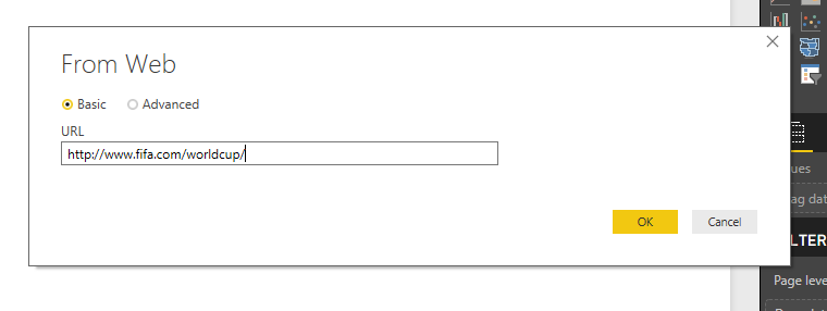
I entered the URL of the web page I wanted to get data from. In this case, it is the official website for the 2018 FIFA World Cup.
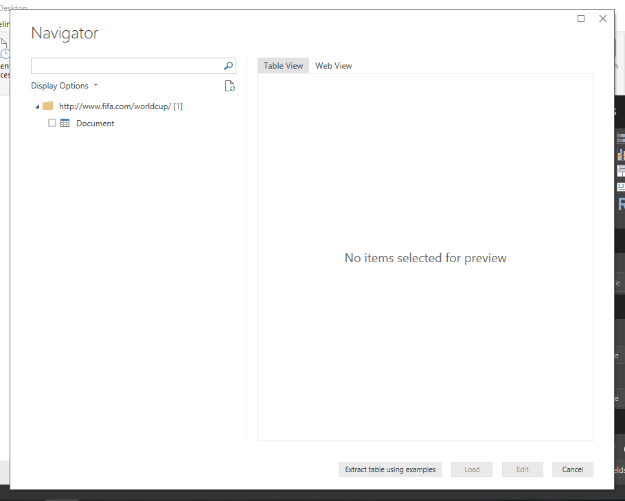
The experience so far has been business as usual. However, in the Navigator pane there is now the option to Extract table using examples.
This is located next to the Load and Edit options. Selecting the Extract table using examples option loads a preview of the web page.
Underneath the preview window, there is a blank table to start filling in examples. This is very similar to using Add Columns From Example in the Power Query editor.
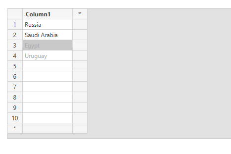
The data I wanted from the page was a list of the 32 countries competing in the World Cup this summer.
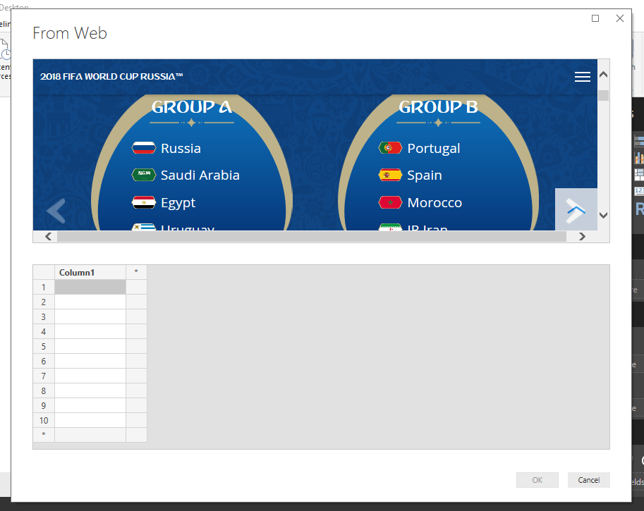
To achieve this, I started typing in the countries. I began with the teams in Group A.
After I had entered the first two teams, Russia and Saudi Arabia, the remaining two countries in the group, Egypt and Uruguay, were populated.
This was a good start, but I wanted all of the countries in the World Cup, not just Group A.
I entered the first country from Group B, Portugal, in row 5 of the table. This populated the rest of the table with all 32 countries.
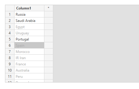
Now I had a list of all countries in the World Cup with only having to enter three of them. I can’t wait to see how this functionality continues to improve.
Line Stroke Width to Zero
One visualization that is a bit limited in Power BI is the combo chart. The only combination is a line and column chart together. However, this new feature provides some another formatting option to this chart type: the ability to set the line width to zero, creating a dot plot.
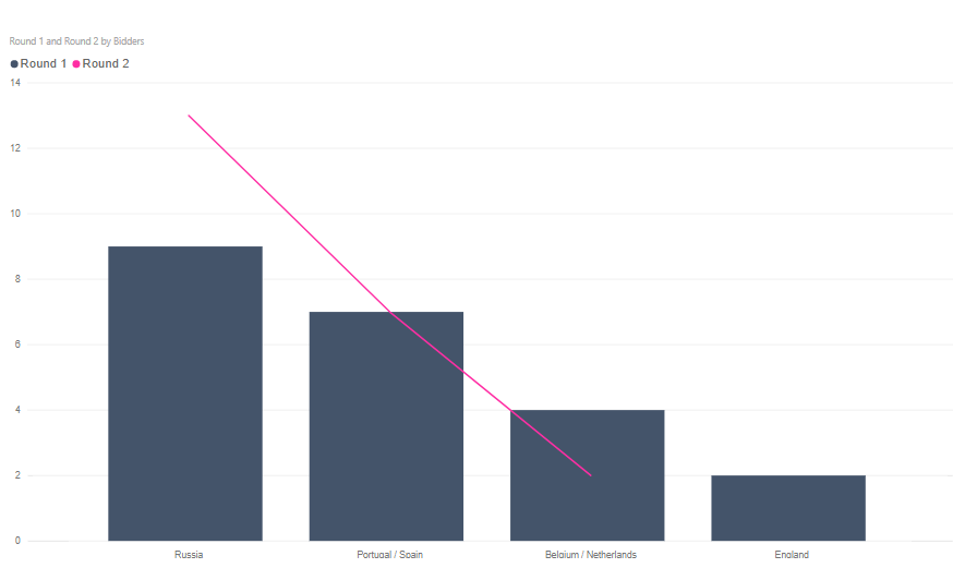
To demonstrate this feature, I started with some data on the countries who bid to host the 2018 World Cup. There were two rounds of votes. I wanted to plot the Round 1 votes along with the Round 2 votes.
I started with a combo chart with the default formatting.
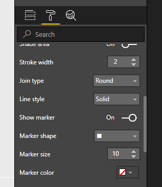
To change how the chart appears, I navigated to the Format tab on Visualizations pane.
By default, the stroke width for the line is set to 2 and Show marker is toggled off.
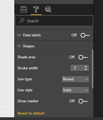
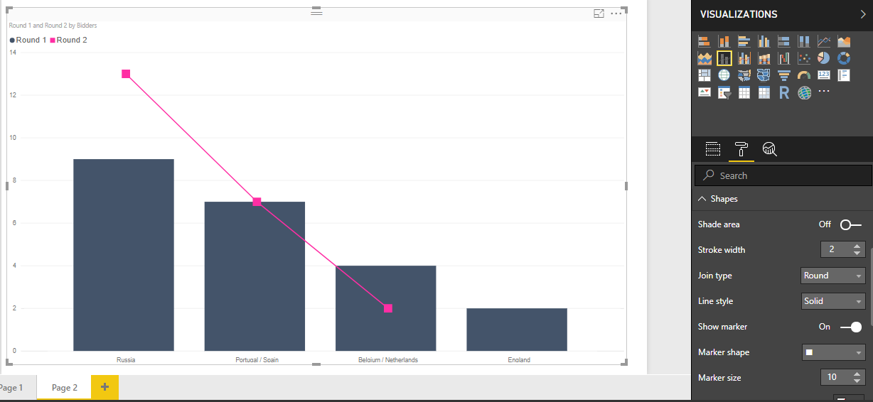
The first thing I did was toggle Show marker to On and increased the Marker size to 10.
This added large square markers along the axis points on the line chart.
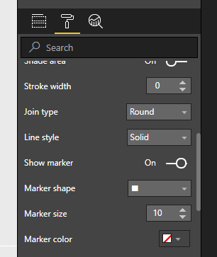
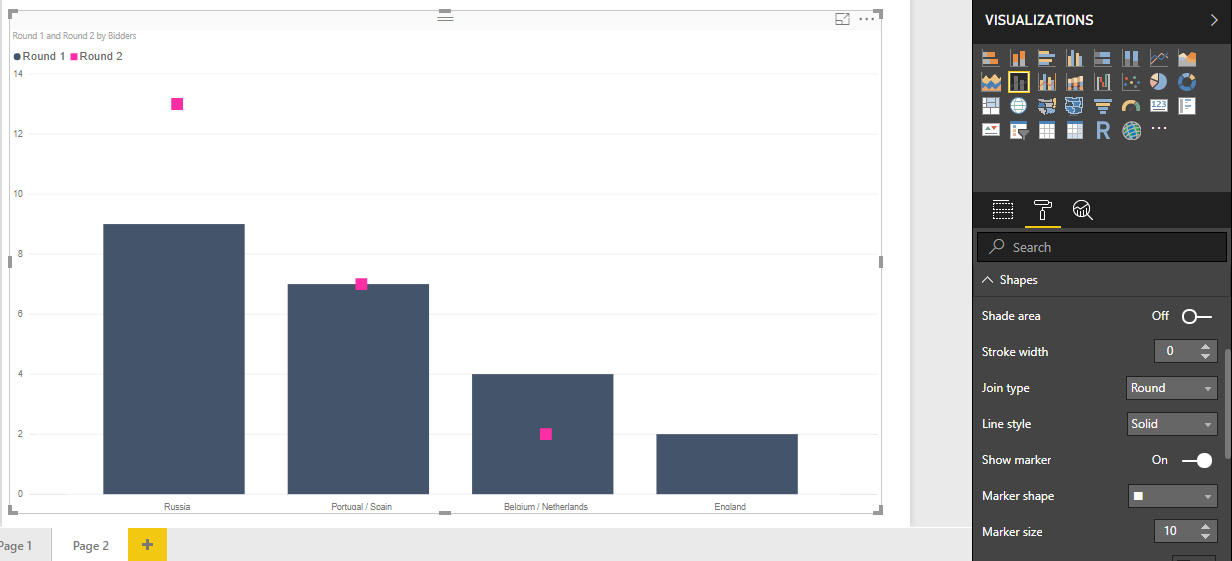
To eliminate the line and only leave the markers, I reduced the Stroke width to 0.
This resulted in the following visual:
I cleaned up some more formatting options for the chart, resulting in the final visual. A properly labeled chart plotting the two rounds of votes to host the 2018 World Cup.

Those were my two favorite features from the May 2018 update. Next week I’ll cover my favorite features from June! Then I’ll be back to my R Series, focusing on how to effectively bring R and Power BI together.