I’m starting off 2020 with a quick review of three of my favorite features that were part of my “What’s New in Power BI” presentation at the January 2020 Vancouver Power BI Meetup. The slides and example files from my session can be found here.
Setting a table column or matrix value as a custom URL
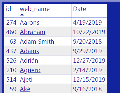
I have a data table in the report which contains three columns:
- player id
- player name
- date
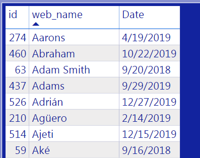
I want to be able to generate a web search of a particular player name directly from the table. Previously, I would have had to add an additional column to the table and format the column as a URL link.
We now have the ability to transform the player name column so that a user can click on a player name to spin off a web search for that player name!
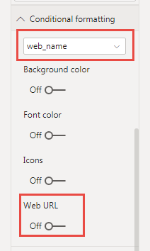
To do this, I selected the table visual and navigated to Format tab within the Visualizations pane. I went to the Conditional formatting section and selected the column in the table that I wanted to format. Then I toggled on the Web URL option.
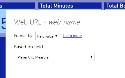
Toggling the Web URL option to on generates the Web URL pane. I was prompted to select the field the Web URL will be based on. I had created a DAX measure, Player URL Measure, for this very purpose.
This conditional formatting changes the table visual. I can now select a web search without needing to add an additional column!
Customize current theme (preview)
The second feature I liked is the ability to customize the theme applied on the report. This could potentially save a huge amount of time, as now we can make a few small tweaks to an existing theme rather than creating a custom theme completely from scratch.
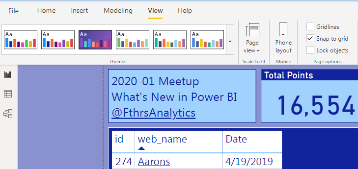
To customize the current theme, I navigated to the Themes section in the View tab on the ribbon.
I expanded the Themes section of the View tab to see all of the themes and option available. I navigated to the Customize current theme option near the bottom of the drop down menu.
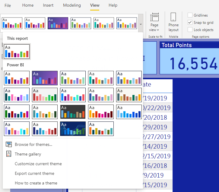
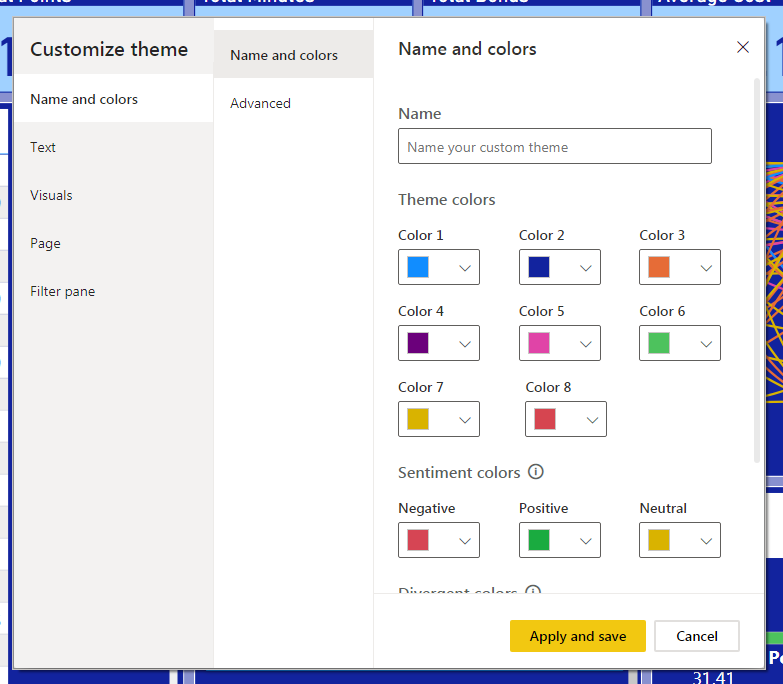
This provides the ability to customize the most common options of the theme currently applied to the report.
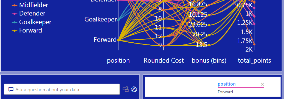
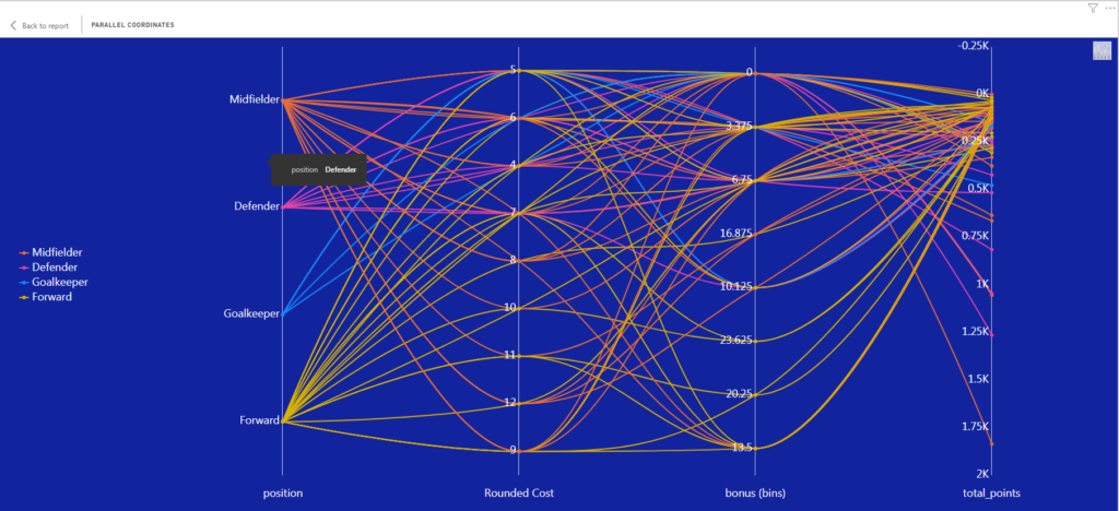
New xViz visuals – Parallel Coordinates
The parallel coordinates visual is used to plot multiple columns of numerical data. It provides the ability to quickly analyze the relationships between a number of different variables in the same visual.
I’m still playing around with this visual, but I can see it being useful when comparing a category across multiple measures that have a low cardinality. Particularly if the measures are part of a sequence, such as a sales pipeline or order fulfillment process.
Those are three of my favorite features from the December 2019 Power BI release! These three and many more will be part of my presentation on “What’s New in Power BI” at the January 2020 Vancouver Power BI user group!