The new Premier League season is just around the corner.. For myself, and many others, this does not just mean early mornings but a new fantasy football season! The league can get quite competitive and I am always looking for an advantage that can bring me bragging rights come the end of May. What better way to gain an advantage than by diving into the numbers and doing some analysis!
There will be a series of posts on this topic. I will begin with exploratory analysis achieved through data visualization in RStudio with Tidyverse packages. So, onto visualization! The primary focus of my analysis is the points scored by players, as it is the most important aspect of fantasy football.
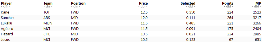
My data set was pulled at the beginning of August. It includes the price of players at the beginning of this season and some basic statistics from last season. After importing and inspecting the data, it is evident there was some quick cleaning to do. Fortunately, this only consisted of dropping some variables.
data <- select(raw_data, Player, Team, Position, Price, Selected, Points, MP)
head(data)
Now my data set is nice and clean and ready to visualize. As I mentioned, points are the primary focus of my analysis. Therefore, my initial visual was a simple histogram to see the distribution of points.
ggplot(data, aes(Points)) +

geom_histogram(binwidth = 10) +

ggtitle("Points Histogram")
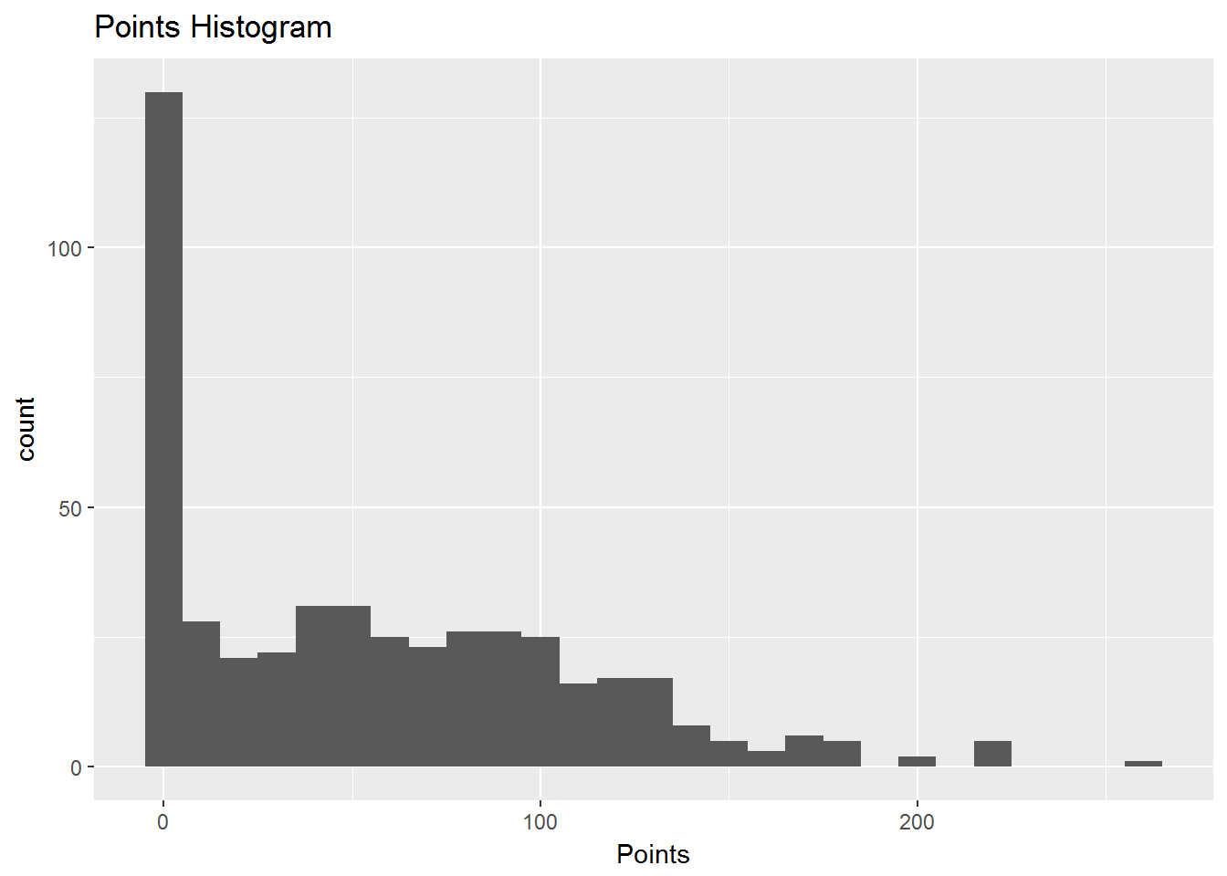
The first insight that jumped out to me is that there are a lot of zero values. Why are there so many? There are over 125 players with no score from the previous season. I went back to the data set to look at these players with no score. This was easy to achieve with the dplyr package.
data %>%

filter(Points == 0) %>%

select(Player, Position, Team, Price) %>%

arrange(desc(Price))
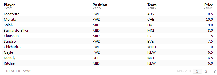
Upon first glance I identified that these players with no score are all new to the league. They were either promoted from the Championship or were new signings this summer. I will demonstrate how I handled these players in the next post in the series; however, I filtered these players out for now.
returning_players <- filter(data, Points != 0)
Having looked at the distribution of points across all players, I wanted to analyze the relationship between points and the other variables in my data set. The first variable I analyzed was position. Specifically, I wanted to see if and how position impacted the points scored by players. I visualized this relationship with a box plot or a box and whisker plot. This allowed me to quickly see variability of points for the four positions.
ggplot(returning_players, aes(Position, Points)) +

geom_boxplot() +

ggtitle("Returning Players Boxplot")
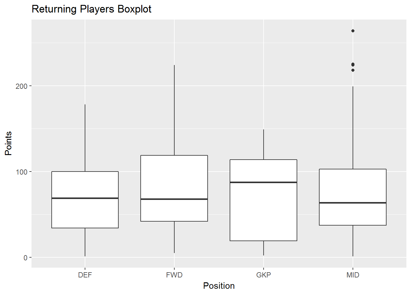
This simple visualization reveals some quick insights. The position with the highest median points is goalkeeper. The other three positions have comparable medians. The box plots for both forwards and midfielders are positively skewed, meaning there is a wider range of higher scores above the median than below the median. For example, when examining the box plot for forwards, the median points value is around 75. Half of the forwards scored between zero and 75 points and half scored between 75 and ~225 points. Compare this to the negatively skewed box plot of the goalkeepers. The median points value is around 90. Half of the goalkeepers scored between zero and 90 points and half scored between 90 and 150 points. This indicates that the highest scoring forwards have output much higher than the median, while the highest scoring goalkeepers have output much closer to the median. Midfield is the only position that has several outliers, indicating that some players score larger than Q3 by at least 1.5 times the IQR.
With these insights in mind, I revisited the original histogram. This time I also included position in the histogram.
ggplot(returning_players, aes(Points, fill = Position)) +

geom_histogram(binwidth = 10) +

ggtitle("Returning Players Points Histogram")
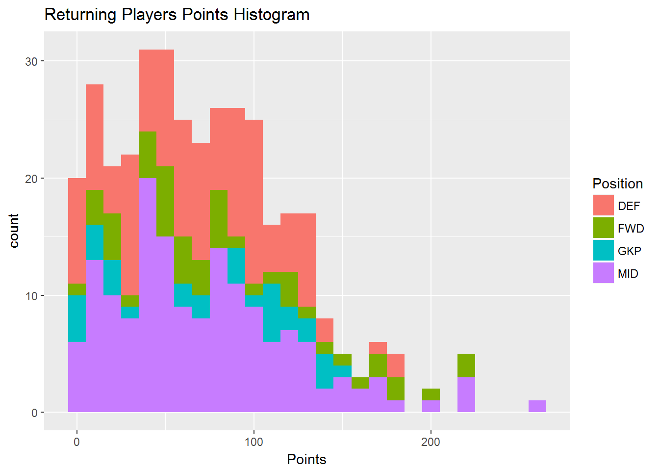
This reinforces the insights from the box plot. The positions with the highest points, to the furthest right, are all purple midfielders and green forwards. There also seems to be a cluster of blue goalkeepers around 90 points. There is some blue to the right of this cluster and a lot to the left. Again, this is consistent with the negative skewed box plot for this position.
Another variable to consider when analyzing points is price. I typically assume the market is efficient in pricing players and there should therefore be a strong relationship between price and points. However, it is always best to investigate. I plotted price against points as well as the linear relationship between the two.
data %>%

filter(Points != 0) %>%

group_by(Points, Price) %>%

summarise(NumPlayers = n()) %>%

ungroup() %>%

ggplot(aes(Price, Points)) +

geom_point(aes(size = NumPlayers), position = "jitter") +

geom_smooth(method = lm, se = FALSE) +

ggtitle("Points vs Price Scatterplot")
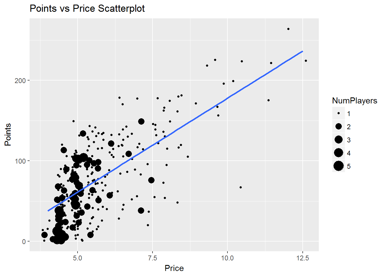
There is a strong, positive relationship between price and points. Most players are clustered around £5.0 points and between zero and 100 points. I assumed that the players to the top of the visual are midfielders and forwards, as seen in the previous box plot and histogram. I was also interested in seeing which players were to the top left of the visual: those with high points output for a lower price. To analyze this I created another scatter plot, this time differentiating players by position.
data %>%

filter(Points != 0) %>%

group_by(Points, Position, Price) %>%

summarise(NumPlayers = n()) %>%

ungroup() %>%

ggplot(aes(Price, Points)) +

geom_point(aes(size = NumPlayers, color = Position), position = "jitter") +

ggtitle("Points vs Price Scatterplot with Positions")
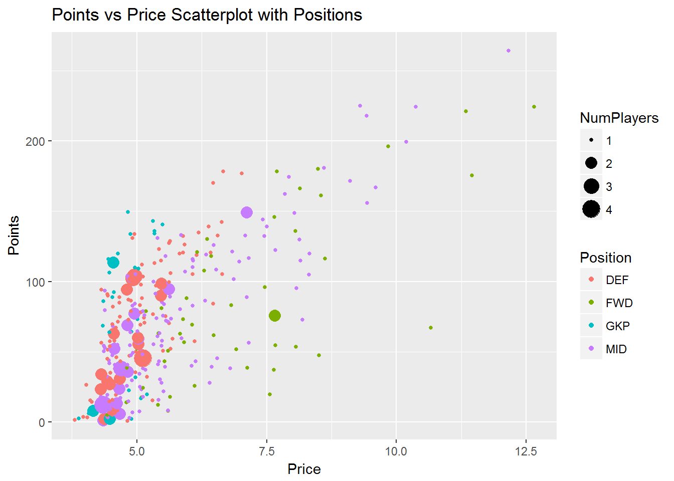
As seen earlier, the high scoring players are almost exclusively forwards and midfielders. However, those players toward the top left are goalkeepers and defenders. This indicates the top scorers in these positions are better value than forwards and midfielders, who are priced higher for the same points scored. Forwards are consistently priced the highest of all positions for each level of points scored. After this initial analysis of the scatter plot, one trick I like to do is plot lines over top of the visual. This allows for an easier comparison across both price and points axes.
data %>%

filter(Points != 0) %>%

group_by(Points, Position, Price) %>%

summarise(NumPlayers = n()) %>%

ungroup() %>%

ggplot(aes(Price, Points, color = Position)) +

geom_point(aes(size = NumPlayers), position = "jitter") +

geom_hline(yintercept = c(200, 150, 100, 50)) +

geom_vline(xintercept = c(5.5,7)) +

ggtitle("Points vs Price Scatterplot with Grid Lines")
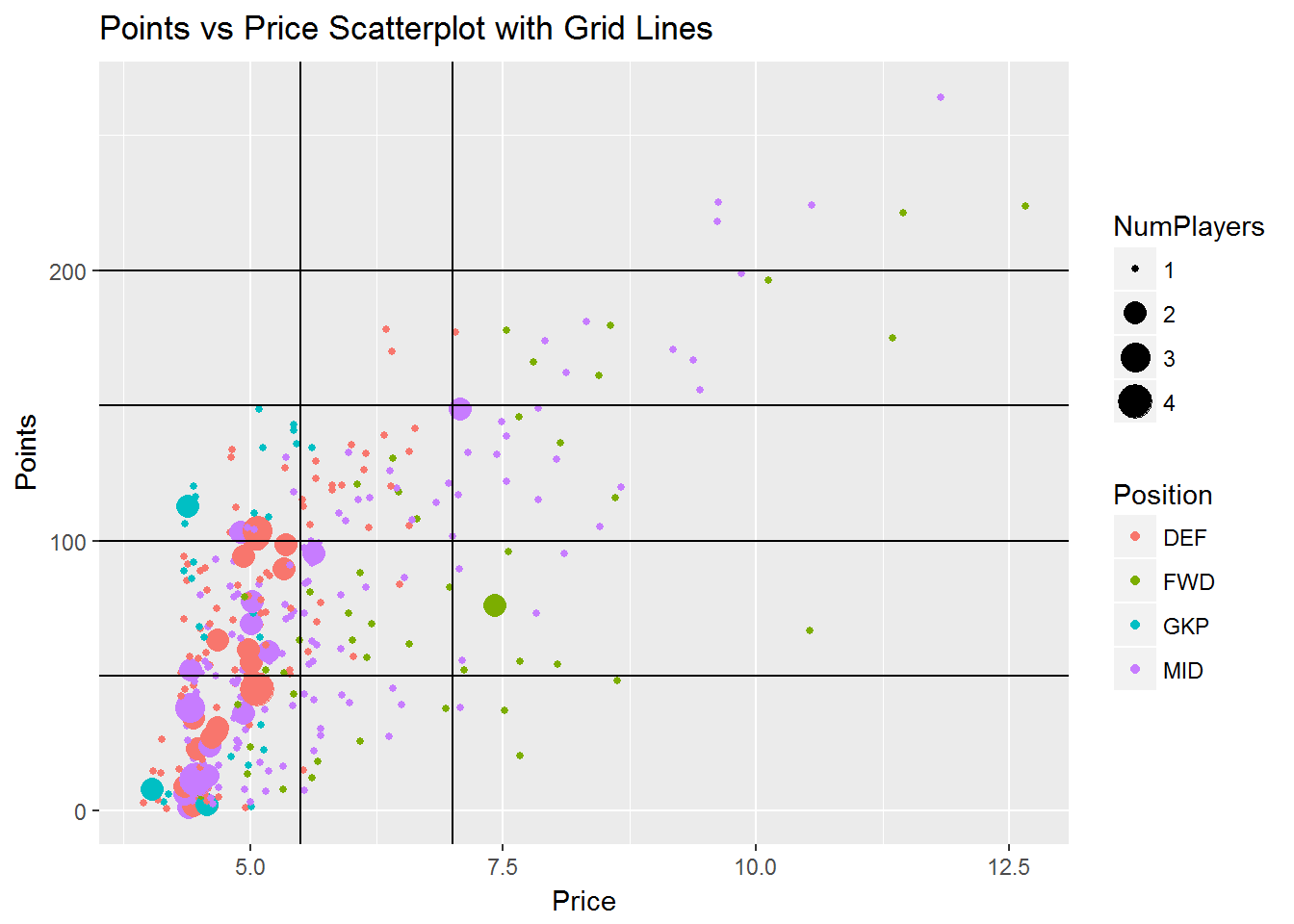
With the grid lines, every player now falls into one of roughly ten segments. The segment at the top right of the grid contains the players with the highest points scored with over 200 points. These players seem to be priced appropriately at £9.0 or higher. It looks a worthwhile investment, because there are several players priced in a similar range, in the segments immediately below this group, with lower points scored.
Midfielders and forwards also dominated the 150-200 points tier. However, the three defenders in this tier were clearly the best value for money as they were the only players priced at less than £7.5.
There are three segments of players who scored between 100 and 150 points. The low priced group at this output consist primarily of goalkeepers and defenders. The group to the right of the low priced group, priced higher for comparable points scored, consist primarily of defenders and midfielders. The group to the far right at this level of points consist exclusively of forwards and midfielders. Again, we can see that forwards are consistently priced the highest of all positions for each level of points scored.
There are six segments of players who scored less than 100 points. Most players in these segments range in price between £4.0 and £5.5 and are goalkeepers, defenders and midfielders. Overall, it is clear that the highest priced players do not always produce the highest output of points scored. But why is this the case? Why would the market price these players so high if they have not produced the expected points output? This leads to analyzing a third variable: minutes played.
Players need the opportunity to score points by playing in games and this is measured by minutes played. High priced players are expected to produce a high points output, assuming that they have the opportunity to do so. However, this is not always the case. The first looked at the distribution of minutes played with a histogram. I set the binwidth argument to 90, as that is how many minutes are in one game. This allowed me to see the equivalent of how many full games each player played.
ggplot(returning_players, aes(MP)) +

geom_histogram(binwidth = 90) +

ggtitle("Returning Players Minutes Played Histogram")
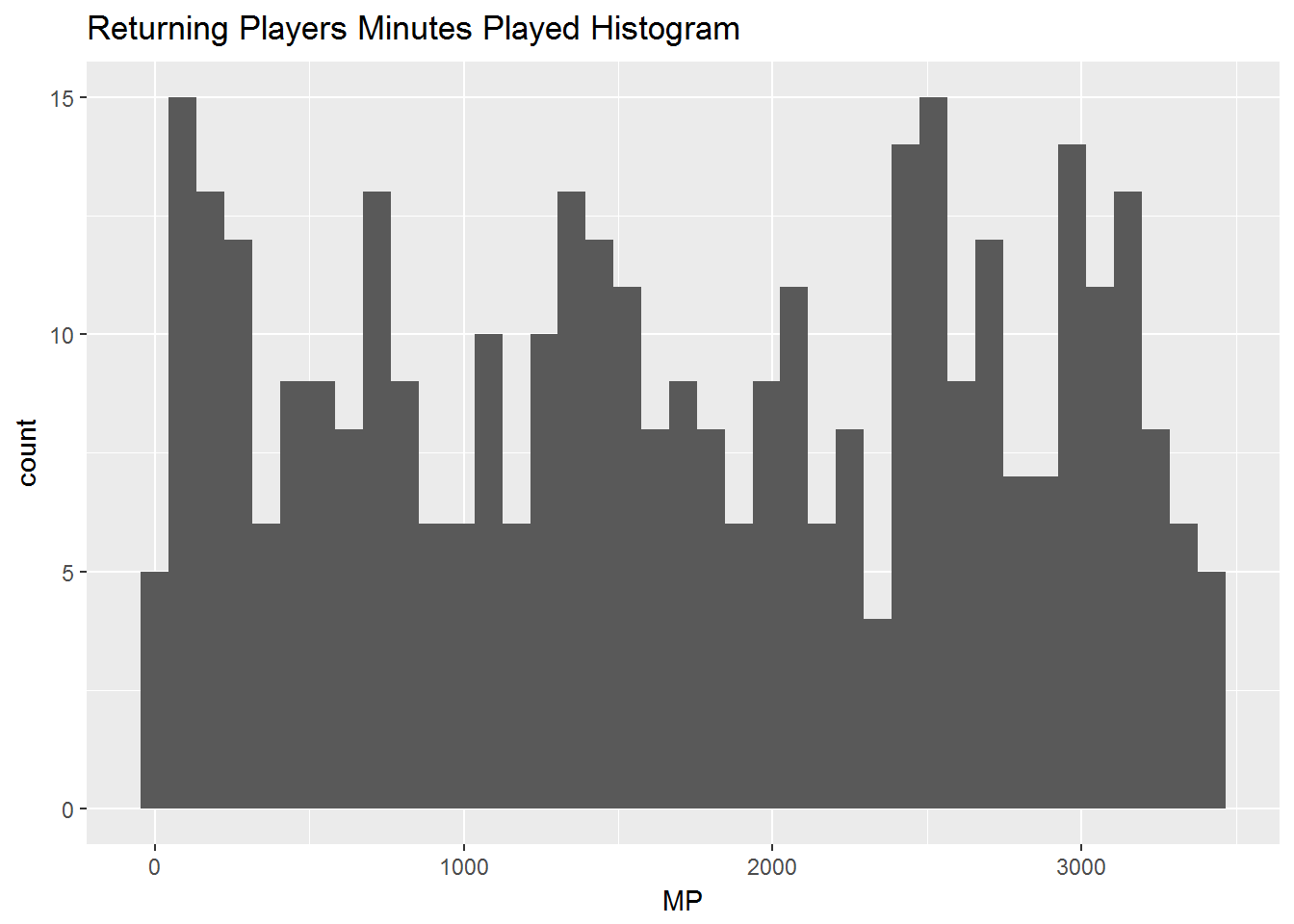
No clear insights jump out from the visual. There is high variability in the amount of minutes played across all players. The next step in my analysis was to look at the relationship between points and minutes played. Similar to my initial inspection of price, I plotted minutes played against points as well as the linear relationship between the two.
data %>%

filter(Points != 0) %>%

ggplot(aes(MP, Points)) +

geom_point(aes(color = Position), position = "jitter") +

geom_smooth(method = lm, se = FALSE) +

ggtitle("Points vs Minutes Played Scatterplot")
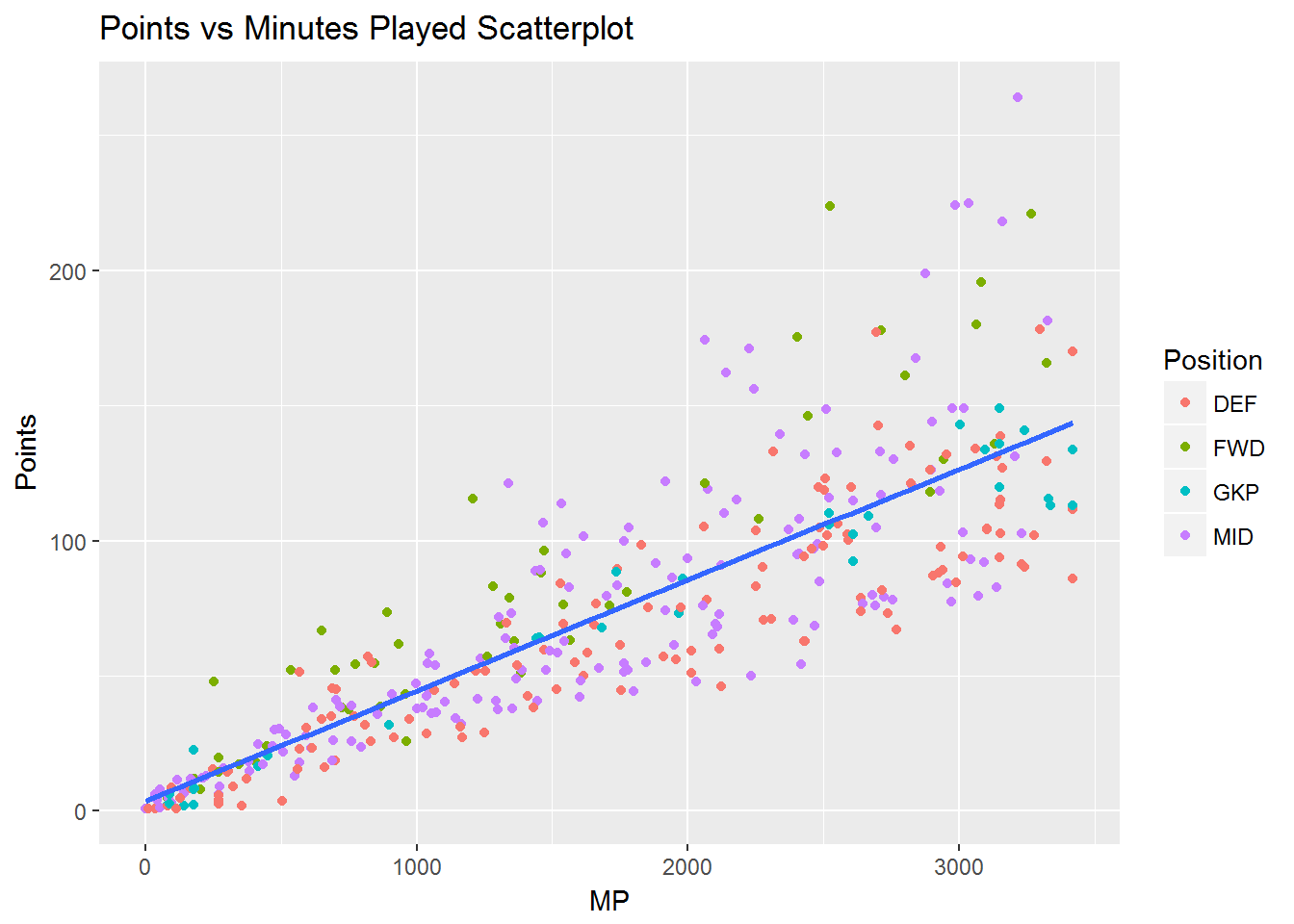
There is a strong, positive relationship between minutes played and points. The first insight that jumped out at me from the visual was forwards have a high points output across all minutes played. This helps explain why they are priced the highest for each level of points scored. Defenders have lower points scored across all minutes played. Again, this helps explain why they are priced lower for each level of points scored. Midfielders have a high variability of points across minutes played. This is probably due to the wide range of roles of players considered midfielders. Some midfielders are primarily defensive players and some are more attack minded. The scoring system in the game generally rewards attacking more favorably than defending, which would also explain why defenders score lower points than forwards given the same minutes played opportunity.
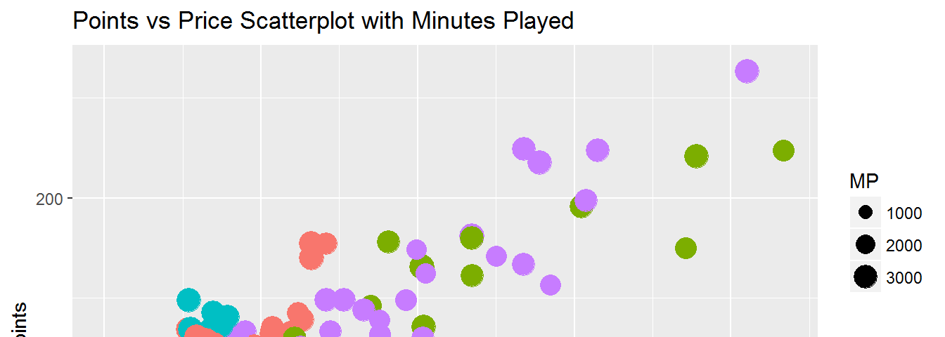
I saw that there are a high number of players who played an equivalent of four games or less from my minutes played histogram. Bringing this insight together with my previous analysis, I plotted points and price with color indicating position and size indicating minutes played.
data %>%

filter(Points != 0, MP > 360) %>%

ggplot(aes(Price, Points, color = Position)) +

geom_point(aes(size = MP), position = "jitter") +

ggtitle("Points vs Price Scatterplot with Minutes Played")
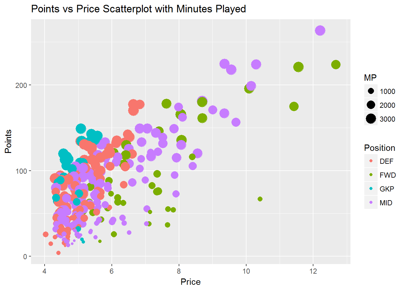
This adds some additional insights from our previous scatter plot. Lower scoring players have played fewer minutes. This is consistent across all positions and helps explain why some players are priced highly with lower points scored. Several goalkeepers have dropped out of our visual. This is probably due to the fact there is less player rotation at this position. Those who covered for injury or rotation likely played four games or less and were filtered out.
Those nine visuals were all part of my exploratory analysis of the data. It led to a greater understanding of the data, some insights and lots and lots of questions. In my next post, I will deal with some data manipulation and more visualization. Stay tuned for part two!
1 thought on “Premier League Fantasy Data Analysis in R”
Comments are closed.