I am very excited to cover a topic that brings together the two data tools I use the most: Power BI and R. Custom R visuals can be found in the Office Store to use in Power BI reports, but I prefer creating my own! This serves as a great learning tool to understand how best to use R to manipulate and plot my data to visualize exactly what I want.
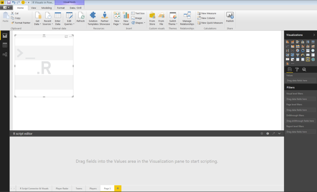
To build R visuals in Power BI, I used the R script visual found in the Visualizations pane. Selecting the R script visual opened the R script editor at the bottom of the page. The editor contains the message:
Drag fields into the Values area in the Visualization pane to start scripting.
Which is exactly what I did. The data set I used to create this visual was actually imported to Power BI using the R script data connector.
I proceeded to select fields for the Values area. I selected five fields: Player, Points, Price, MP and Position.
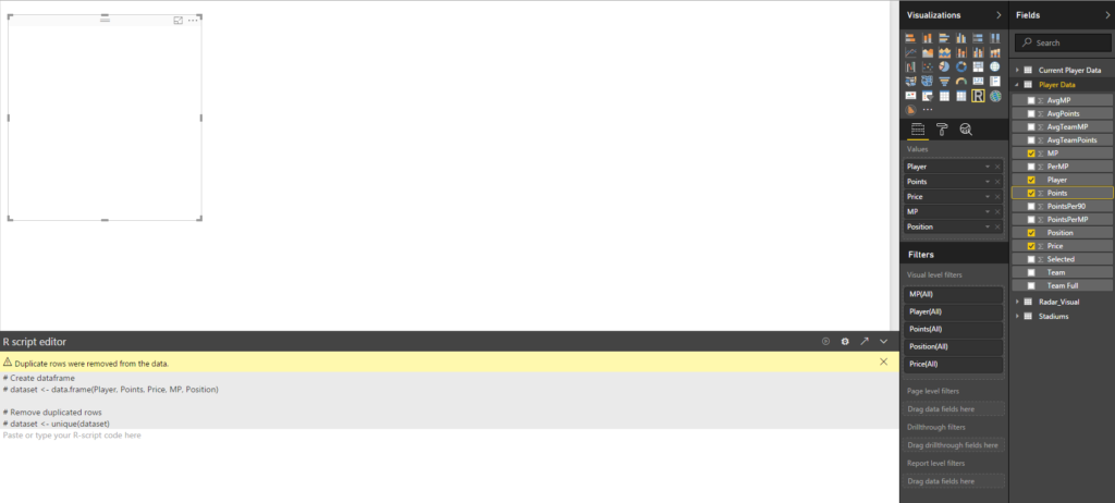
After dragging my fields into the pane, the script editor conveniently wrote the first few lines of R code for me. It defined the data set used for visual.
dataset <- data.frame(Player, Points, Price, MP, Position)
Read from left to right, this line of code can be interpreted as: create the object “dataset” which is defined as a data frame of the five variables.
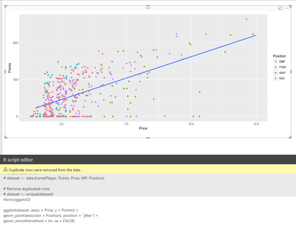
Now that the data set was defined, I began to write the R code to create a visual. I recreated a visual from one of my previous blog posts: Premier League Fantasy Data Analysis in R. It is a simple scatter plot with a line of best fit. The code to create the visual is as follows:
library(ggplot2)
ggplot(dataset, aes(x = Price, y = Points)) +
geom_point(aes(color = Position), position = "jitter") +
geom_smooth(method = lm, se = FALSE)
There is quite a bit going on in these four lines, so I will go through them one by one to analyze exactly what they are defining and how they contribute to creating the visual.
library(ggplot2)
The library function loads the package containing the functions needed to write the subsequent lines of code. I only need to load the ggplot2 package to create my visual.
ggplot(dataset, aes(x = Price, y = Points)) +
The ggplot function creates the visual. The first argument defines the data used in the visual, in this case the “dataset” data frame that was created in the R script editor. The second argument defines the mapping used in the visual. Defining the mapping aesthetics here ensures that they will be inherited in subsequent plot layers, unless they are explicitly defined by the layer mapping argument. I set the x-axis to Price and the y-axis to Points.
geom_point(aes(color = Position), position = "jitter") +
The geom_point function adds a scatter plot layer to the visual. It defines how the data will look in the plot area defined in the previous line. As mentioned in the previous section, each layer has their own aesthetic argument. In this case, I set only the color argument to Position.
The second argument defined in the geom_point function is position, which I set to “jitter”. This is useful because Price is a discrete variable: players can only have a price in increments of £0.5 million. Therefore, it is possible for overplotting to occur in the visual, with multiple data points plotted on top of one another. Jitter adds random noise to the data points, which separates these layered data points and can be helpful in reading and interpreting the visual.
geom_smooth(method = lm, se = FALSE)
A second geom layer, this time the geom_smooth. This function fits a line on our visual, which can help with interpretation of visuals with a lot of data points. I set the method argument to lm, or linear model. This results in a straight line plotted on the visual. The se, or standard error, argument defaults to true and displays a confidence interval around the fitted line. I did not need these confidence intervals for my visual, so I set this argument to false.
These four lines of code, as seen in the R script editor pane below the visual, resulted in this visual.
This is a basic example, as a similar visual could have been created using the Scatter chart visual and a Trend Line in Power BI. However, hopefully this simple visual has showcased the extent of the customization and control available when creating R visuals from scratch. I recreate this visual, as well as a few more not found in Power BI, during my “R Visuals in Power BI” presentation. As I mentioned, next week I will have a post covering another aspect of my presentation: the Power BI R script data connector.
3 thoughts on “R Visuals in Power BI”
Comments are closed.