This is a technique that I have used in reports that analyze a feature in a data set that is at the bottom of a hierarchy. For example, customer that belong to a larger customer segment or accounts that belong to a grouping. The report analyzes information for an individual customer or account; however, we want to bring in some comparisons for other customers or accounts that belong to the same segment, grouping or cluster.
Initial Report
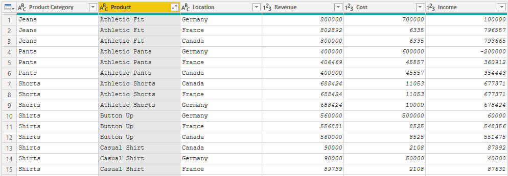
The report that I’ll use as an example in this post analyzes product information: sales revenue, cost and income by location. The underlying data model is a single table. There is sales information for each combination of product, product category and location.
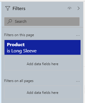
The report is controlled by a single filter, on the product field. It requires single selection, so only one product can be selected at a time.
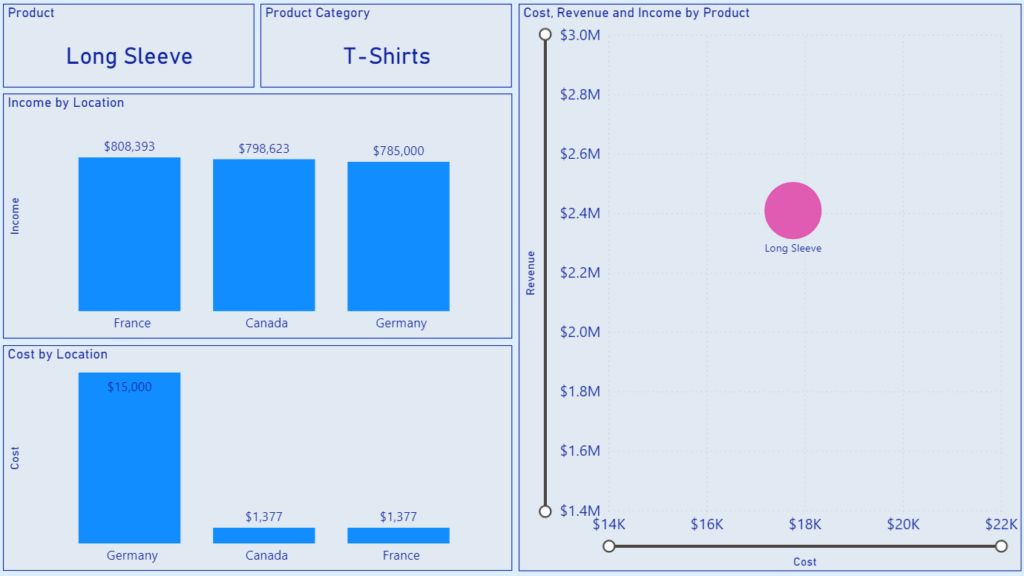
This filtering produces the following visuals in the report. The product and product category are displayed in the top left corner. There are two column charts underneath displaying income and cost by location. The final visual is a scatter chart on the right of the report. This visualizes revenue, cost and income by product.
The scatter chart visual is where we want to visualize all products within the product category of the selected product. The two card visuals and the two column charts should remained unchanged: only displaying the information of the selected product.
Create the Category Comparison
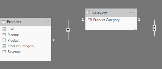
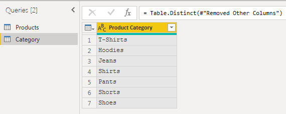
The basic recipe to create a user driven comparison of similar products is to create some additional dimensions in the data model. The first is a Category dimension. This is a table that contains each of the unique product categories found in the initial table.
This is the first step to create a star schema type of data model. We could create a similar location dimension and create a one-to-many relationship to the Products fact table, that contains the numeric sales information.
However, this in itself does not create the functionality that we’re looking for. Just filtering by product category in the new dimension table will returns all of the products that roll up to that product category. This will result in all the products being visualized in the scatter plot, but all of the revenue and cost information will also come into the column charts.
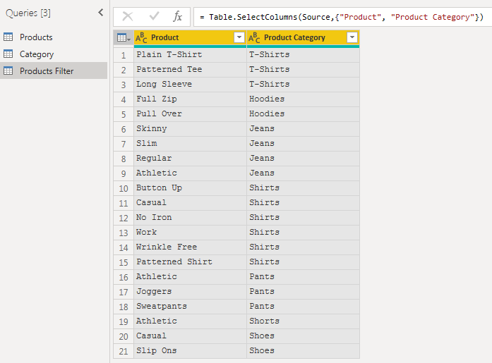
To create the filtering that we want, we need to create an extra dimension, the Filter dimension. This is a table that contains all combinations of products and product categories. This will be the key to our final enhanced report.
I loaded the three tables and created the following relationships between them. There is a one-to-many relationship between the Category dimension and both the Filter and Products tables.
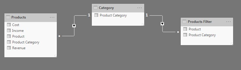
Right now, the Filter dimension can’t actually filter the products table. The arrow on the relationship between Category and Filter indicates that the Category table can filter the Filter table, but not the other way around.
To enable this, I double clicked on the arrow to open the Edit relationship pane. From the drop down under the Cross filter direction box, I selected Both.
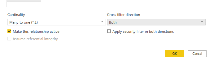
After I closed the pane, there is now a double sided arrow, which indicates that the Filter table can now filter the Category table and in turn, the Products table.
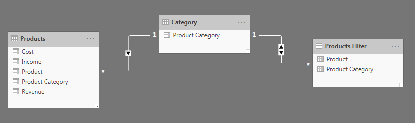
The Filter table is now connected to the Products table via the Category table with the Product Category field. This means that when we select an individual product from the Filter table, the product category associated with that product filters the Category table. This Product Category then filters the Products table by Product Category once again.
However, there can be multiple products that roll up to this category! That is how we can return multiple products from the same category by filtering down to an individual product in the Filter table!
We are very close, but not quite there yet! Once again, filtering by just the product category in the Filter table will returns all of the products that roll up to that product category. This will result in all the products being visualized in the scatter plot, but all of the revenue and cost information will also come into the column charts.
There are two ways to complete the pattern. One is to expand the data model and the second is to create a more advanced DAX measure. I will cover both in Part 2!
2 thoughts on “Filter by Cluster in Power BI – Part 1”
Comments are closed.