The analytics pane in Power BI is tool that can enhance report visuals. A user can select a variety of reference lines to add context to a report.
I will cover four line types that can be added to certain visuals:
- Trend
- Constant
- Average
- Forecast
The processes for adding these lines are all similar, but each are unique in the value they can bring to a visual.
The documentation for adding and formatting reference lines from the analytics pane can be found here.
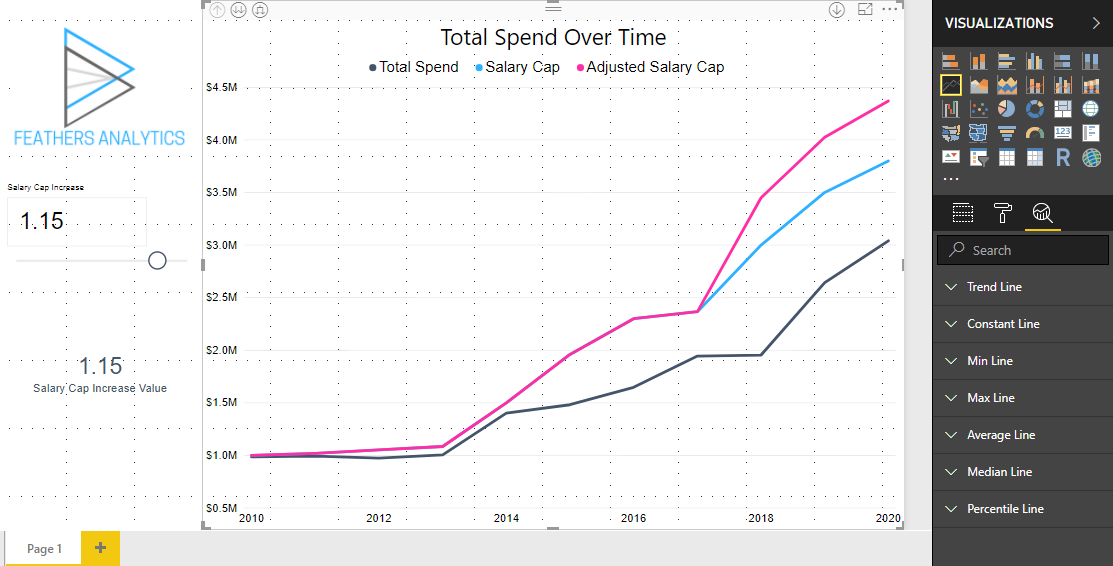
Analytics Pane
The analytics pane tab is located in the Visualizations pane to the right of the report canvas. The Analytics icon is the magnifying glass next to the Fields and Format tabs.
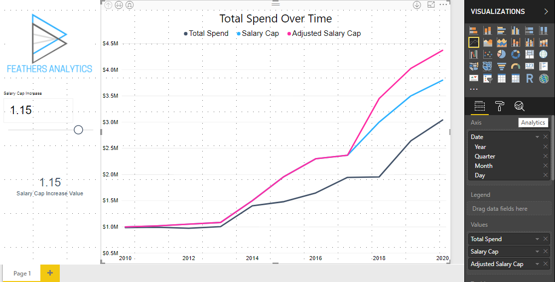
Selecting the analytics pane brings up a list of the different line types available to add to a visual.
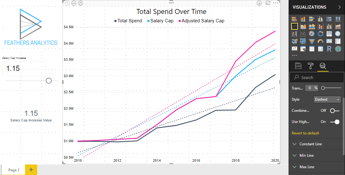
Trend Line
A trend line can help visualize the overall trend over a series of data points. This is helpful if there are multiple data points on a visual or lots of variability.
I added a trend line to the line chart from the report found in my What If Parameter post from last week.
This demonstrates that the trend for salary cap and spend is increasing at a rate of about $500,000 a year.
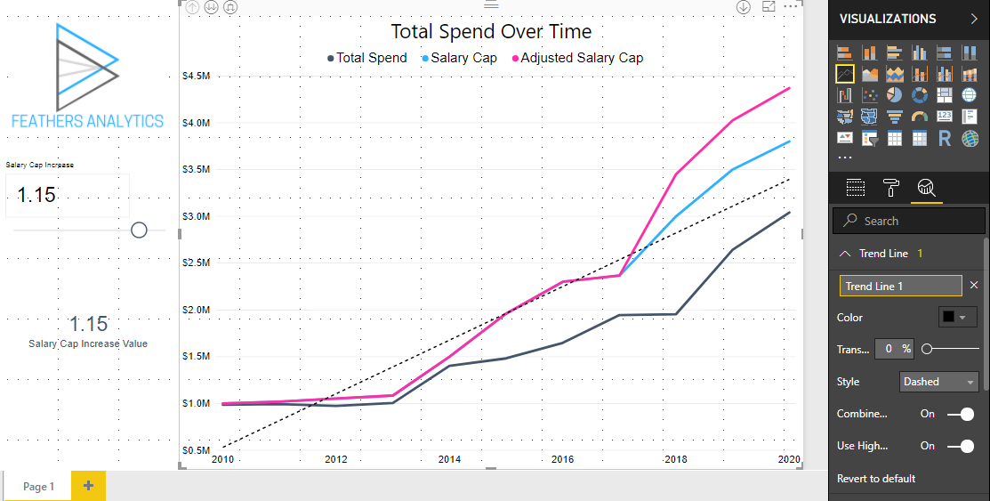
One of the formatting options for a trend line that I really like is the ability to toggle combine series. This provides the ability to plot one trend line on a visual for multiple series, as demonstrated above, or for each individual line in a series.
This helps provide the insight that the salary cap is growing faster than the spend.
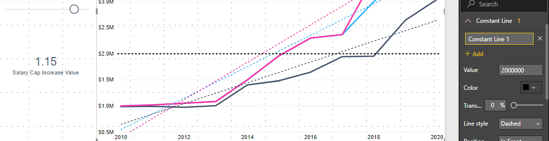
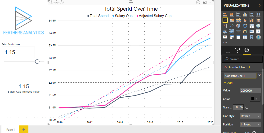
Constant Line
A constant line plots a line on a visual that provides a point of comparison to the data. For example, I wanted to show when the salary cap and spend went above $2 million.
This insight is much easier to see and interpret on a visual when a constant line at this point is plotted on the visual.
It is clear that the salary cap crossed this threshold in 2015, whereas spend only got to this point three years later.
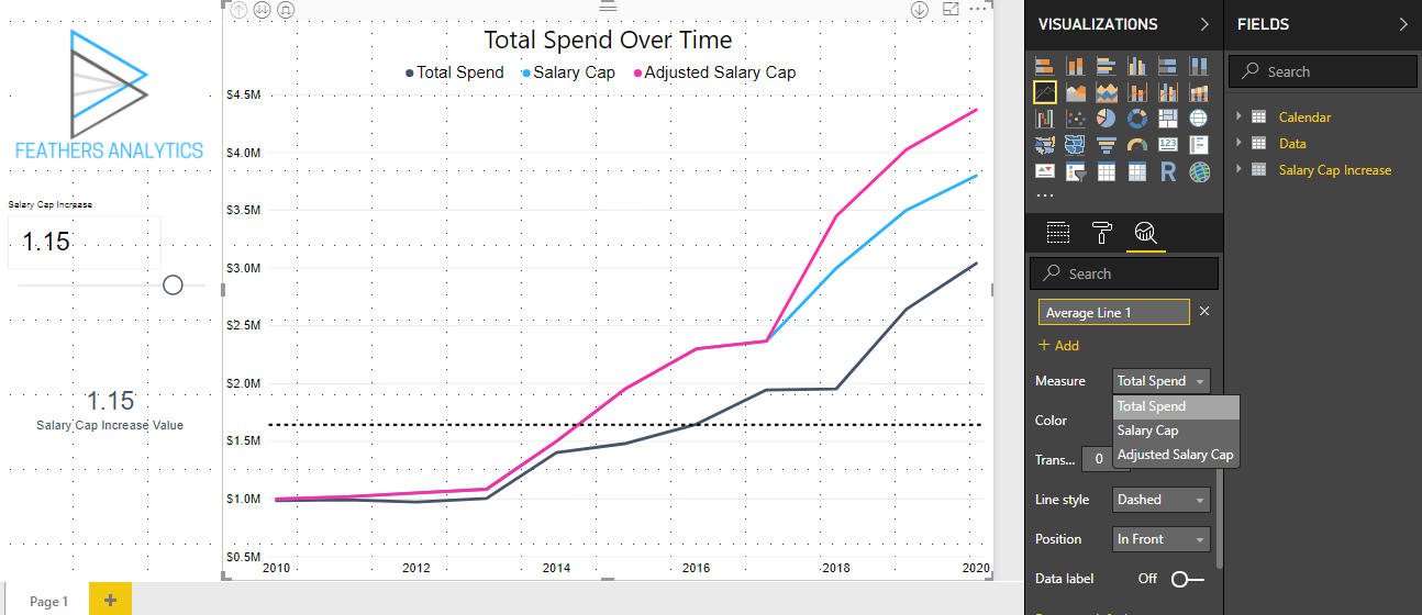
Average Line
An average line plots a line at the average for one series of data. The series on which the average is calculated is controlled with the drop down list selecting the Measure.
I plotted the average for total spend. Over the ten year period, the average spend (and projected spend) is about $1.6 million.
Forecasting
I think this is the coolest reference to add to visuals, especially when dealing with time series data.
A forecast line projects future data points based on the data plotted in the visual. Forecasting can only be applied to one series of data in a visual.
There are four options to customize in calculating the forecast.
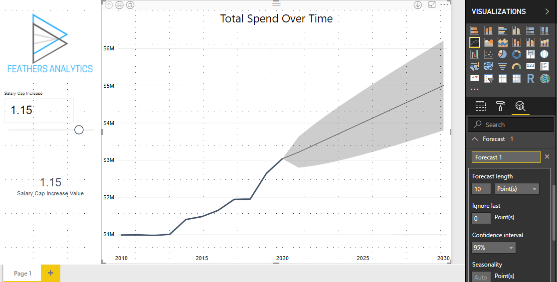
Forecast Length
The length of time into the future for the forecast. The units and number of units into the future can both be customized.
After I added a forecast line, the default (I believe) is ten points into the future. I changed the units to years and the number of years to five.
Ignore Last
This controls at what point the forecast should start. This can be useful if you do not want recent data points to be incorporated into the forecast calculation.
The spend line in the visual already included a forecast three years into the future. I calculated the forecast ignoring these three years.
This results in a much more conservative forecast for spend, as it is based on data from 2017 and earlier.
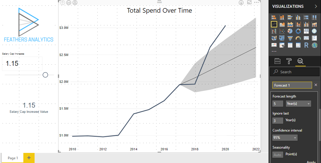
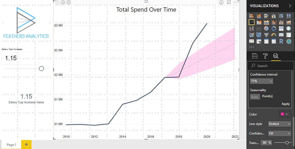
Confidence Interval
The confidence interval displays the boundaries of certainty for the forecast. The higher the confidence interval, the wider the bars will be to capture the variance of the projection.
This was initially set to 95%, which results in a wide range around the forecast. I lowered the confidence interval to 75%, which narrowed the bars because there is less certainty in the forecast.
Seasonality
The seasonality setting can help control the forecast for any cyclicity within the series. This could be useful for forecasting sales of winter equipment, which would presumably have higher sales in the winter months than summer months.
That is my take on the analytics pane in Power BI. It is a great way to enhance reports and provide additional context to the visuals.
It is something I have been trying to incorporate more and more into my reports to more clearly demonstrate the insights I am trying to communicate.