Binning and Grouping data in Power BI are two great features that assist with data exploration and visualization. These features make ad hoc analysis quick and easy. I will demonstrate how I used both in a recent report I created. The Power BI report I built visualizes one of my recent morning runs. One of the visuals I wanted to create for my report was a column chart depicting the time duration of each kilometer of my run. Binning and Grouping helped me achieve this analysis and led to interesting insights from my data.
Binning
Binning is used to segment large ranges of data into smaller groups. This allows for easier analysis and visualization. My data set has a field of distance traveled, defined in meters, as well as a field that calculates the time duration of each record of data.
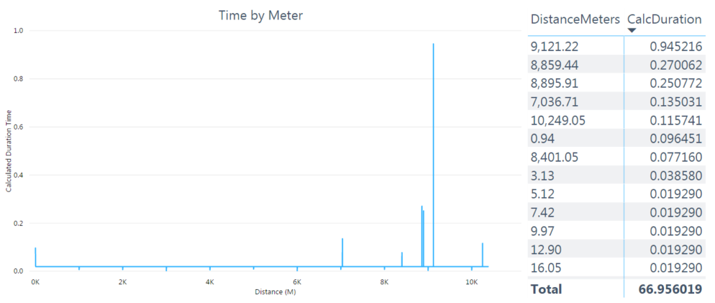
After I plotted the data into a column chart, I decided that meter was too granular a level of distance to meaningfully visualize my data. I created a new field, DistanceKM, to aggregate these records into kilometers and make them a bit easier to work with.
= Table.AddColumn(#"Removed Top Rows", "DistanceKM", each [DistanceMeters] / 1000)
I inserted the new kilometer field into the existing visual, replacing the meters field.
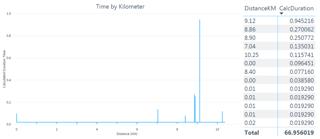
Now it was time for binning! As shown in rows 9-12 in the table visual above, each kilometer, rounded to the nearest ten meters, had multiple records. I wanted to bin my data into the nearest kilometer, summing the time from these multiple records to get the duration spent running in each kilometer. To bin my data, I right-clicked the DistanceKM field in the field pane and selected New Group from the menu.
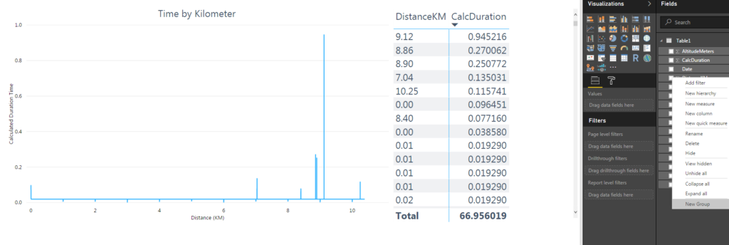
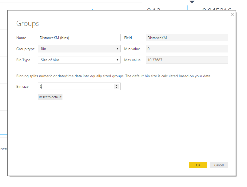
This brought up the Groups pane. A few things happened automatically. The minimum and maximum values of the field were recognized. The Bin type was set to Size of bins by default, with a bin size of 0.3347 because the default number of bins is 31. (Does anyone know why this is the default..?)
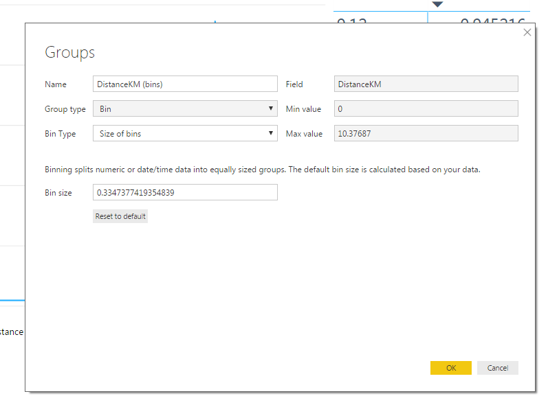
The only change I made was to change the Bin size to 1 so I had one bin for each kilometer. I selected OK and exited the Group pane.
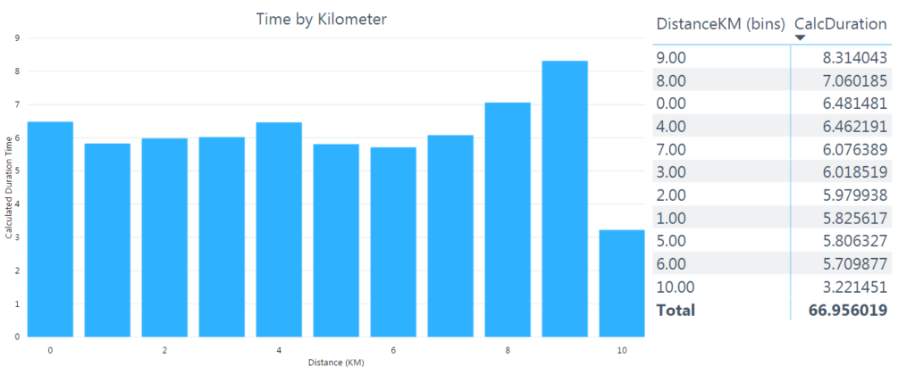
I changed the visual for a third time, inserting the new kilometer bin. The column chart was now much easier to read and interpret. The only thing I did not like was the bin labeling starting at zero. The labeling for each bin was defined as the distance of the minimum value of the bin, but I wanted the label to be the distance of the maximum value.
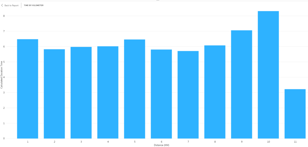
I created a custom column, KMDistance, that added one to the kilometer bin, giving me the maximum value. I used this new field as the axis for the column chart.

Grouping
Grouping is used to create combinations of data points. It makes it easy to combine similar items or isolate certain records in the data. To demonstrate the grouping functionality, I continued using the column chart built from binning my distance data that depicts the time duration of each kilometer of my run.
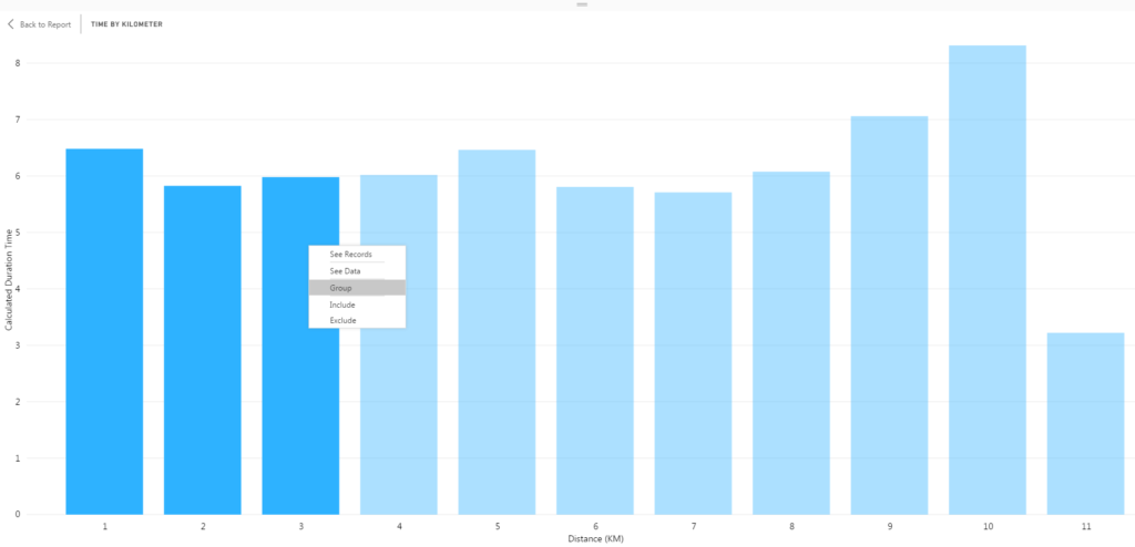
I wanted to group the data of my run into five sections. To accomplish this, I selected the first three columns and then right-clicked and selected Group from the menu.
I now had two groups in the visual: 1 & 2 & 3 and Other. Creating this group changed the color of the first three columns in the visual. The default naming convention of a group is a list of the data points included in the group (1 & 2 & 3) and Other for all remaining data points.
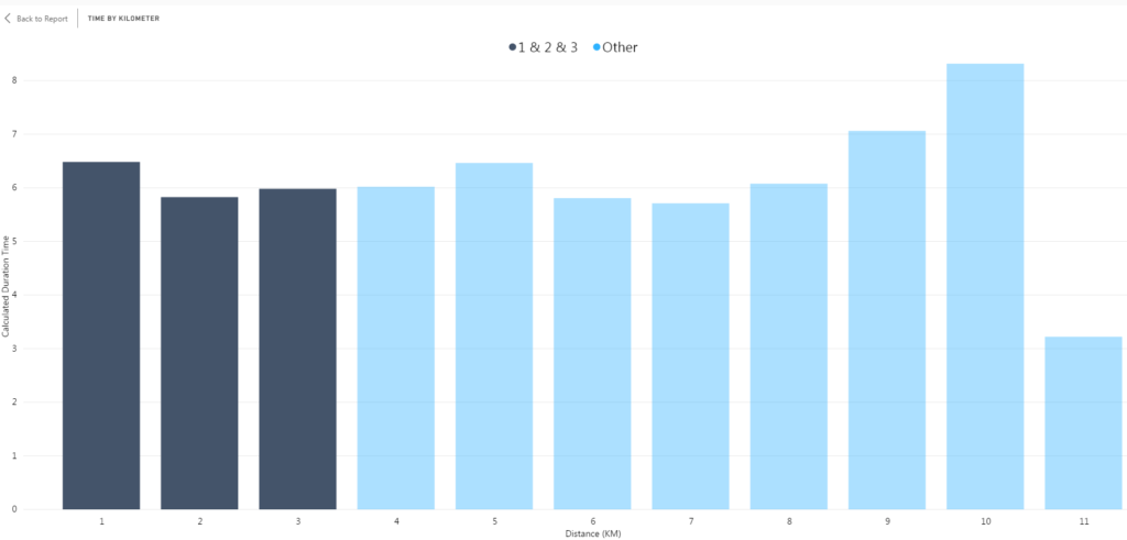
I repeated this process for the rest of the visual. Now my column chart had five distinct groups for each section of my run. However, I did not like the default labeling of the groups as it did not add any meaningful information to my analysis or visualization.
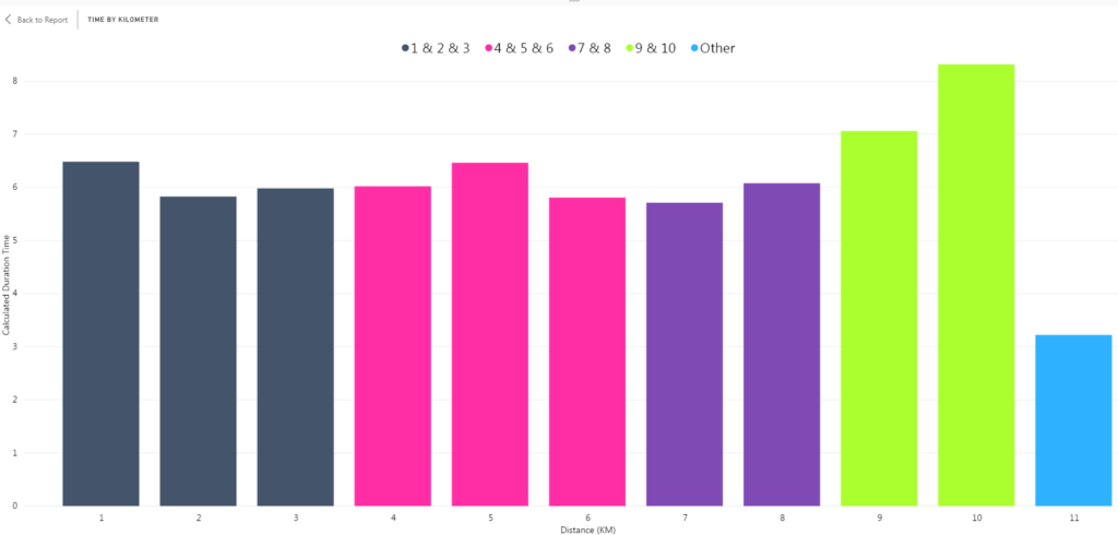
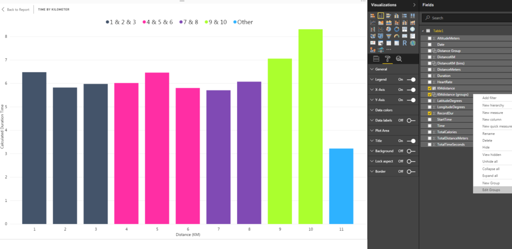
To change the labeling of the group, I right-clicked the KMDistance (groups) in the Fields pane and selected Edit Groups from the menu.
This brought up the Groups pane that we saw earlier when binning the data. This time, Group type was set to List instead of Bin. The Ungrouped values list contains all data points that were not defined as part of a group. These are included in the Other group. The Groups and members list contains all of the groups I have defined as well as the data points contained within the groups.
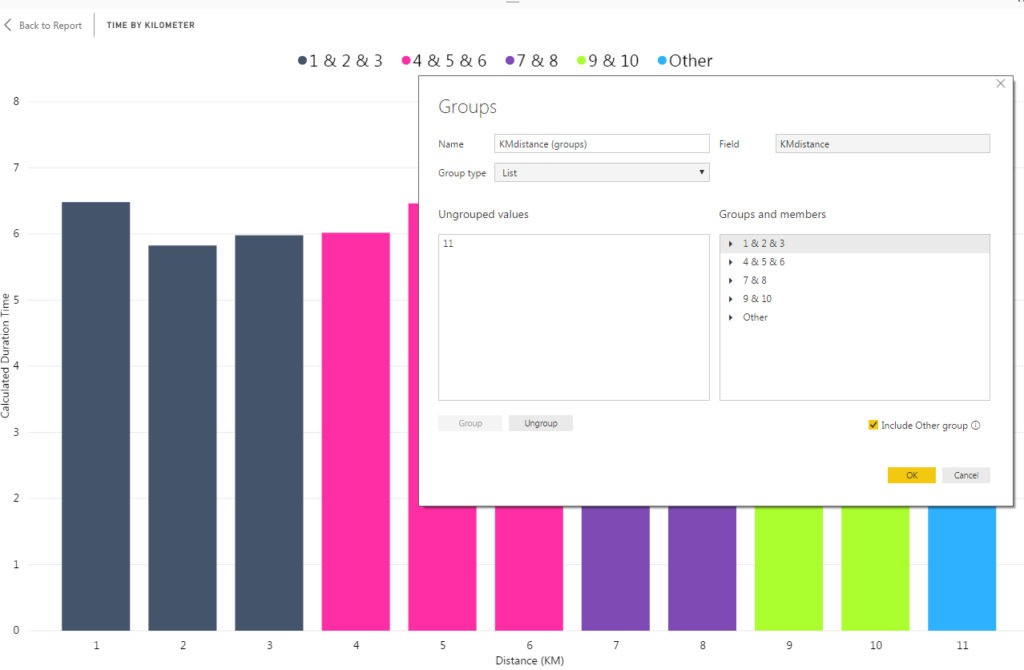
To change the labeling for my group names I double-clicked each item in the Groups and members list and renamed to something more meaningful.
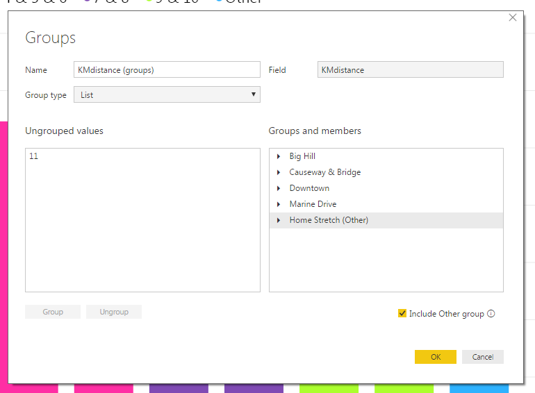
I selected OK and exited the Groups pane. Now the column chart has groups with descriptive labels.
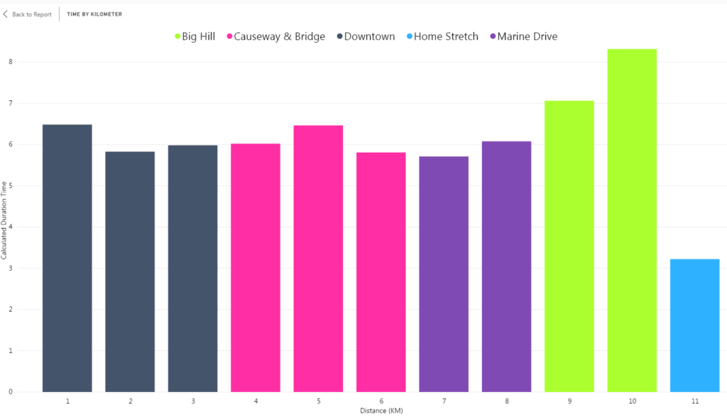
Binning and Grouping are helpful when working with continuous variables that have a wide range of values. As shown in this example, they can be used together to help transform a column chart with little meaning into a bold visual that is easier to analyze.

Great article Joseph!
Thanks Ken!
Great article Joseph! We set the default bin size based on Sturges’ Rule. It’s a general rule of thumb but works for most small-ish datasets.
Thank you for your response Will! I played around with binning variables in a few different data sets this morning and Sturges’ rule does provide a logical bin size as a starting point. Thanks for clarifying!
Running a blog now too? Well done, well explained
Thanks mate!