This blog post summarizes the presentation I gave last week at the Vancouver Power BI user group. The topic for the session this month was tips and tricks in Power BI. As I have discussed previously, and outlined in my presentation, Power BI is such a great tool because it can be used for all stages of the data journey.
The Power Query engine handles the ETL process to create and load the data model. DAX measures can be used to analyze the data in the model. Finally, the visualizations pane in the report view can be used to build visualizations of the data analysis.
With this in mind, I decided to present a tip (or tips) for each of these three stages. Some of these tips could better be described as best practices, but I feel that they added value to my presentation and supplemented the tips I discussed. I will outline the tips I presented, broken down into the three stages of building a visual report in Power BI.
Data Modeling
The first tip I outlined was how to create a date dimension for a star schema model. To create my date dimension, I first created a list of dates, to be used as my date key, using the List.Dates() function. I then converted my list into a table. Finally, I expanded my table and created all of the date fields through the interface.
The List.Dates() function takes three arguments:
- Start
- Count
- Step
The first argument defines the beginning date in the list. I set up a parameter that defines my start date (aptly named StartDate) to use for this argument.
The third argument defines the increment added to the previous value in the list. For this argument, I used the #duration function. This function takes values for days, hours, minutes, and seconds. I wanted one value for every day, so I set days to 1 and all the other values to 0.
The second argument defines the length of the list, or how many steps from the start. I wanted all of the days from the start date to today. Therefore, I had to calculate the number of days between today and my StartDate parameter. To get today’s date, I used the DateTime.LocalNow() function. To define my argument, I wrapped both dates with the Number.From() function and calculated the difference.
= List.Dates(StartDate, Number.From(DateTime.LocalNow()) - Number.From(StartDate) , #duration(1,0,0,0))
The second point I outlined was the benefits of using dimensional modeling in Power BI. I have a previous post on dimensional modeling that gives a high level overview and some of the benefits for modeling data this way. When building reports in Power BI, I find that there are two main benefits of utilizing dimensional data models.
The first benefit is the ease and predictability of filtering. The star schema model is in essence a single large table, so filtering the data is straight forward. This also means that most analysis expressions written for the data can be relatively simple.
The second benefit of dimensional modeling is query organization. As all fields used for filtering and providing context to data are contained within the dimension tables, they are already grouped logically. This makes it easy to find specific fields, as they are already grouped together with similar fields. This also holds true for the fact table. All facts, or measures, that provide analysis are contained within the fact table. They are not spread out across various queries. This allows for an efficient first time build and quick edits or updates to the analysis or visuals.
Data Analysis
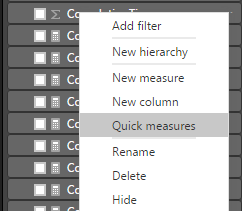
Analyzing data in Power BI is made easy by creating DAX measures. You can create a measure by navigating to the field list in the Report view. Right click on any field and select New measure. This will populate the formula bar at the top of the page under the ribbon. As someone who knows the basics of DAX, but is still learning how to build more complex expressions, building measures from scratch can be difficult and intimidating. However, the Power BI interface can now build measures for you!
Quick measures is a fantastic tool to build and learn DAX. No code is needed. It can be achieved through drag and drop fields through the interface. After building your measure, you can view your expression syntax in the formula bar. This allows you to see which functions and arguments were used to build your expression and gain an understanding on how to achieve this from scratch. To use the Quick measures tool, follow the same navigation path as New measure. Microsoft has helpful introduction documentation to help get you started with Quick measures.
The second tip I presented for data analysis was testing measures in a matrix visual. This is more of a best practice, as opposed to a tip. It can often feel unnecessary to test measures; however, it is a good habit to get into and it can save you a lot of time and frustration in the long run.
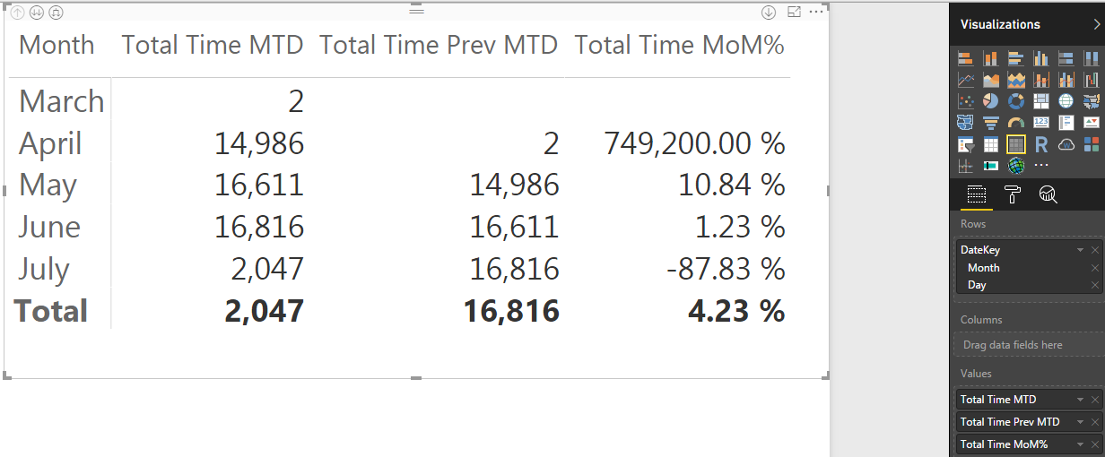
I demonstrated this by selecting three time intelligence measures as the values of my matrix. I also selected the DateKey in my rows. I drilled down to Month in my date hierarchy, as all of my measures were relevant to this level. My first two measures were Total Time MTD and Total Time Prev MTD. They were built off of a simple measure I created, Total Time, which is a summation of a field that captures minutes spent working on an issue. I passed this measure as an argument into both the TOTALMTD function and DATEADD function.
When visualized in my matrix, it is easy at a glance to see that both of these measures are working as intended. The time spent in the previous month corresponds the the previous month measure of the current month. My third measure captures the percent change in the time spent month over month. Again, at a glance with some basic math, the percentage change seems accurate. It does not take much time to do this validation and it is quickly apparent whether the measures need editing or if you can continue with your analysis.
Data Visualization
I presented four tips I use to customize reports. I love visualizing data. I think that it makes insights more accessible to a wide array of users. I also think that it increases engagement in consuming data driven insights, which hope leads to more objective decision making. I feel that taking the time to customize reports from the default visual settings allows you to take ownership of them. Customizing with something as simple as a corporate color palette can help build trust in the data and insights you are presenting as it seems more familiar to the user. Four techniques I frequently use to accomplish this are:
- Importing a custom theme
- Adding a report background
- Adding visual backgrounds
- Adding visual title backgrounds
Importing a theme allows you to apply a defined color theme to the entire report. This saves a lot of time in customizing the report, as all visuals change upon selecting your theme. Creating a theme is easy. It is simply a JSON file with a few lines of code:
{
“name”: “Feathers Analytics”,
“dataColors”: [ “#44546A”, “#2EB2FF”, “#FF2EA4”],
“background”:”#FFFFFF”,
“foreground”: “#44546A”,
“tableAccent”: “#2EB2FF”
}
The first line indicates the name of the theme. The second line indicates which colors make up your theme. This is achieved by a list of color hex codes. The third through fifth lines define the default background, foreground, and table colors for the visuals in your theme.
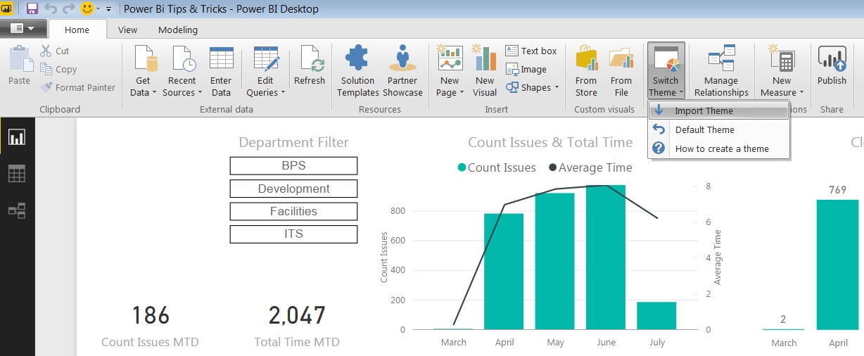
To import a theme, navigate to the Switch Theme button in the Themes section of the ribbon when on the Report view. Select Import Theme from the drop down list and select the JSON file that you have created.
Adding a report background is another quick and easy way to customize the report. I typically add an image as the background, utilizing a corporate background template. This helps fill in the blank, white canvas space used to create the visuals. I add my background after changing the theme, as I want it to supplement my visuals and help them pop.
The visuals should always be the focal point of a dashboard and adding a background image is a way to get them to stand out. To add a background image, first be sure to deselect any visuals. Then, navigate to the Format tab in the Visualizations pane on the right hand side of the Report view. Select Page Background and then the Add Image icon. From there, select your image file. You can increase the transparency of your image so it is not overpowering. I typically set my transparency to at least 75%.
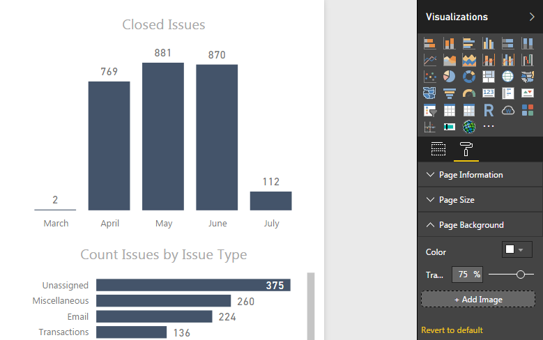
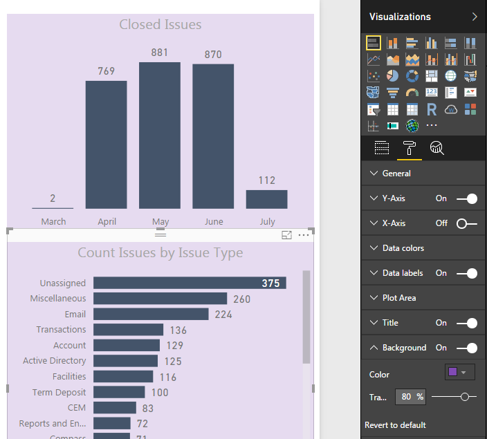
After adding a report background, I also add backgrounds to my visuals. This helps create negative space between the visuals and a flow for your report. This flow of visuals improves the user experience as there are distinct sections of the page to view. Everything stands out and adds value. To edit the visual background, select a visual and navigate to the Format tab in the Visualizations pane on the right hand side of the Report view. Select Background and a color from the drop down list. This should contain the colors you importing from your custom theme. Again, I usually increase the transparency to at least 75% because I do not want the background to take focus away from the visual itself.
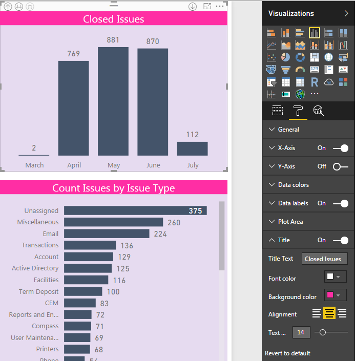
A final step to report customization is adding a background color to a visual’s title. This will make your descriptive title pop and help the user understand what data is being presented. I make sure to select a bold color that blends well with the visual background yet highlights the title. To set the title background, select a visual. Again, navigate to the Format tab in the Visualizations pane on the right hand side of the Report view. Select Title to set your title, font color, and background color. Together, these four steps let you take ownership of your report. This effort in the final stage of building a report can increase user experience and help make it easier for them to navigate and understand the visuals. I feel this time finalizing the feel and customizing is well worth the time investment.
Power BI enables the creation of powerful, interactive visual reports that allow the end user to ask their own questions of the data. Analysts can use the interface to build these reports from beginning to end: from data modeling, analysis, and visualization. These tips and best practices can help build efficient models, reliable analysis, and stunning visuals that can add huge value to any business.

super tips. thanks for sharing
Hello, Thanks for your Awesome post! I quite Satisfied reading it, you are a good author.I will Make sure to bookmark your blog and definitely will come back from now on. I want to encourage that you continue your great job, have a nice day.
Hey Loved the post! Great article and congrats on Reaching the To 50! I will be back to visit often
Power Bi Training in Hyderabad
Power Bi Training
Power Bi Training Online
Thank you for sharing the article. The data that you provided in the blog is informative and effective.
Tableau Training in Hyderabad
Wonderful article for the people who need useful information about this course.