The third installment reviewing the monthly Power BI updates! As always, I select my three favorite feature updates from this month and give my take on them.
These three features solve some headaches of mine in Power BI reports. I am excited to start using these when building reports, as it will result in a more intuitive experience for the users.
Multi-Select Data Points Across Multiple Charts
I am so happy that this functionality is now available as it was a constant cause of frustration.
Intuitively, the first thing a user will try (at least I did!) is to cross filter and highlight multiple visuals in a report. Previously, selecting data from a second visual would remove the filtering from the first.
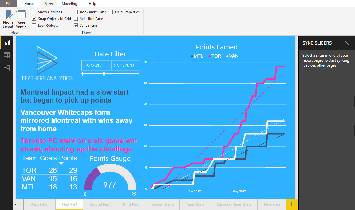
To demonstrate multi-selecting points across charts, I started with a page on a report.
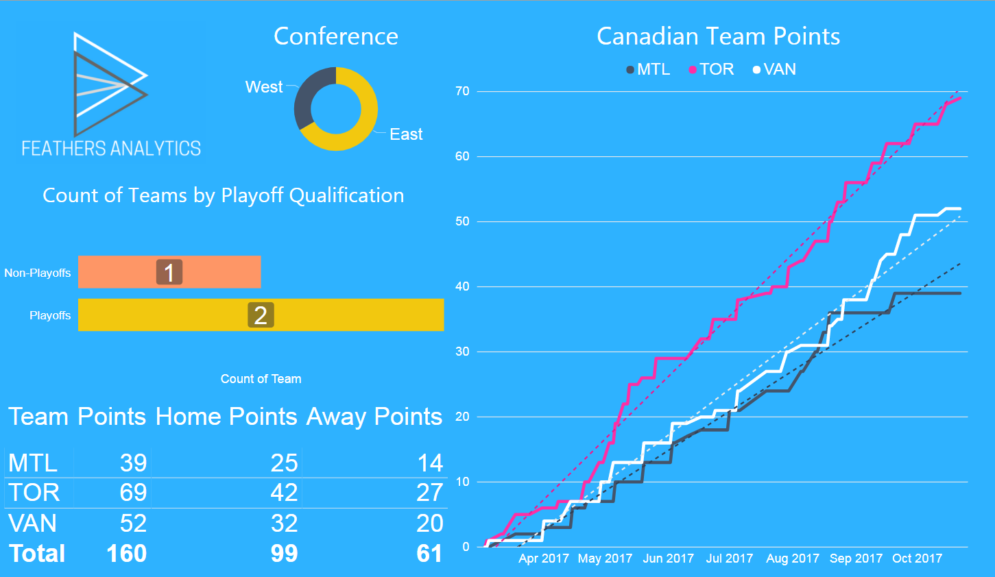
I selected the Playoff bar of the Playoff Qualification bar chart visual. This filtered the table, doughnut chart and line chart visuals to only display teams that had qualified for the playoffs in MLS. In this case, Toronto and Vancouver.
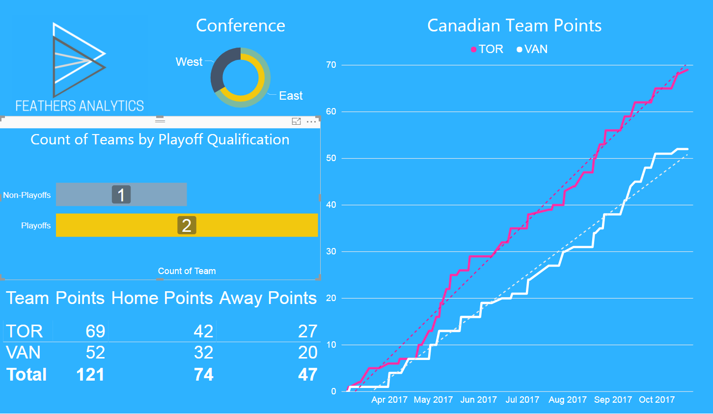
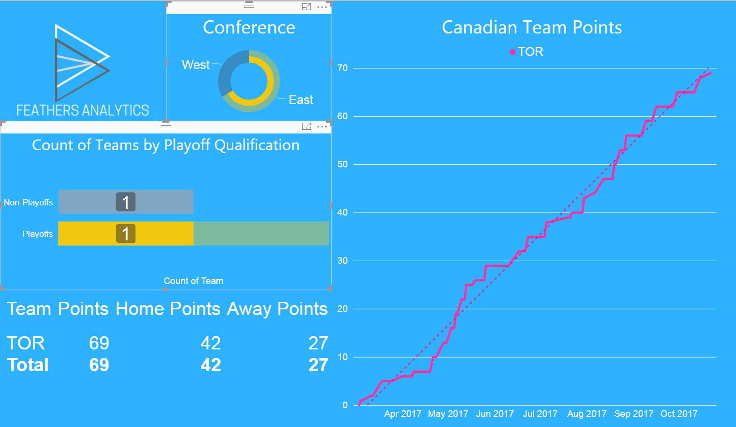
To cross filter by conference, I CTRL-clicked the East section of the Conference doughnut chart. This further filtered the bar chart, line chart and table visuals.
Toronto is now the only team on display in the report, as they are the only Canadian who qualified for the playoffs and play in the Eastern conference.
Previously, there were some workarounds to filter on multiple data points, such as:
- creating bookmarks
- utilizing drill through
- using filter visual(s)
Having said that, it is much cleaner to be able to navigate and filter multiple visuals in a report.
Sync Slicers
This update has proven to be popular in the Power BI Community. Slicers can now be synced across multiple pages, resulting in a consistent view throughout a report without the need to set slicers on multiple pages.
To sync slicers in the report, I navigated to the View tab on the ribbon and checked the Sync slicers checkbox in the Show section. This brought up the sync slicers pane to the right of the report canvas.
I selected the Date slicer visual, which populated the side pane. The sync slicers pane has three columns:
- Page Name
- Sync Slicers
- Slicer Visibility
It shows that the date slicer is visible on three pages of the current report, but that they are not synced.

To sync this filter across the three pages, I checked the sync checkbox for each page. The date slicer does not have to be visible to be synced; however, in this example it remains visible on all pages.
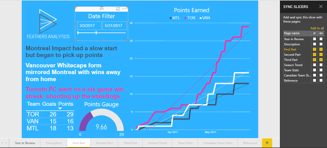
Now the date filter is visible and in sync across the three pages of the report.
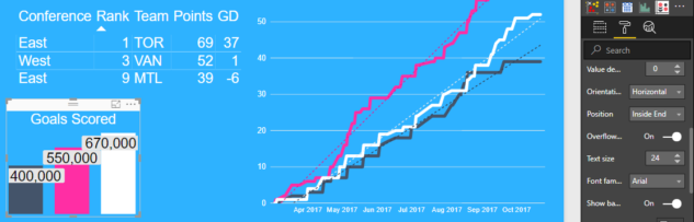
Overflow data labels for bar and column charts
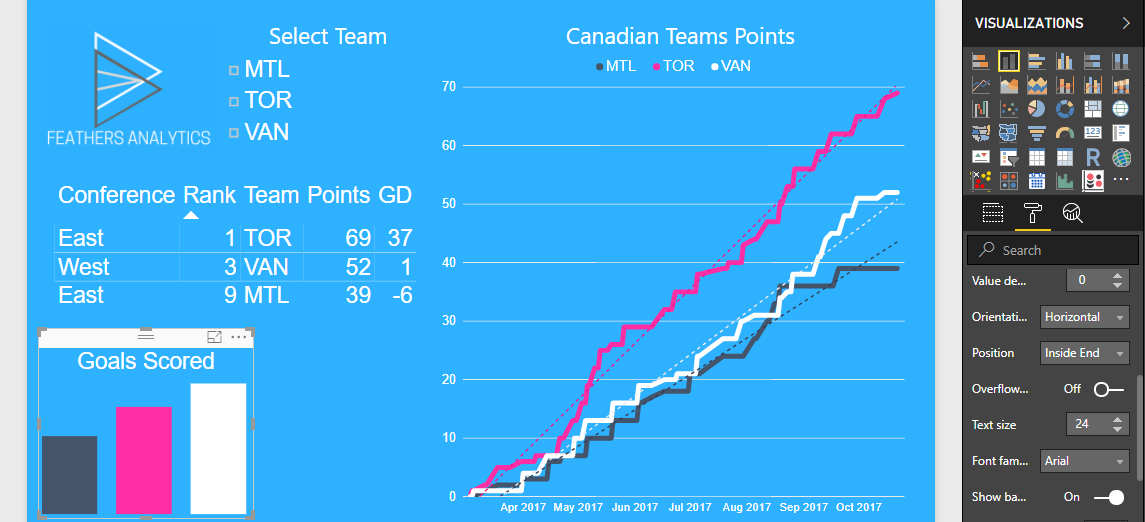
This is probably my personal favorite from the month. I prefer to remove the y-axis from column chart visuals and utilize data labels instead.
Formatting the labels proved challenging at times as the visuals had to be large enough to contain the entire label, otherwise it would disappear.
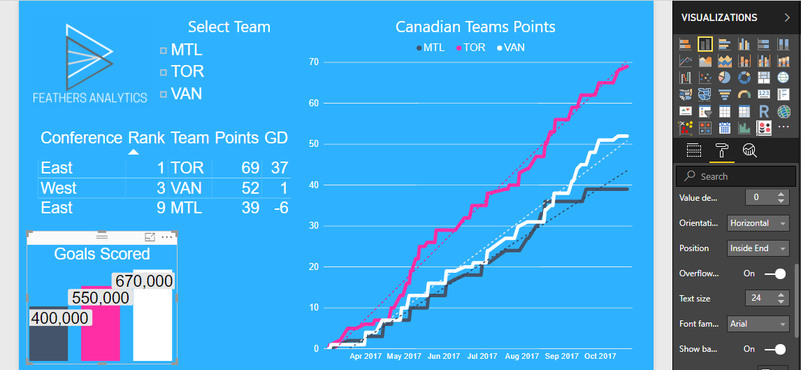
This has been fixed with the ability to set an overflow label. I started with the Goals Scored column chart. No labels appear on the visual because the text size of 24 means they are too large to display.
After toggling the Overflow text to on, the data labels appeared. This works really well when paired with the new Show background functionality that came out in January.
I set a grey background to the labels and now the visual is easy to read and interpret.
That’s it for this month! The full documentation for the updates from this month can be found here.
After conducting a Twitter poll (@FthrsAnalytics), my post next week will be on What-if parameters! I’m excited for that one, so be sure to check it out.