The new features and updates to Power BI have been coming thick and fast in the past two months. It was exciting to see the road map for the next few months and the Business Applications Summit in July, and it’s even more exciting now that I get to play around with these features!
This post will cover some of my favorite features from July and next week I will cover August in some back-to-back update fun!
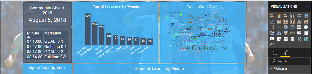
I am using a report I built around twitter data from the Community Shield, the game that is played the week before the start of the new Premier League season each year. Every year, the winner of the previous league title and FA Cup go head to head for some early season bragging rights.
I’m planning to use this report for a few different posts in the next few months.
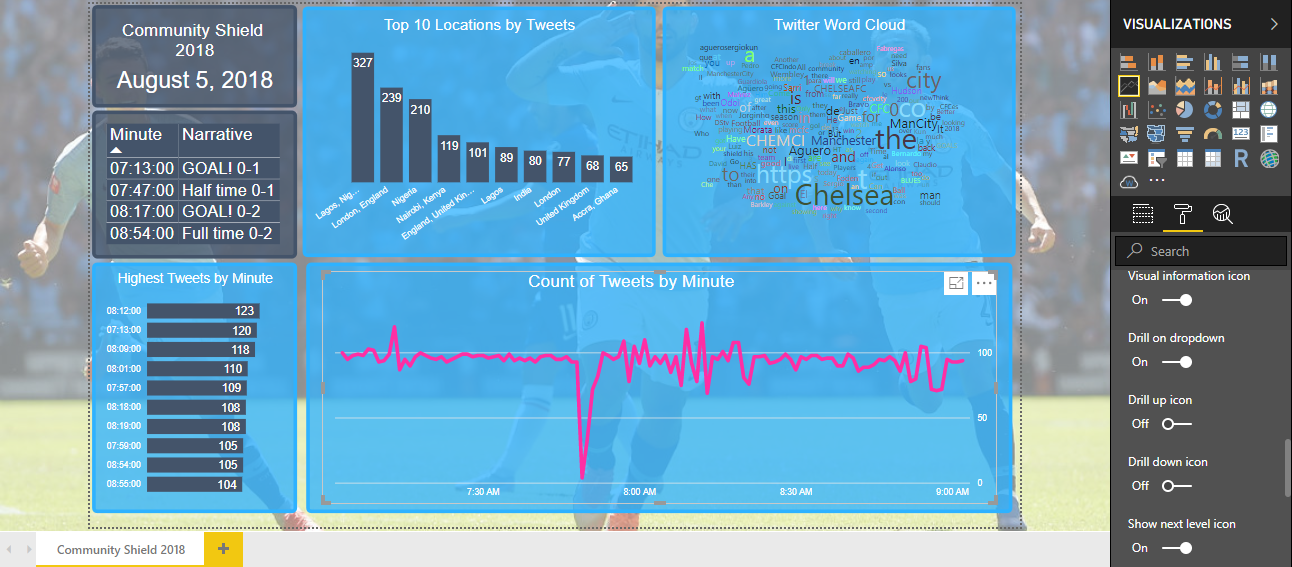
New Visual Header with more Flexibility and Formatting
This feature provides more control over those (sometimes) frustrating visual headers. The format tab in the visualizations pane for each visual now has an option to toggle the visual header.
This gives the option to turn off different buttons on the report header. This will be very useful if you want to allow report users to manipulate the visuals in only a certain way.
It also provides lots of customization options for the header icons.
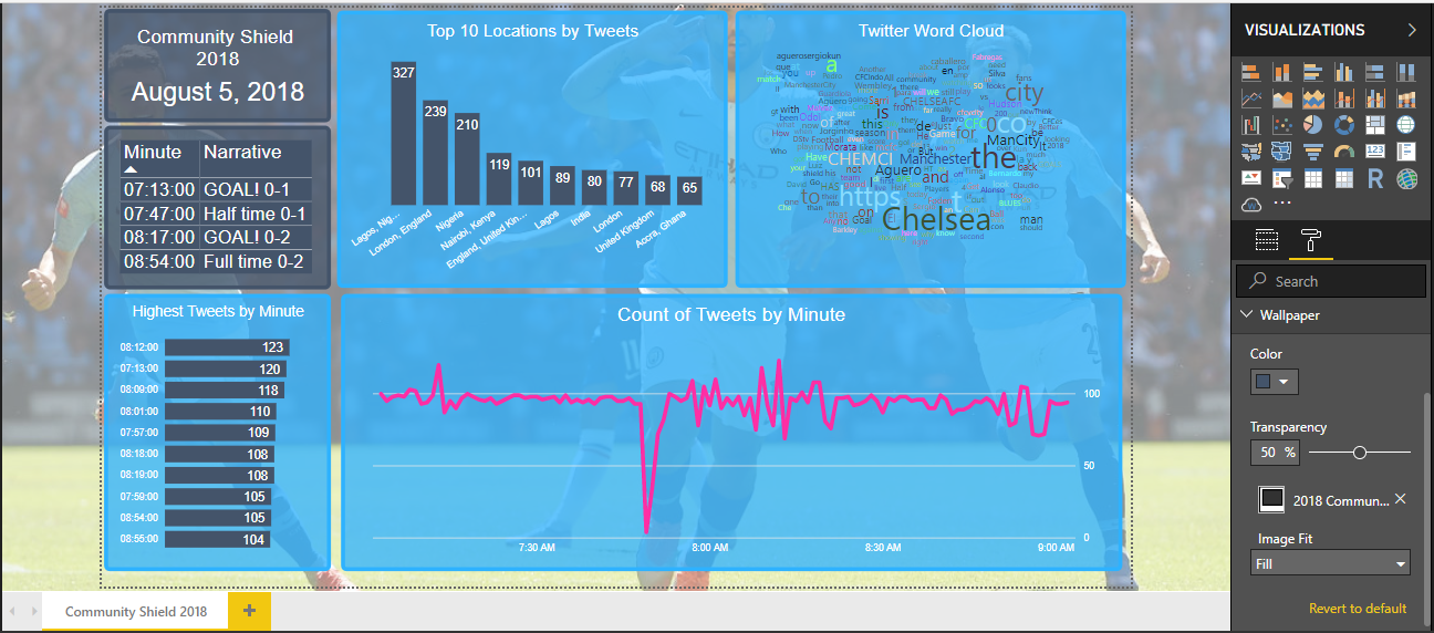
Wallpaper Formatting
This is one of favorite updates from the past few months as it creates a much more cohesive look to reports. Gone are the days of the grey side bars in Power BI!
A wallpaper gives you the option to fill the space behind and around the report background. Pair this with the ability to set the report background to transparent and we have the foundation for some reports that pop.
In my report on the Community Shield, I set the wallpaper image as a picture from the game. My report background was transparent with a slight transparency in my visuals as well. I think this enhances the report above what was possible before with a plain background or sidebars.
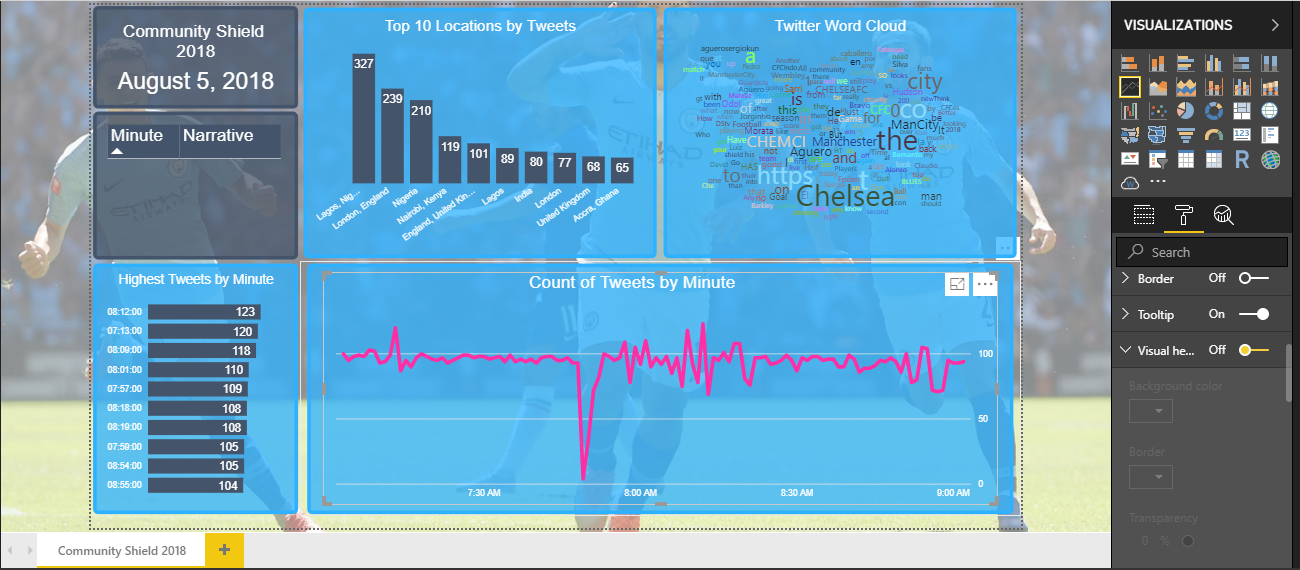
New Sorting Experience
This feature is a great quick win. Before, all of the fields included in a visual were listed as options to be sorted in either ascending or descending order.
This is made much simpler with the option to sort either descending or ascending and a different option to select which field to sort by.
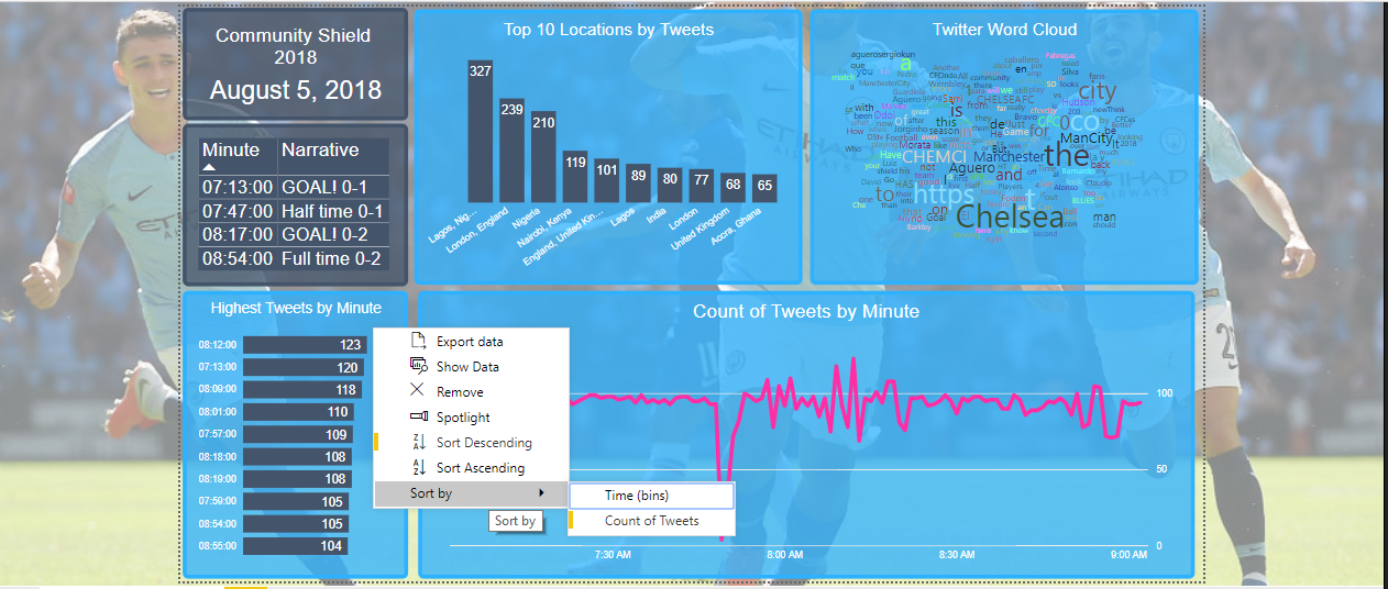
In the example above, I first selected to sort the bar chart in descending order and then selected to sort by Count of Tweets.
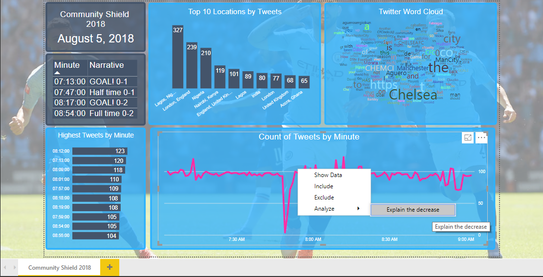
Distribution Factor Insights
I’ve only just started to play around with this new ability to the Insights package.
I love the built in algorithms that help decipher changes or patterns in the report data. Insights can be found by right-clicking on the visual and selecting the Analyze option.
The option for distribution factor will indicate when a different field in the data set would significantly change the distribution of the field currently being visualized.
Next week I will use the same report to demo my favorite features from August!