There’s already another full month of new features and updates! This update was released very close to the Vancouver Power BI Meetup group in July. I did my best to pull together a presentation with a ~24 hour turn around. It was made easy by all the great new features this month!
Updates to Q&A
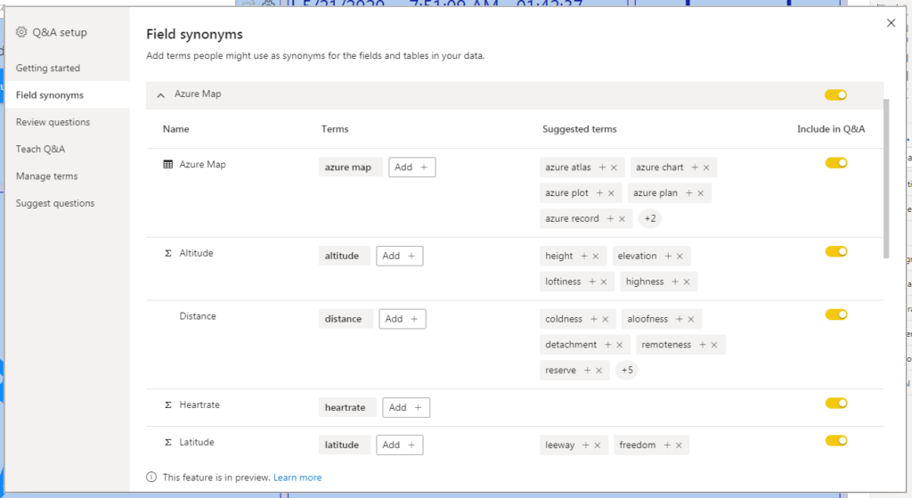
There were a few different updates to one of the best AI features in Power BI. The first is the ability to manage field synonyms. There is now the option in the Q&A setup pane to toggle tables from the data model to included in Q&A.
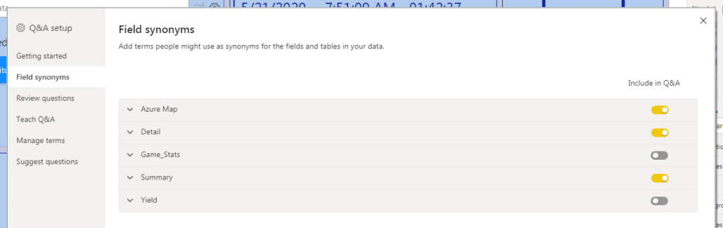
There is also the option to toggle individual columns from being included in Q&A. This could be helpful to narrow the focus that users are able to query themselves in a report.
The second, and my favorite, Q&A update is renaming a field in a visual automatically creates a suggested term. This will speed up the process of setting up Q&A after building a report. The effort has already gone in to labeling visuals and now that flows through to the Q&A experience as well.
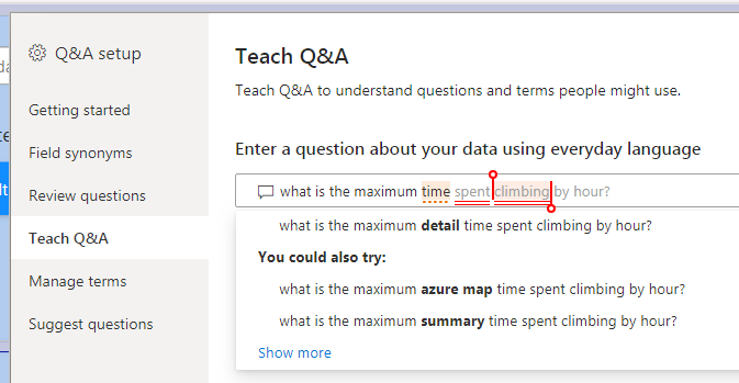
The third update was introducing a third type of underline for ambiguous terms. Terms that Q&A understands are in blue, terms that aren’t understood are in red, and now ambiguous terms are in orange.
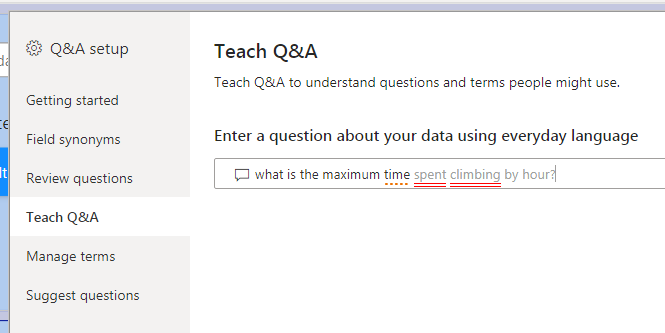
This makes it easy to identify terms that need to be curated for the end user.
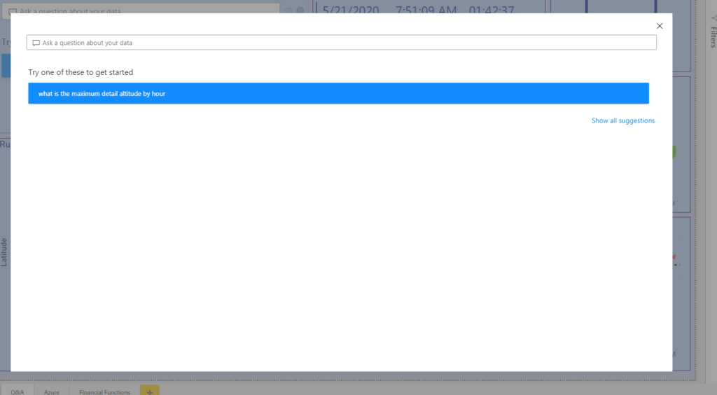
The final Q&A update was to the Q&A pop-out experience. This is relevant when there is a Q&A button added to the report.
Clicking the button now drives an experience closer to the Q&A visual itself. It contains suggested questions and any questions saved in the Q&A setup.
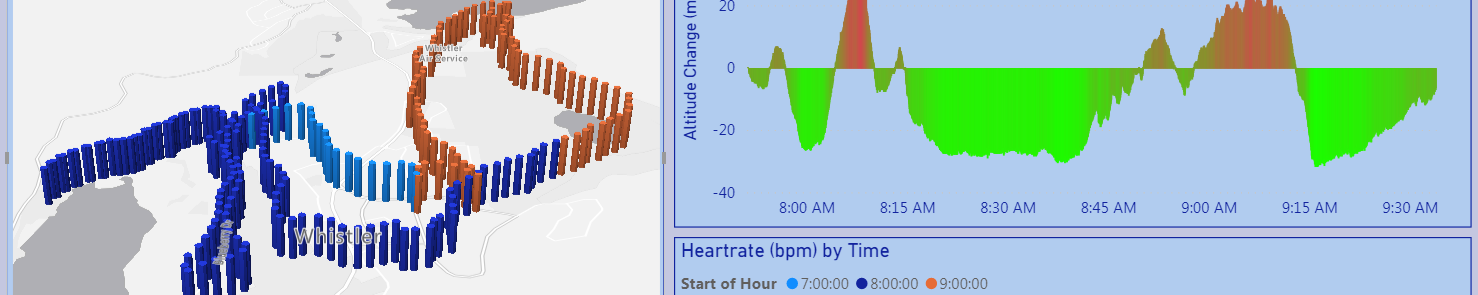
Azure Maps visual (preview)
There is a new map visual in Power BI! I focused on three of the layers that are available in this visual: the Bubble layer, 3D bar chart layer and the reference layer.
The bubble chart allows the user to plot points on a map with a bubble. There is standard functionality around setting colors, bubble size and background layer.
The 3D column adds a third dimension to the plot. The bubble size dimension translates to the height of the column.
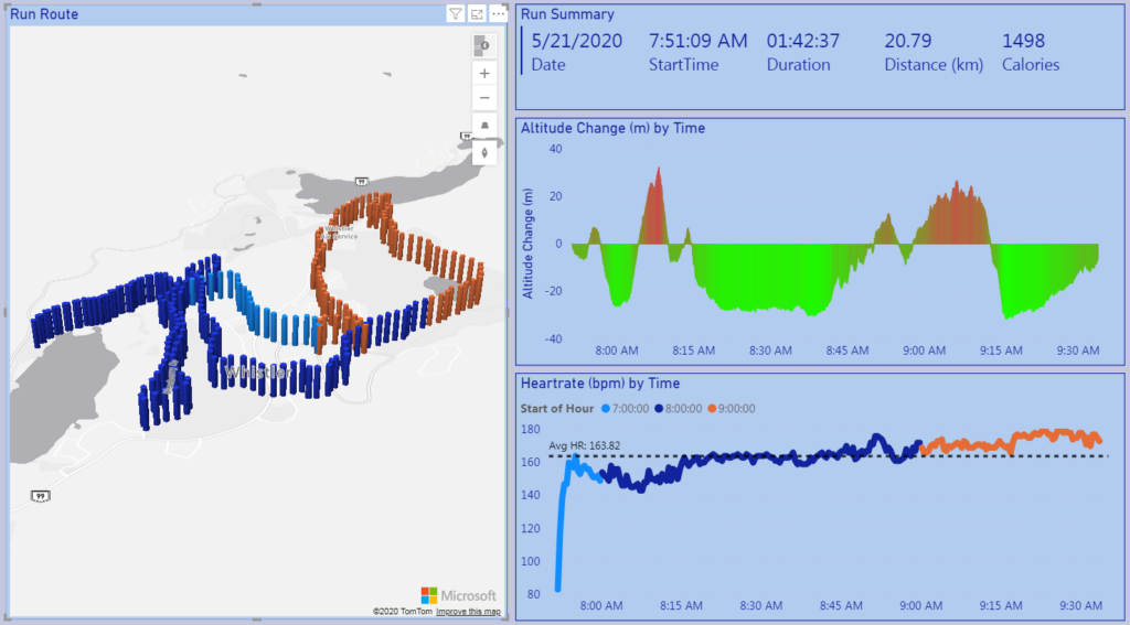
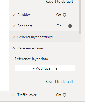
There is also the option to upload a local file to a reference layer to the visual. This could be used to add office or store locations of an organization into the report.
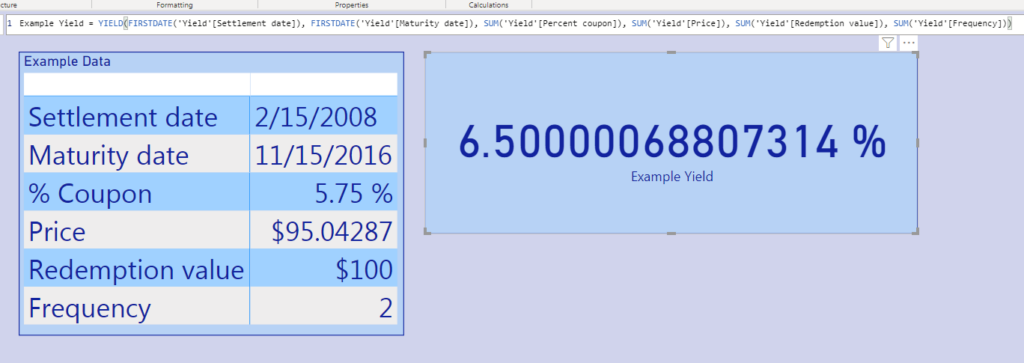
Financial Functions – DAX
This month sees the introduction of 49(!!) financial functions in DAX. This essentially brings Excel’s built in financial formulas to Power BI.
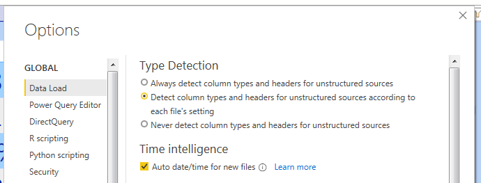
Global Option – Ignore column Types
This is great for Power Query users! Previously, there was a local option to ignore column types on import. Now, we can set this at the global level, so column types are always ignored.
Those were my favorite updates from this month! There were lots of updates to Q&A, a new map visual in preview and financial functions in DAX! I will be back next month to review my favorite updates from the next release.