I presented this content, as well as my favorite updates from the October release, at the Vancouver Power BI User Group. My favorite features from this month include enhancements to visuals, AI functionality and further improvements to the user experience of the Power BI Desktop application.
New Field List (Preview) / New Model View (Preview)
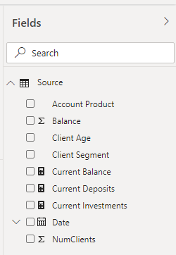
The first group of updates I like are the new field list and model view in the Power BI Desktop app. These updates don’t have a huge impact on the functionality of Power BI, but they greatly improve the user experience.
The new field list is easier to read: DAX measures, date columns, text columns and numeric columns are all easy to differentiate.
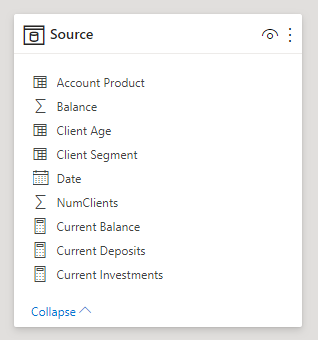
The formatting is consistent with the new model view as well. We see the name of the query on top of the field list with the new formatting applied to the fields within the query.
The field list and model view are now cleaner and easier to interpret at a glance.
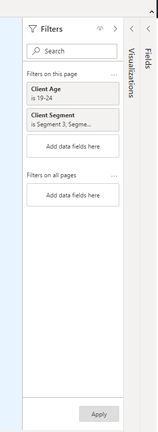
Apply all filters is now generally available
This feature helps reduce query size by applying multiple filters from the filter pane simultaneously. To activate this feature, first go to settings. Then go to the Query reduction section under Current File.
Under the filters section, select “Add a single Apply button to the filter pane to apply changes at once”.
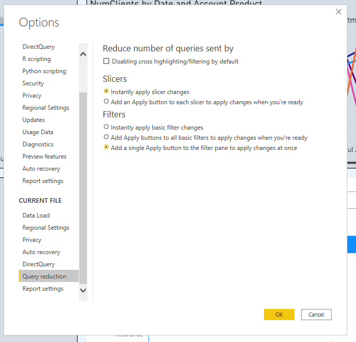
Now, the filters pane has an Apply button at the bottom. This allows the user to select and adjust multiple filters before applying them. This can help speed up the time it takes to filter and is similar to the apply button with Pivot Tables in Excel.
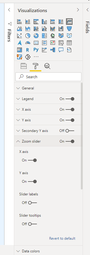
I love this new feature! As the name suggests, the visual zoom slider allows the user to zoom in to a specific area of a visual. A point of note, it simply focuses on an area of visual, it does NOT filter the underlying data.
This is particularly handy in providing the ability to zoom in to a particularly time period on a trend chart. None of the data or insights change, but a user can see a more granular view within their own control.
To set this up, navigate to the Zoom slider section of the format tab on the visualizations pane. You can toggle this option on for the x-axis and y-axis, along with some other formatting options.
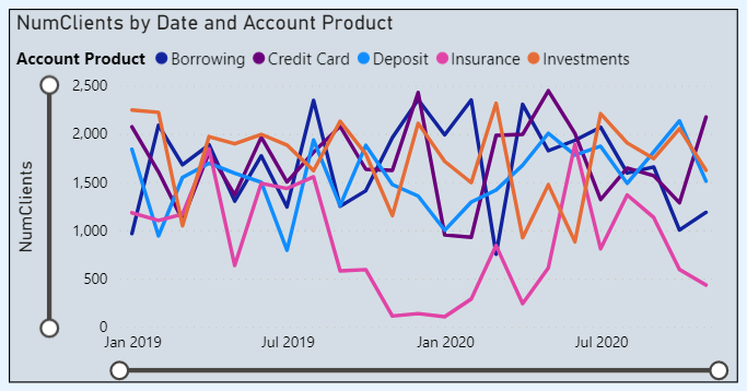
Turning on both resulted in slider bars being added to this line chart visual in the report. Users can now slide either end of the bars to zoom in to a certain range of data. Love it!
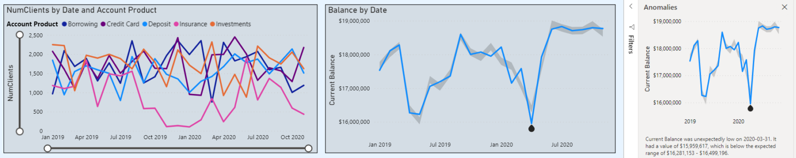
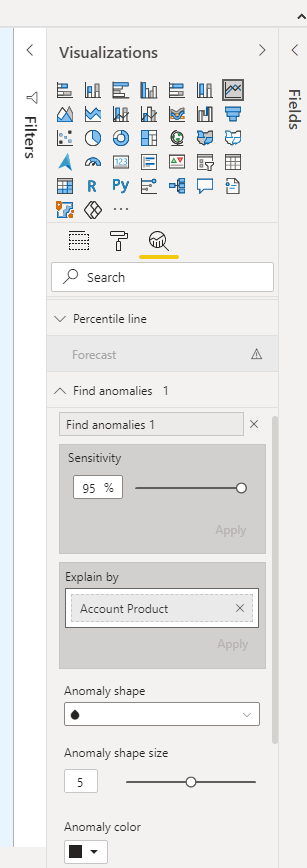
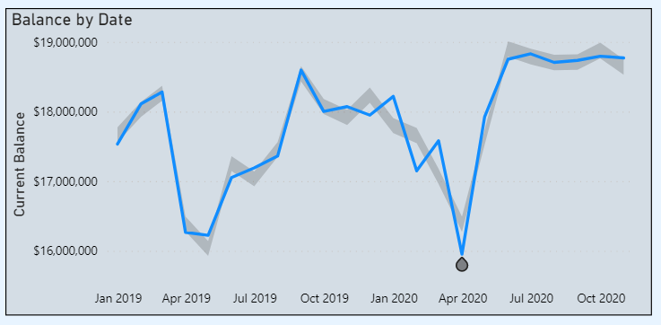
My favorite feature from this month! Anomaly detection provides AI functionality to the line chart and time series data! The native feature can find anomalies in the data, highlighting areas of possible concern or further analysis.
To utilize this functionality, navigate to the analysis tab on the visualizations pane after selecting the line chart visual. There is now a section for Find anomalies.
It is quite customizable, with many parameters to adjust including the sensitivity of detection and which fields to explain any anomalies.
After applying the anomaly detection, the line chart has an expected range of values added around it as well as anomalies highlighted. Only one anomaly was found in this particular example. The actual values in the line chart were lower than the expected range.
Selecting this anomaly opens the Anomalies pane to the right of the report canvas. This provides a natural language description of the value and how it is outside the expected range. It also provides a list of possible explanations and the strength/confidence in these explanations.
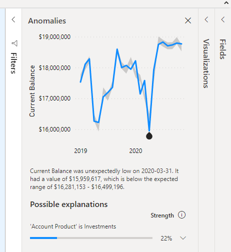
A reason why I love this feature is it can help curate insights and narratives around the visuals in the report. With these explanations provided automatically, users can have some idea as to the “why” behind the “what” that the chart is visualizing!
Those were my favorite features from this month!