There is so much new AI functionality in the September update of Power BI! I presented three of my favorite new features at the Vancouver Power BI User Group. These include a new AI visual, an AI update and a report visual update.
Smart narratives (preview)
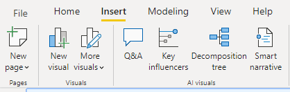
The new Smart narratives feature is available in preview. After enabling the feature, I navigated to the Insert tab on the ribbon.
I selected the Smart narrative visual icon. This inserted the visual in the report, producing a summary of the other three visuals! This is fantastic as a starting point to write a paper or summarize the insights from the visuals included in the report.
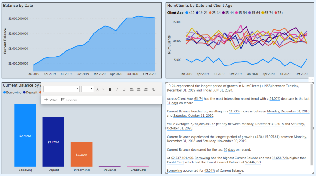
However, it should be treated as a starting point. The user has complete control over customization of the smart narrative, with the ability to remove, edit or add new insights into the narrative. This is done by navigating to the Review section of the visual.
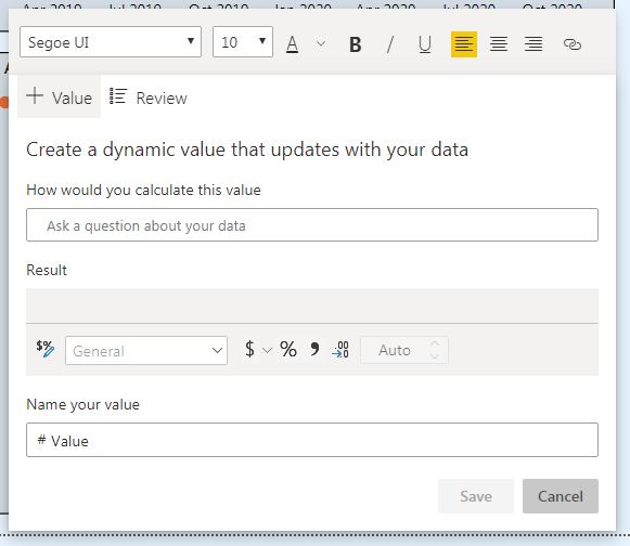
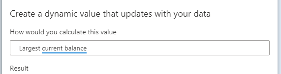
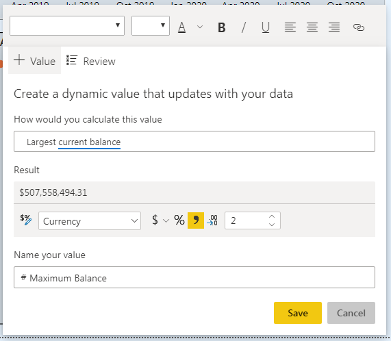
Adding a custom value is done in the Add Value section. Using the existing Q&A feature in Power BI, the author can ask questions of the data using natural language querying and preview the results.
These results can be named, formatted and included in the Smart narrative.
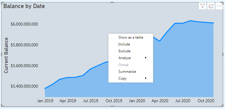
A Smart narrative can also be created for an individual visual. Right-click on a visual and select the option to Summarize. This will create a summary of the single visual with all the same functionality as the report summary.
Q&A now supports arithmetic operations
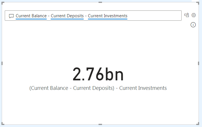
It seems like I cover updated functionality to the Q&A feature every month now! This month, it is the ability to do arithmetic in the visual!
Below, I added together two recognized terms to have the sum displayed. I didn’t need to create a DAX measure to achieve this, it is all done within the visual.
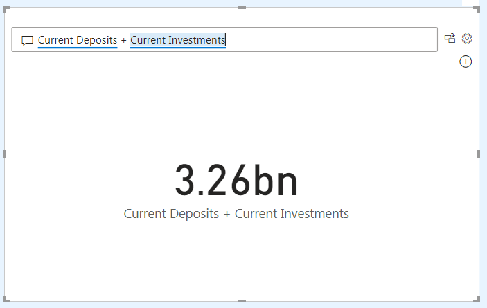
The Q&A experience now supports addition, subtraction, multiplication and division within the visual.
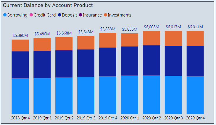
Total labels for stacked visuals
The simplest, but probably my favorite, update from this month! There is now an out of the box feature to display a total label for stacked visuals. No more workarounds needed!
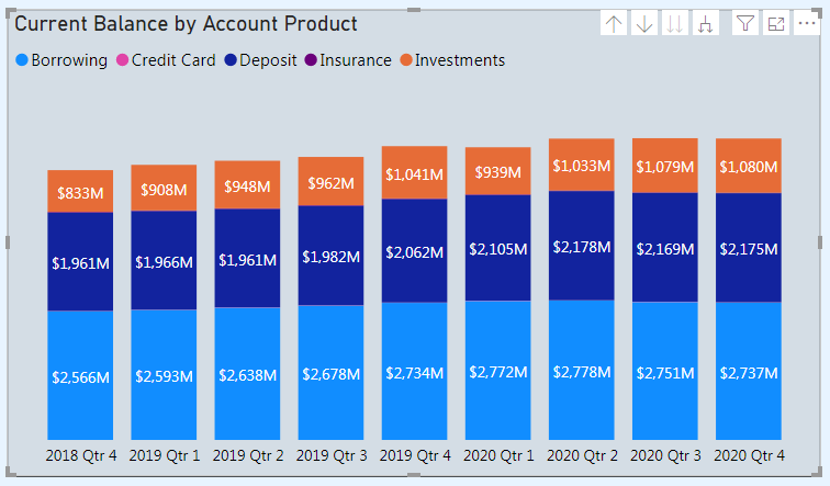
In the visualizations pane, I navigated to the Data labels section.
Underneath, there is now an additional section named Total labels. Toggling this on will produce a total label on top of the stacked column. I also toggled the series label off.
Now the visual has one clean label on top of the column!
Those were my favorite three features from the September Power BI update! More information about these features, as well as the other updates from the month, can be found be clicking on the hyperlink in the section headers.