This is my third post on integrating predictive modeling with R into a Power BI report. The first two posts covered the methods of integration using:
A third method is using an R Script as a data source directly. This means all of the ETL steps typically done with M code in the Power Query Editor are all done in the R Script instead. I have covered the R Data Connector in a previous post.
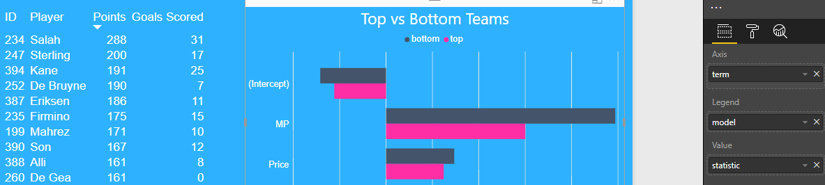
In this example, I created two predictive models from the Premier League Fantasy Football data set and wanted to visually compare the results in a Power BI report.
I created two exclusive subsets of the data set by separating the top six Premier League teams from the rest of the league.
I wanted to predict the points scores by players using three other features:
- price of the player
- minutes played in the season
- percentage of fantasy teams that selected the player
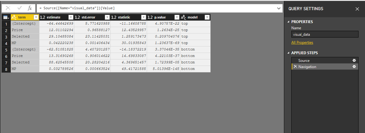
I created a linear model on each subset and then tidied the results using the broom package. I combined these results into one table and used this table as a source for my Power BI report.
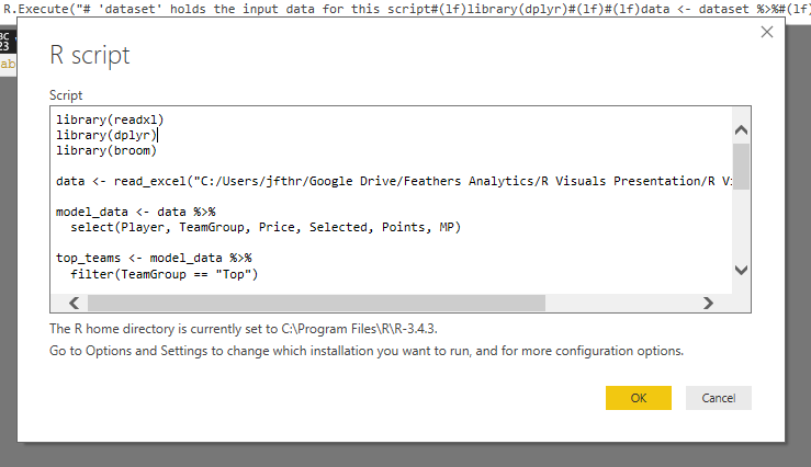
My full R Script I used for this example can be found below:
I loaded the R Script into the Power Query Editor.
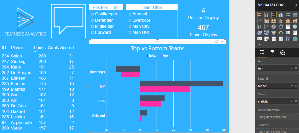
I loaded the query and began to visualize the results of the two models. Two main insights jumped out from a visual comparison with a clustered column chart:
- The intercept, teams selected by and price features all had a similar significance in predicting points for both groups.
- The minutes played feature is more significant in predicting points for players who play for teams outside of the top six in the Premier League.
That is how I used the R data connector to visualize the results of two predictive models in Power BI. I will continue to explore how to bring more machine learning into Power BI over the coming weeks!