Bringing together Power BI & R! I’m really excited to be reviewing this topic over the next few weeks as a natural progression of my R Series.
I’m going to focus on bringing predictive modeling into Power BI reports using R. The first way to achieve this is through custom R visuals.
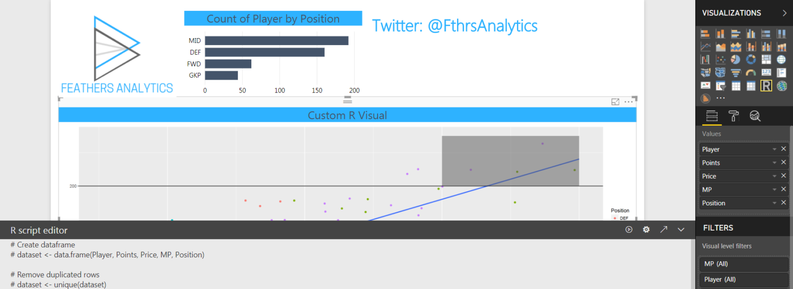
I started with a report I built for my R Visuals in Power BI presentation. The report contains data on Premier League Fantasy Football.
The first page has two visuals:
- bar chart displaying count of players by position
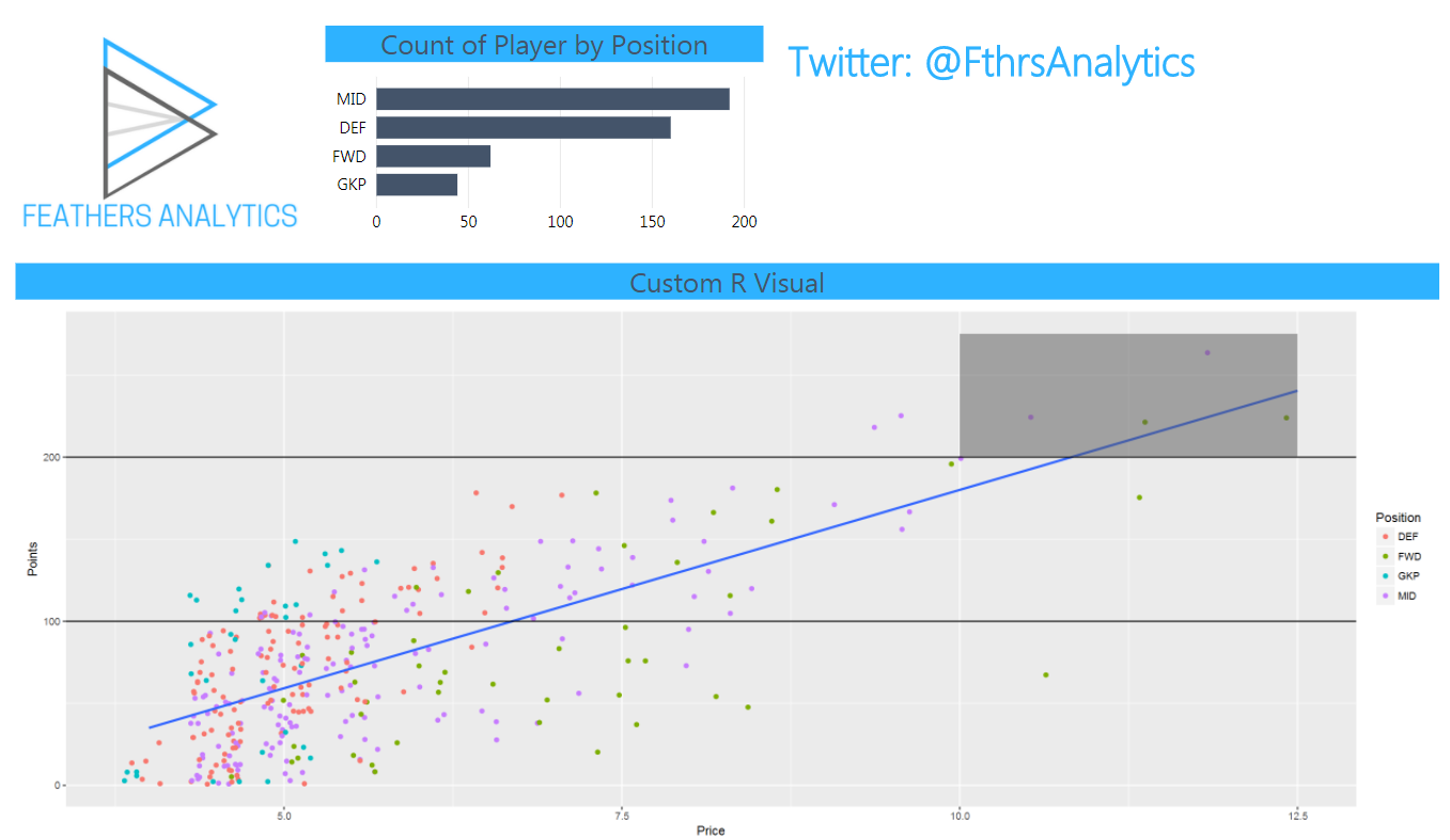
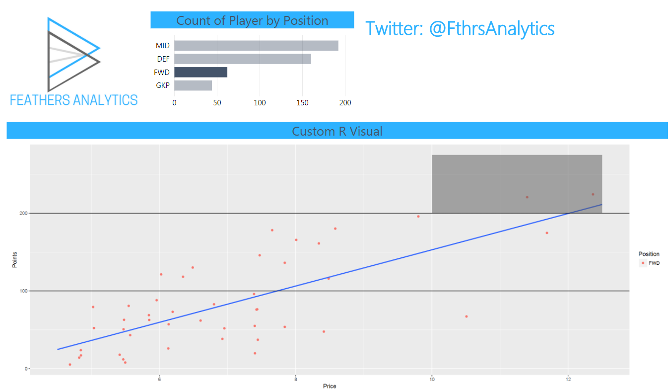
- custom R visual plotting the relationship between points and price of players by position
I did a deep dive in how to create R visuals in Power BI in the post I linked above. As a quick review:
- I selected the R Visuals icon from the visualizations page
- I selected the fields from the data to use in the visual
This creates a dataset in the R script editor associated with the visual on the report canvas.

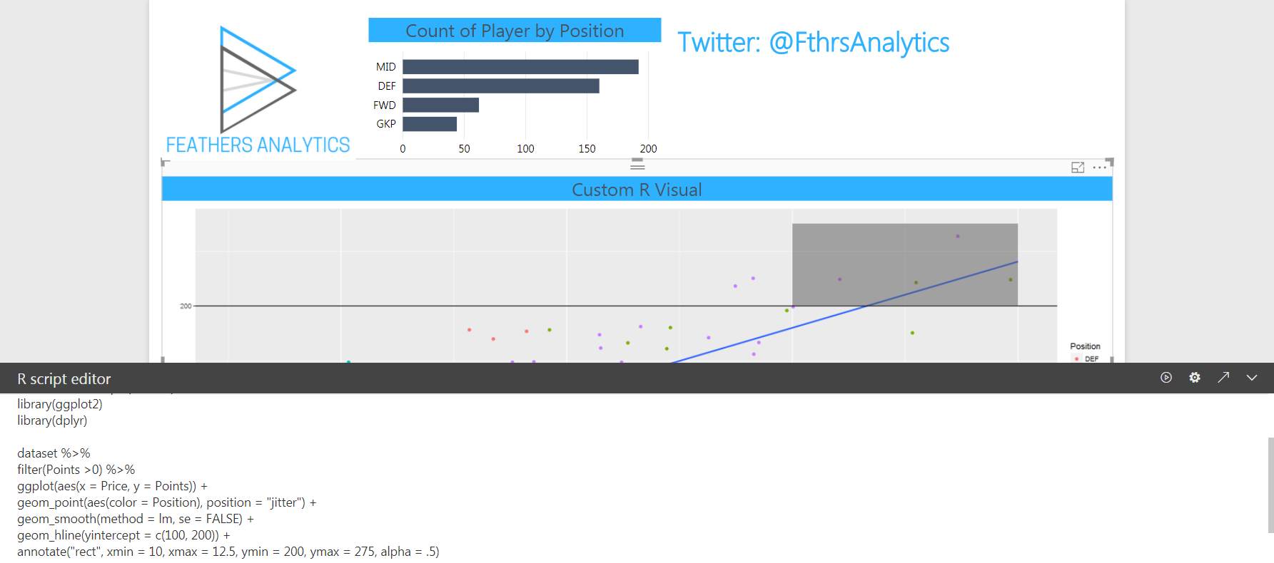
Then I wrote the R code to create the visual.
I built the R visual using the tidyverse package: ggplot2. Again, I did a deeper dive in my previous post, so I will gloss over the details.
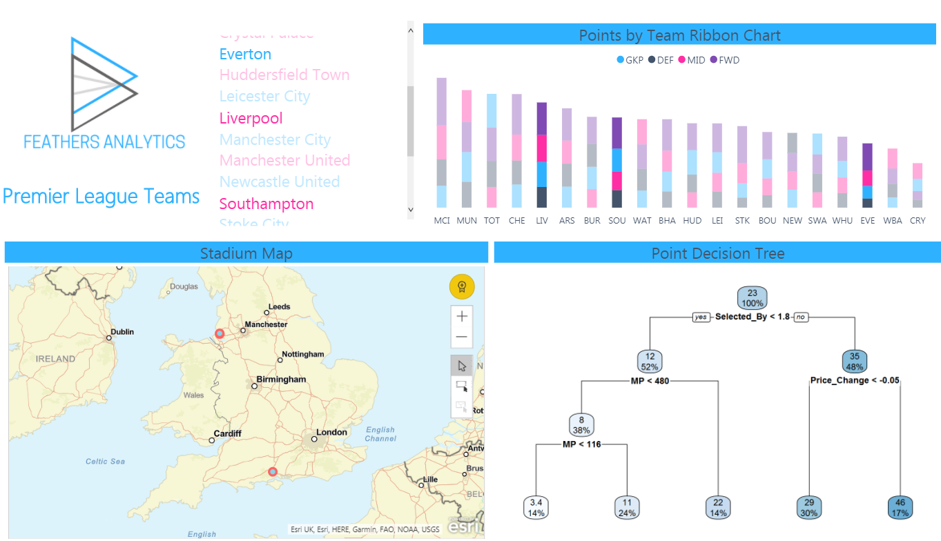
As the visual is built on the same data as the other Power BI visuals in the report, it mains the same ability to be cross filtered by other visuals in the report.
There is a limitation compared to Power BI visuals that an R visual cannot be the source of cross-filtering.
This is powerful as R provides more control and a wider range of options to create these custom visuals. But what is really cool is how R visuals can bring predictive modeling to a report.
On the second page of the report, I decided to build a decision tree. I chose this type of model because it visualizes well and is easy to interpret.
This report page contains information on the teams in the Premier League:
- A list of all the teams
- A ribbon chart visualizing the points earned by position for all teams
- A map visualizing where their stadiums are located
- An R Visual decision tree which predicts the points earned by players
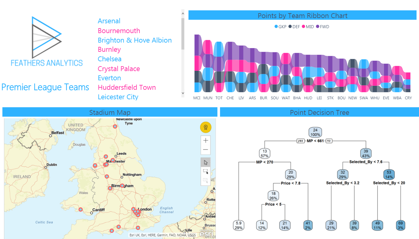
A decision tree is interpreted with a logical test at each node, starting from the top of the tree.
Each node contains:
- the average points for all players in that node
- the percentage of players contained in that node
- the logical test to the next layer of the tree
For example, starting at the top, the average points for all players is 24. 100% of the players are contained in the node, because they have not been divided yet. The logical test is based on the minutes played field, in this case if a player has played less than 661 minutes.
If the statement is true (a player has played less than 661 minutes), you follow the branch on the left, which is labeled “yes”.
If false (a player has played more than 661 minutes), you follow the branch to the right.
You continue down the tree until you reach a root node at the end. The percentages at each layer of the tree should sum to 100%.
I used the rpart package to create the decision tree and the rpart.plot package to visualize the results.
There were only two lines of code for the visual:
tree <- rpart(Points ~ MP + Price + Price_Change + Selected_by, data = dataset)
rpart.plot(tree)
The first line of code creates the object “tree”. This is a decision tree model that uses the dataset created by dragging the Power BI fields into the R visual.
It builds a model to predict Points by the four other factors listed.
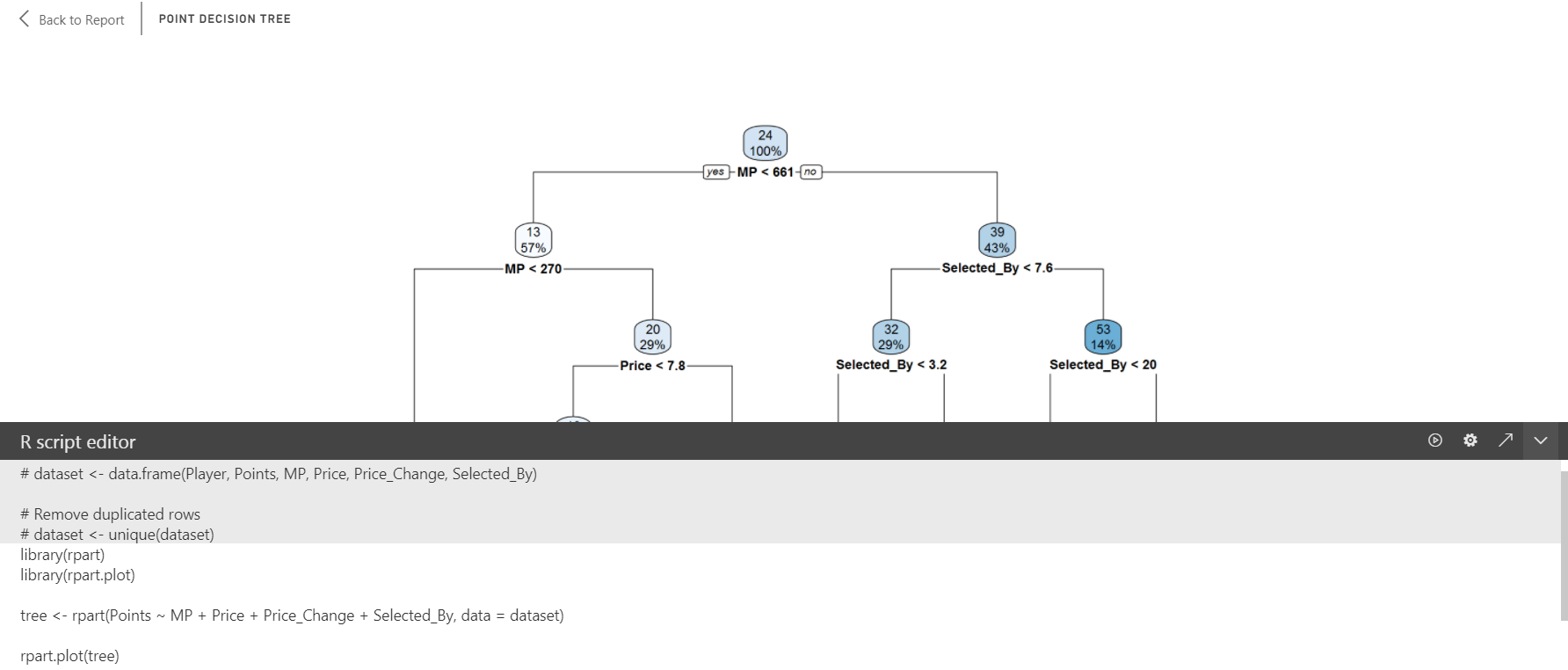
Just like the earlier R visual, it is interactive. When cross-filtered by another visual, the data input into the model is changed with adjusts both the model and the visualization of the results.
That is how I used custom R visuals to introduce a predictive model into my report.
Next week I will cover using R scripts in the Power Query Editor. I also plan to cover using R Scripts as a data source.
2 thoughts on “Power BI & R – Visuals”
Comments are closed.