I’m excited to be sharing the contents of this post at the Vancouver Power BI User Group this month! I will review my favorite features from the April 2020 Power BI desktop update. These features cover the areas of reporting, analytics, and visualizations.
Relative time filter (preview)
This preview feature brings time logic up to par with the existing relative date filter experience. Rather than selecting an explicit time or range of times to filter the report, a user is able to filter the report based on the current time as an anchor point.
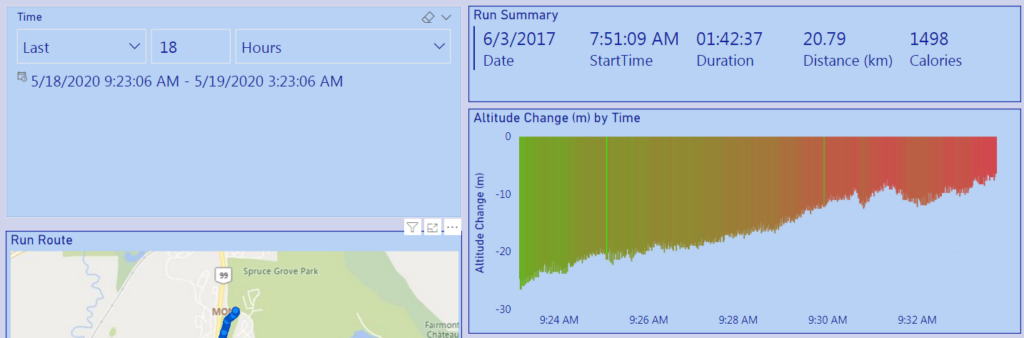
To create the relative time filter, I selected the slicer visual from the visualizations pane.
Then I selected my time field to populate the visual, which was formatted as a data type of date/time.
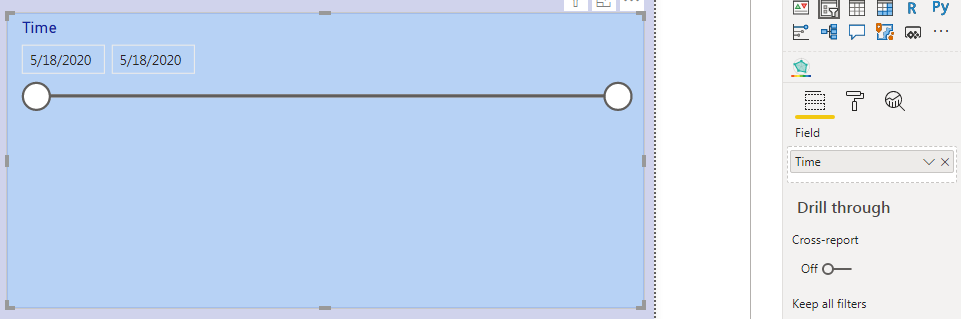
By default, the filter displays the “Between” option. This allows a sliding range of values to be selected. However, they are explicitly selected from the range of date/time values currently loaded in the report data set.
I selected the “Relative Time” option from the drop down menu located in the ellipsis.
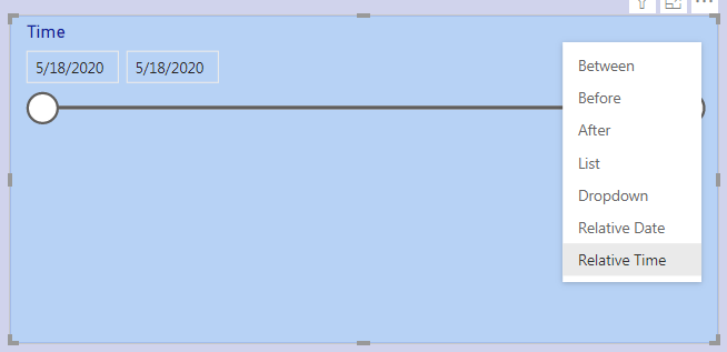
Now I was able to filter the report for time ranges such as the last 18 hours, next 15 minutes, or within this hour. This is useful because as the report refreshes, as the user will see the same type of view without needing to update any filters.
Rectangular lasso select across visuals
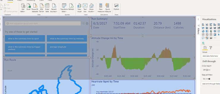
A very handy feature for report authors! You can now select multiple visuals by clicking and dragging to create and area on the report canvas. All visuals completely enclosed in this area are selected.
Q&A Updates
There are three updates to the Q&A experience in Power BI this month:
- Suggest your own questions
- Teach Q&A supports measure conditions
- Q&A support within Power BI datasets
I’m going to focus on the first, the ability to suggest your own questions to help your end-users. This was one of my favorite features of Q&A before this update.
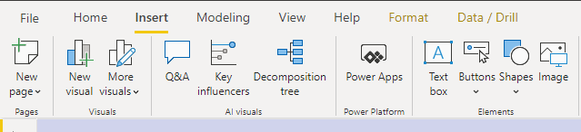
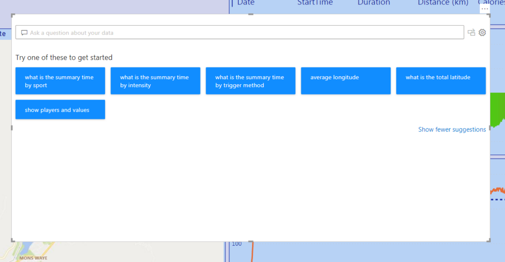
To enable this feature, navigate to the Insert tab on the ribbon and select Q&A from the AI visuals section. This brings up the Q&A visual, with a text box to enter questions about the dataset.
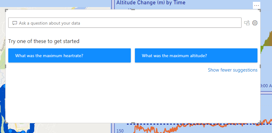
There is also a list of questions (generated automatically) that users can select to get started with asking questions. I think these can provide a helpful prompt and help users understand how to pose natural language questions more effectively.
To curate this list for my users, I navigated to the Q&A setup page by selecting the gear icon on the top right corner of the visual. There is now a “Suggest questions” option on the bottom of the menu on the left.
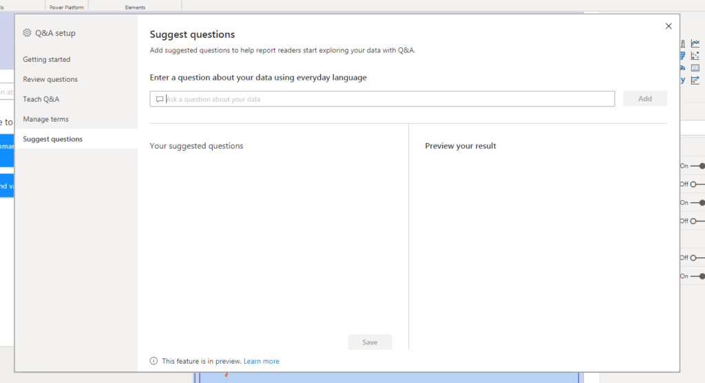
In this area, I can start typing in some questions and see a preview of the answers. If some of my questions don’t work, I could always go to Teach Q&A as well!
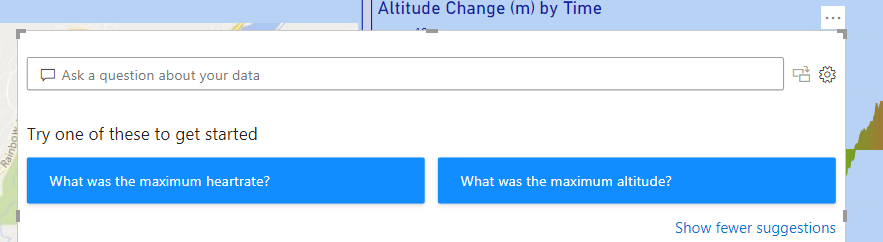
I entered two questions that I thought my users would be most curious about (everyone is curious about maximums, right?).
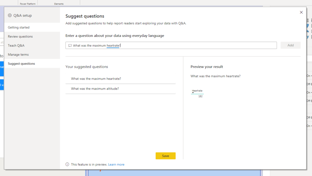
Once I was satisfied with the preview result, I saved the questions and exited the setup. Now, the users are posed with my two questions to get them started when using Q&A!
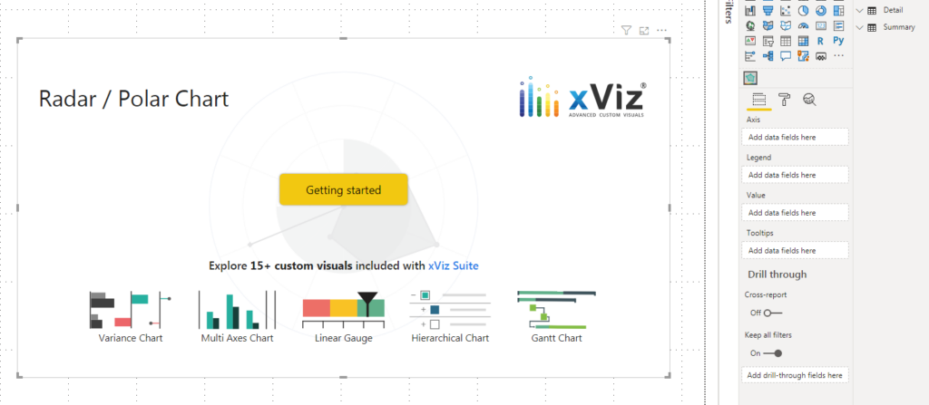
Radar/Polar chart by xViz
The crowd pleasing radar chart! I had never used an out of the box radar chart in Power BI before. I preferred to build my own using a custom R visual. However, when I saw this on the feature update list I knew I had to check it out!
I started by downloading the visual from the marketplace.
The visual requires three main fields:
- Axis – what are the list of things that we want to measure
- Legend – what are the things we want to compare within the axis
- Value – what should populate the axis
I used the “Unpivot columns” function in the Power Query editor to shape the data to meet the needs of the visual. The axis column consisted of six measures that I used to compare the performance of four people.
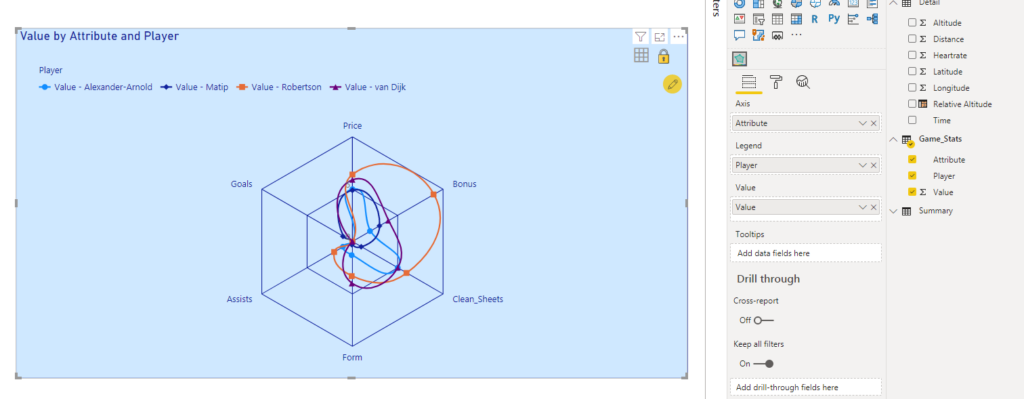
As usual with xViz visuals, there are a lot of formatting options. I was impressed with how many options there were out of the box for how the data can be represented inside the visual itself.
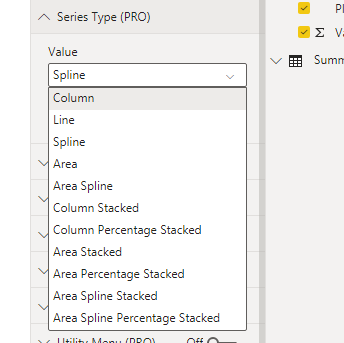
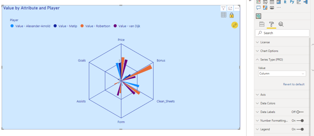
I switched from spline to column. This created more of a polar chart and I was happy with the result!
The full write up, documentation, and tutorial video for the visual can be found here.
Those were my favorites for the month! I’m looking forward to presenting them (and maybe some of the May 2020 features too) at the Vancouver Power BI user group.
1 thought on “What’s New in Power BI – April 2020”
Comments are closed.