The first release of 2020! This post highlights three of my favorite features from the update this month. Two of them address highly popular requests from the community. The full update documentation can be found here.
Incremental refresh is now generally available
Incremental refresh is now available for Power BI Pro! I will cover how I set up incremental refresh in the following section. For more information, the detailed documentation can be found here.
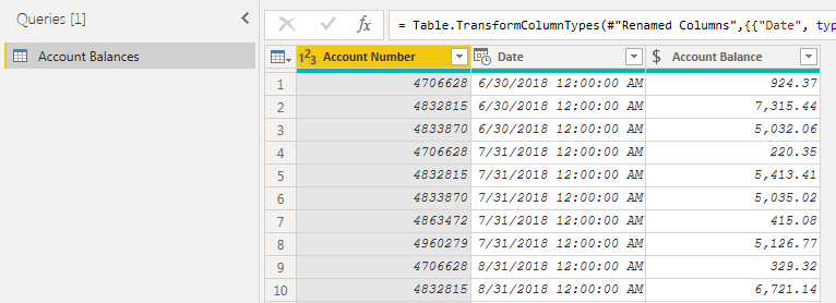
I started with a query that was connecting to a data source that supported query folding.
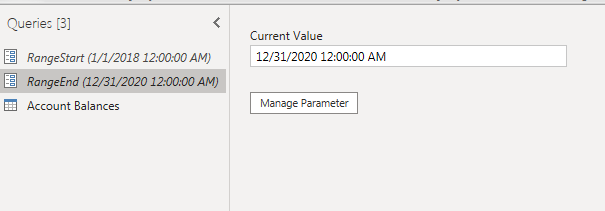
My first step was to create two parameters: RangeStart and RangeEnd. These parameter names are reserved for the purposes of enabling an incremental refresh (and are case sensitive).
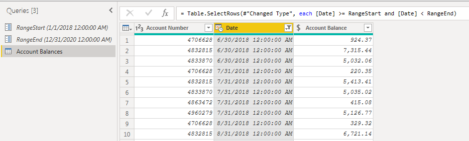
My next step was to filter the date column in my query:
= Table.SelectRows(#"Changed Type", each [Date] >= RangeStart and [Date] < RangeEnd)
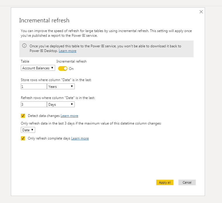
I applied my query and then navigated to the model view from the report page. To set up the refresh, I right-clicked on my “Account Balances” query from the fields pane on the right and selected the incremental refresh option. This brought up the following dialogue box.
It contains the options for:
- toggling incremental refresh
- setting which dates should be stored
- setting which dates should be refreshed
I was delighted that this feature was finally made generally available. I will be including it in my reports with lots of historical data to speed up the refresh time.
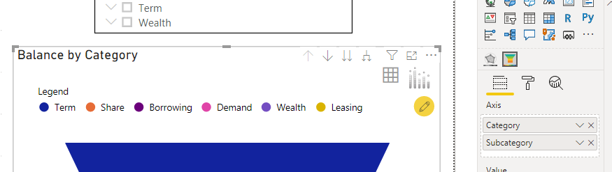
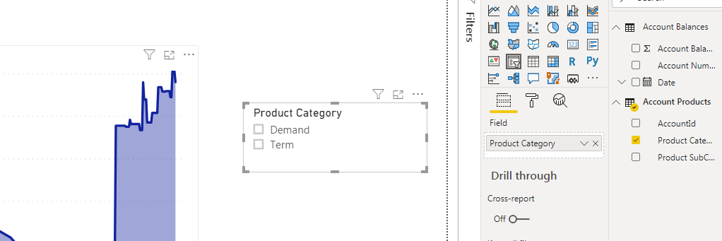
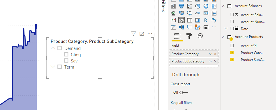
Hierarchical slicer (preview)
The out of the box slicer visual now supports hierarchies! This feature is very similar to the functionality of filtering hierarchical data in Excel.
There is now no more need to create multiple slicers for columns such as category and subcategory. Both fields can be dropped into the same visual, saving space in the report and enabling a more intuitive experience for the user.
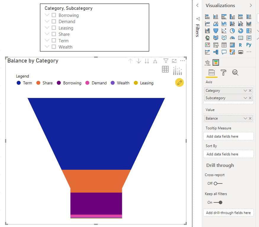
Funnel and pyramid chart by xViz
This is the second consecutive monthly update that I have included an xViz visual as one of my favorite features.
I like this visual because it is really two visuals wrapped into one. The author can choose to visual the data as either a funnel or pyramid.
To start, select the Axis category and a measure to populate the values.
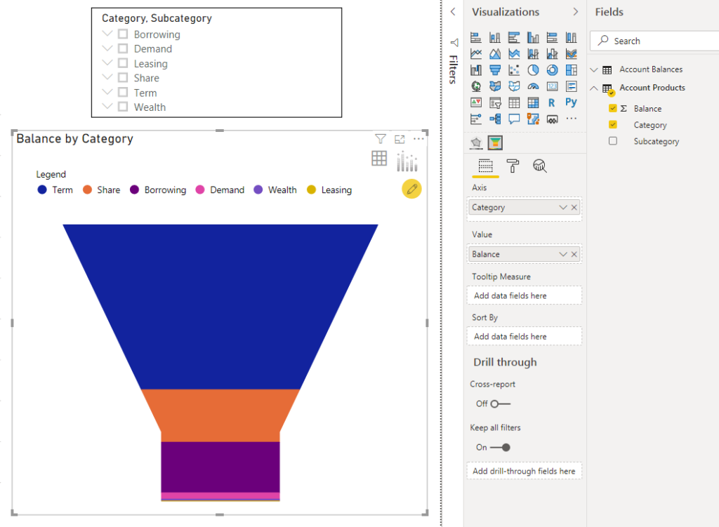
The axis also supports multiple fields, which pairs well with the new hierarchical slicer.
As mentioned above, the same data can be visualized as both a funnel and a pyramid. To toggle, navigate to Chart Options under Format in the Visualizations pane.
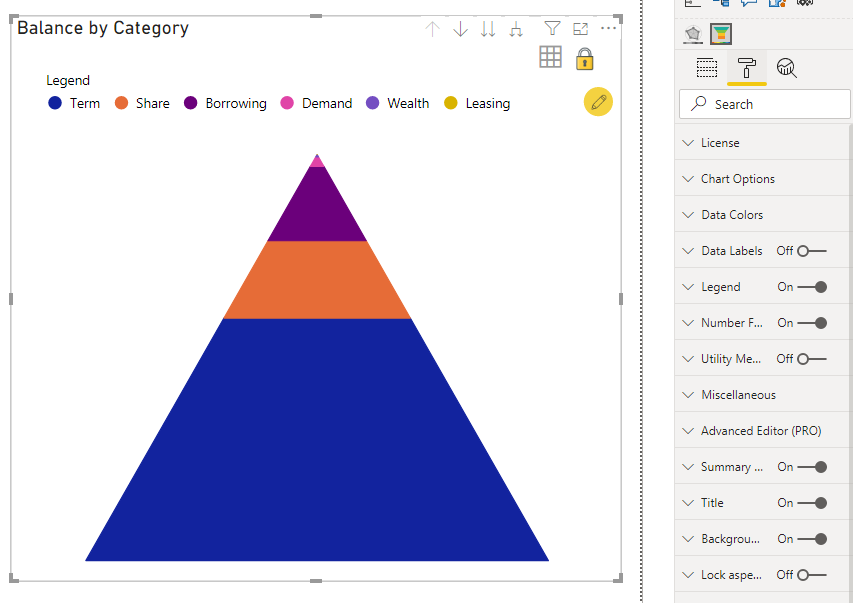
There are plenty of additional formatting options that I did not cover here. More information about the custom visual can be found here.
That wraps up this month! My three favorite features covered the topics of dataset management, reporting and visualization.
1 thought on “What’s New in Power BI – February 2020”
Comments are closed.